Ision
Bold B2B branding empowers solar energy newcomer to stand out
The challenge
In 2024, the German solar market is in a dynamic phase of growth and transformation. In 2023, a total of 14.1 gigawatts of new solar capacity was installed in Germany, putting the country back at the top of the European solar markets. This increase represents a significant leap compared to previous years and marks a new record for the most solar capacity installed in one year in an EU country.
Even though the solar industry is still booming, it is suffering from an image problem: the market is oversaturated, with many new suppliers dumping prices in order to profit from the hype market. More and more dubious companies are packaging false promises in non-transparent offers, and construction botches and waste residues after installation are unfortunately often the order of the day. As a result, customers are unsettled, mistrustful and disorientated. The challenge was to introduce the spin-off of UKB Energie GmbH as a new brand and new kid on the block in the dense solar market.
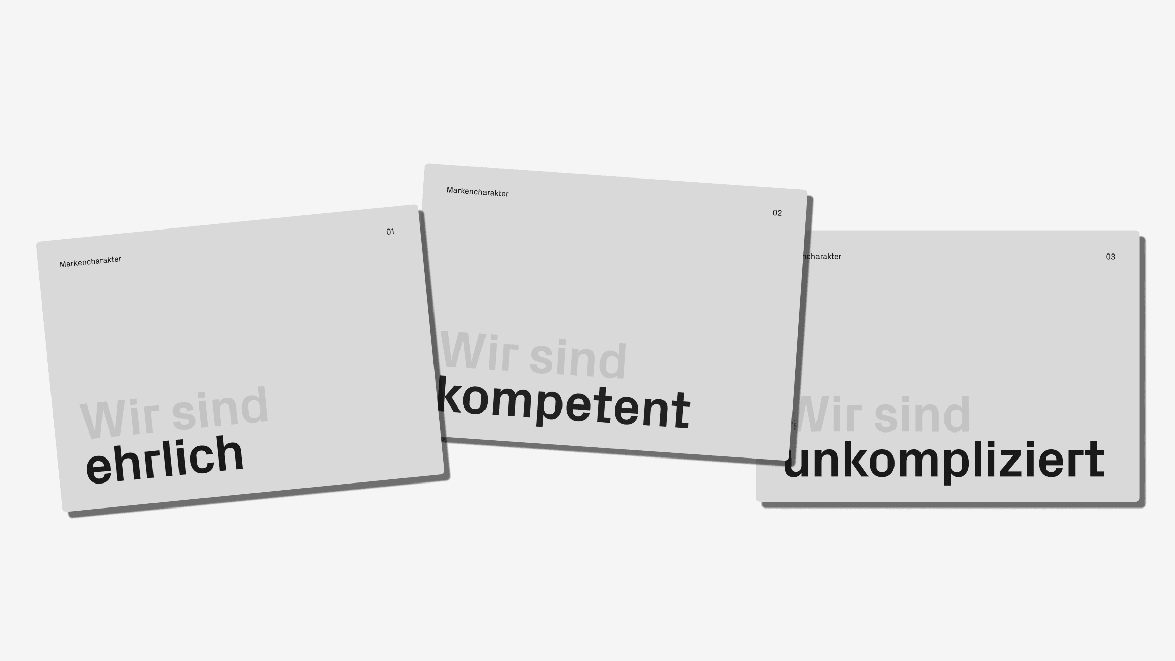
Brand strategy
As an independently managed brand of UKB Energie, Ision focuses primarily on B2B sales. Based on the conviction that it wants to drive forward the energy transition, the solar company aims to provide small and medium-sized enterprises with access to sustainable solar energy and enable an independent and cost-transparent energy supply.
The aim is to prioritise reliability, expertise and trust in a non-transparent market. To make this possible, the brand focuses on honest, personal advice at eye level, technical expertise and first-class service. The aim is to finally make it easy for companies to utilise solar energy, become self-sufficient and play an active role in shaping the energy transition.
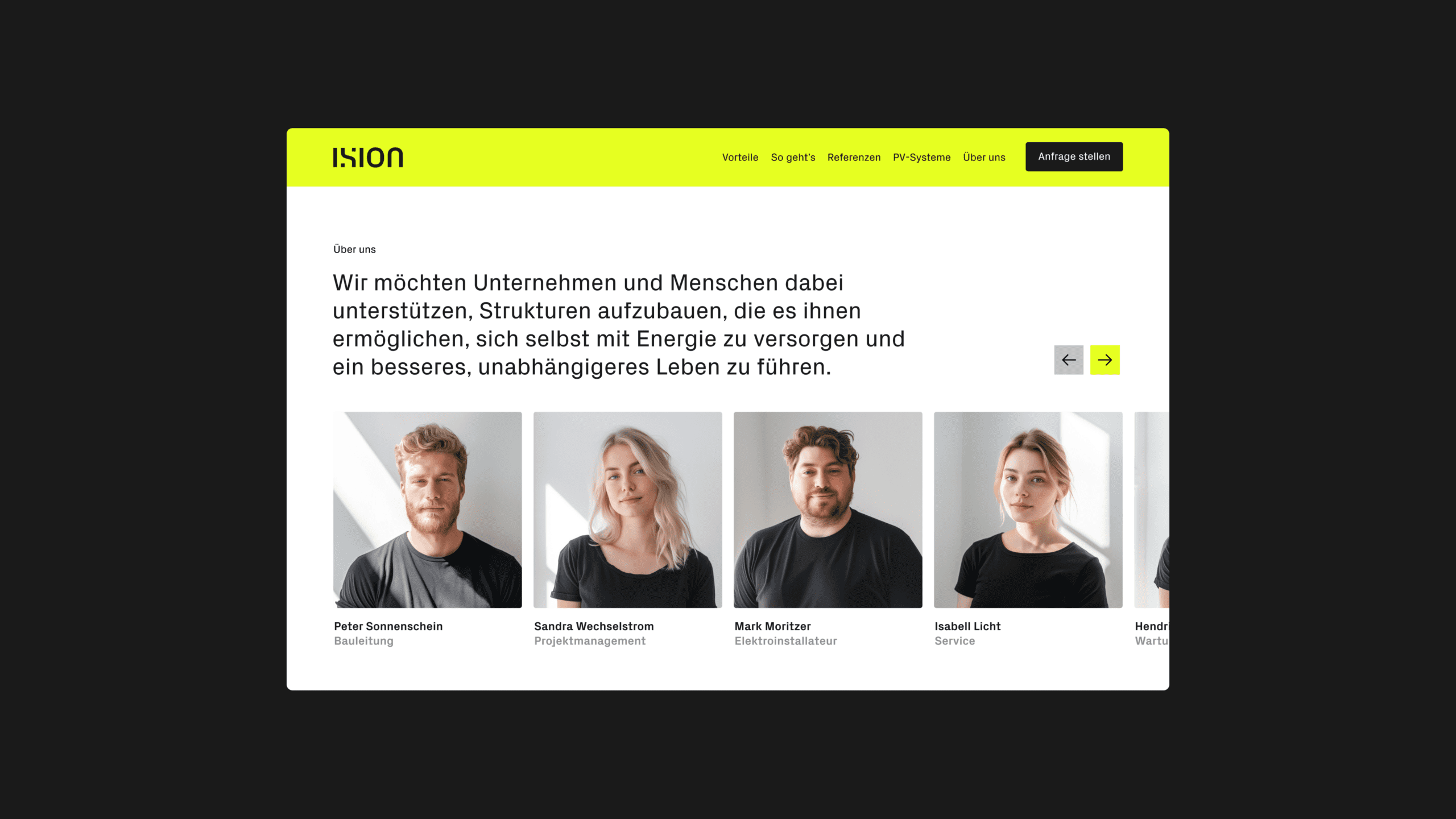
The expertise of the young founding team is based on the experience and structures of UKB Energie, which has been an established name in Berlin, Brandenburg, Münsterland, NRW and beyond since 2013.
The new brand capitalises on the role of the underdog by expressing rebellious traits in its personality. It is sceptical about the market and the behaviour of the competition and does not shy away from communicating this attitude at the right moment.
Naming
The new name expresses the central idea of offering customers a simple user experience and enabling quick and uncomplicated access to solar energy in a three-syllable neologism. The combination of easy (simple) and on (activated, switched on) creates a short, memorable name that sets the brand apart from the competition and can be used uniformly and understood identically in the relevant countries.
Visual identity
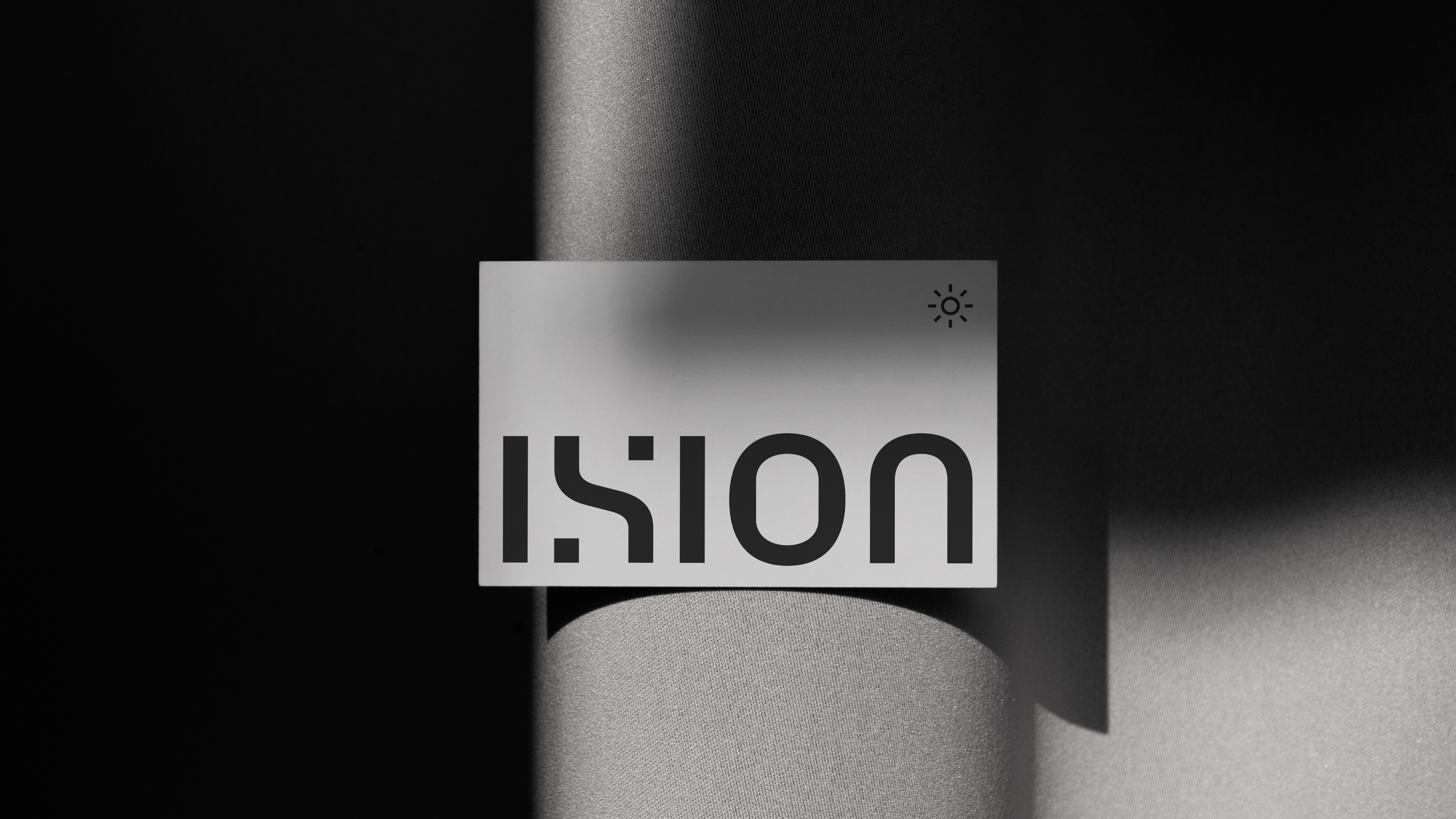
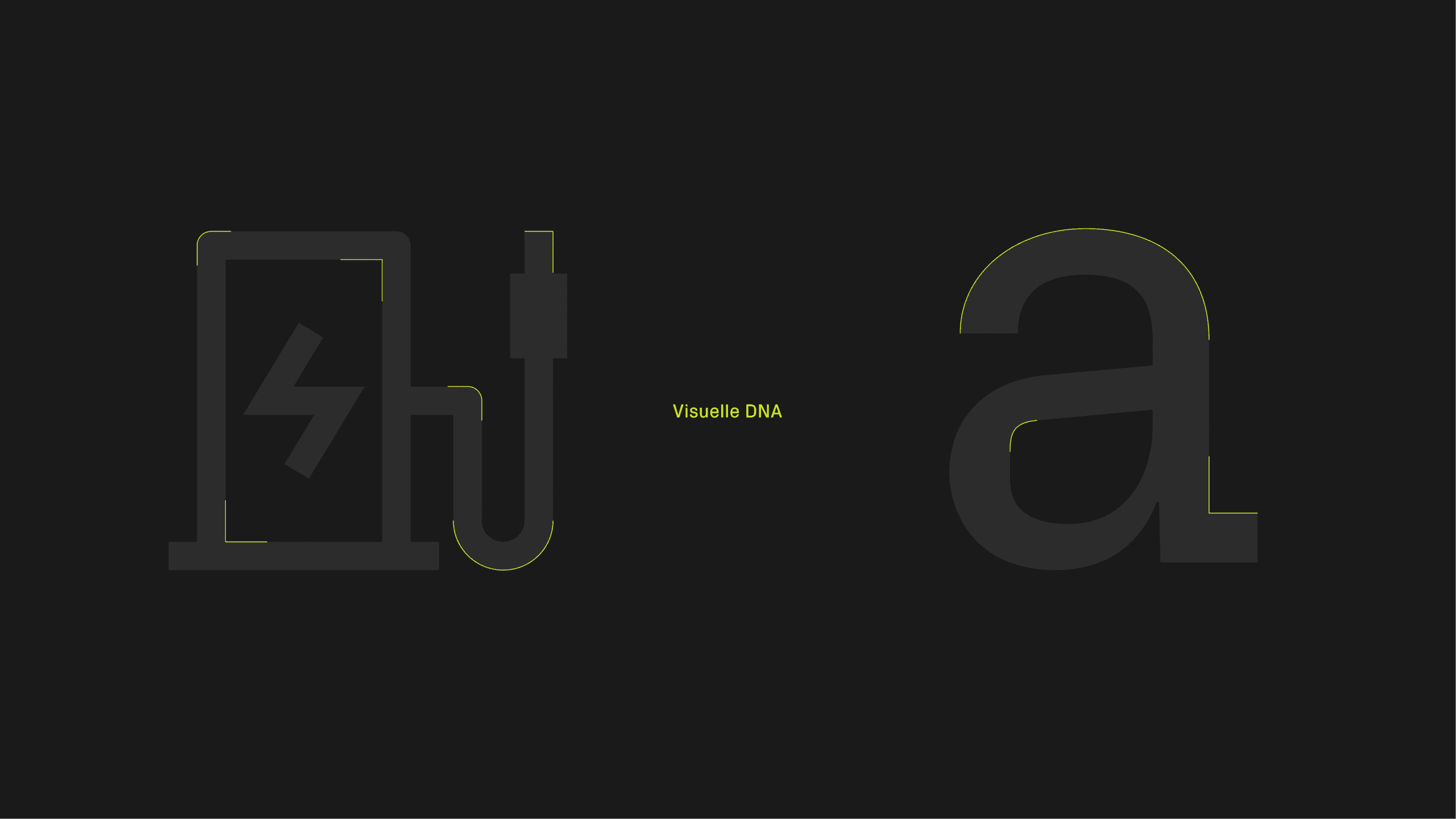
Transformation in every cell
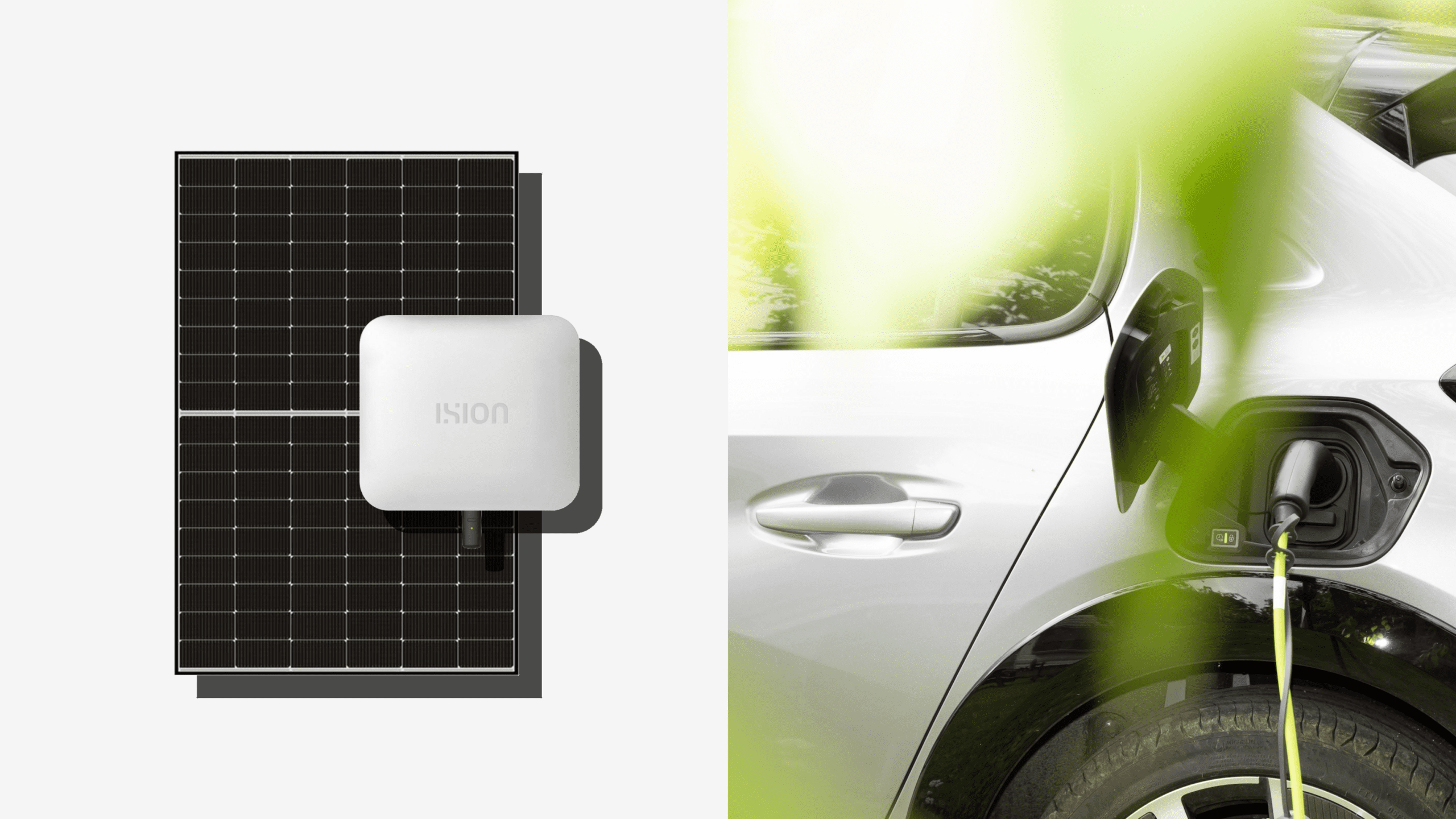
A semiconductor material is used in a solar cell, as semiconductors have improved conductivity when energy is supplied. When light is applied, the conductivity of the cell increases, electrons move and electricity is generated. In order for this to be utilised, the direct current must first be converted into alternating current. The independent, characterful word and figurative mark was derived precisely from this central function.
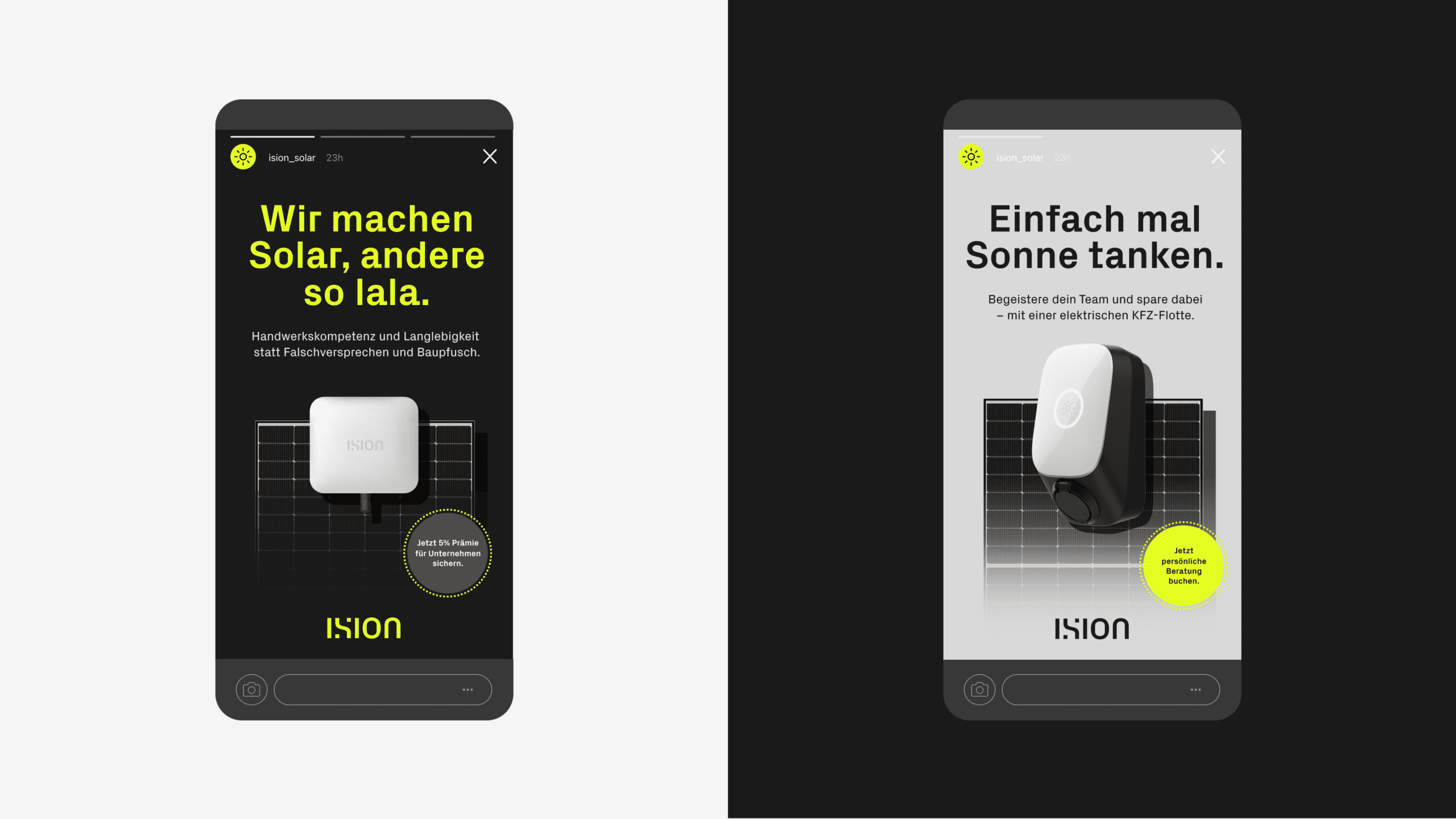
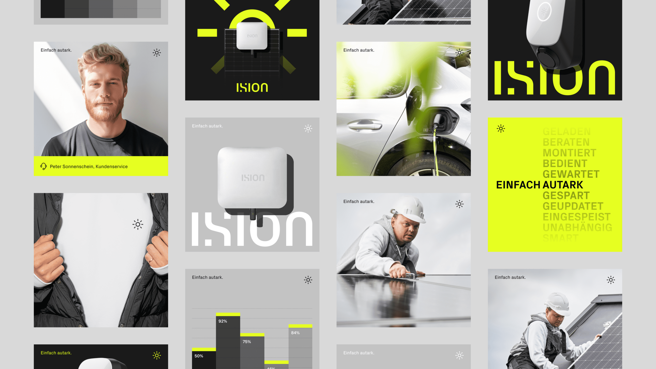
This is complemented by a sun icon that can be used flexibly, guides the user through the customer journey and acts as an element in user interfaces or as an activator in motion design.
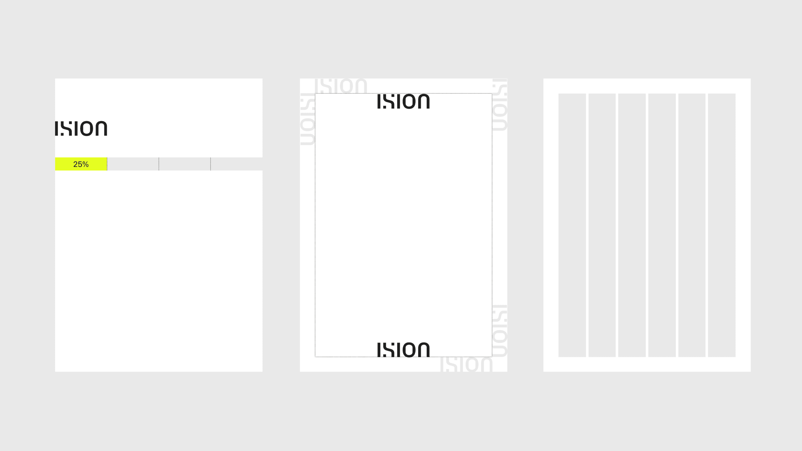
The formal characteristics of the word mark are harmoniously combined with the striking character of the Px Grotesk font and the design language of the figurative mark and icon system. This creates a memorable visual DNA for the brand that is independent and differentiates it from the competition.
The formal characteristics of the word mark are harmoniously combined with the striking character of the Px Grotesk font and the design language of the figurative mark and icon system. This creates a memorable visual DNA for the brand that is independent and differentiates it from the competition.
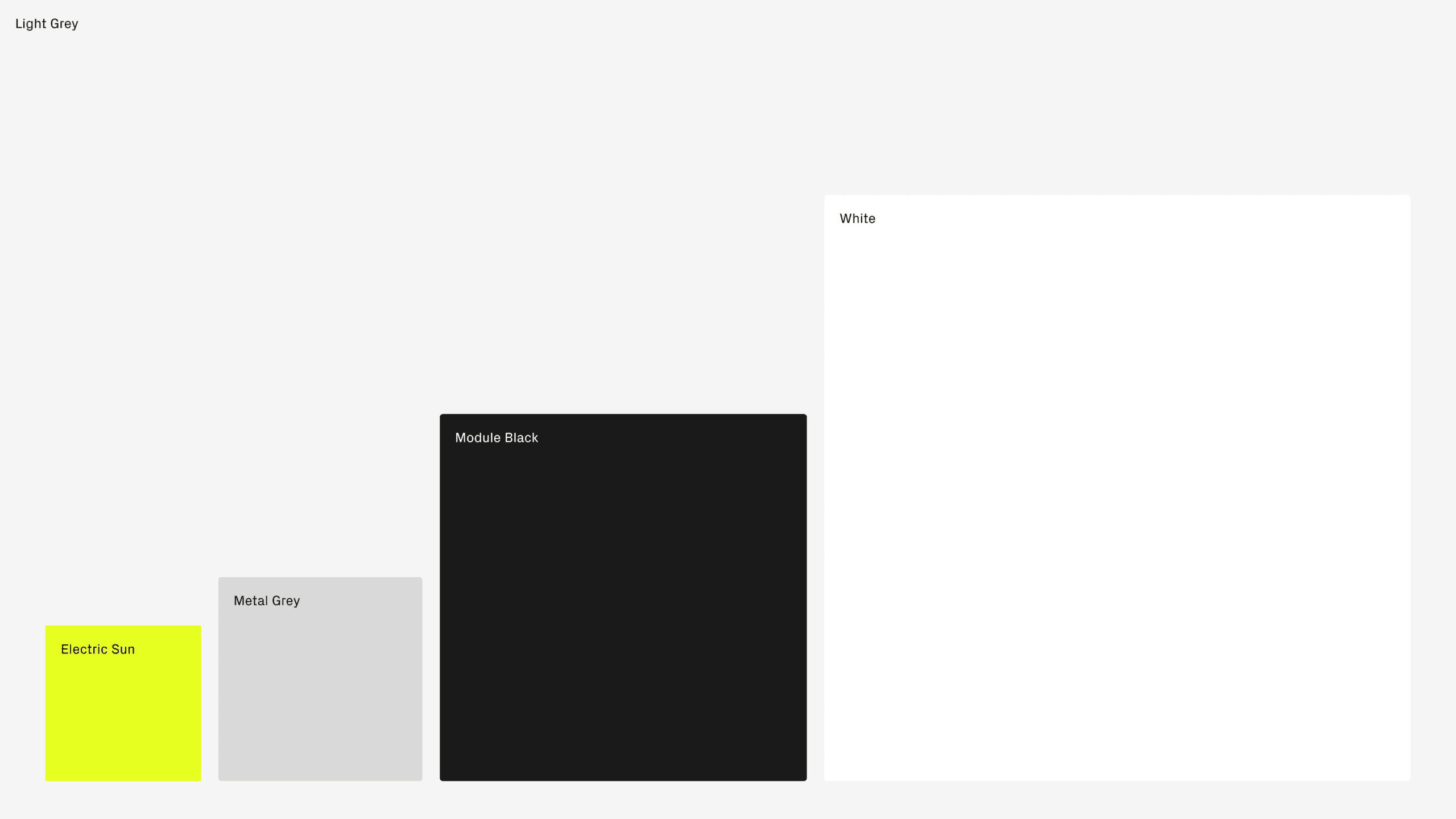
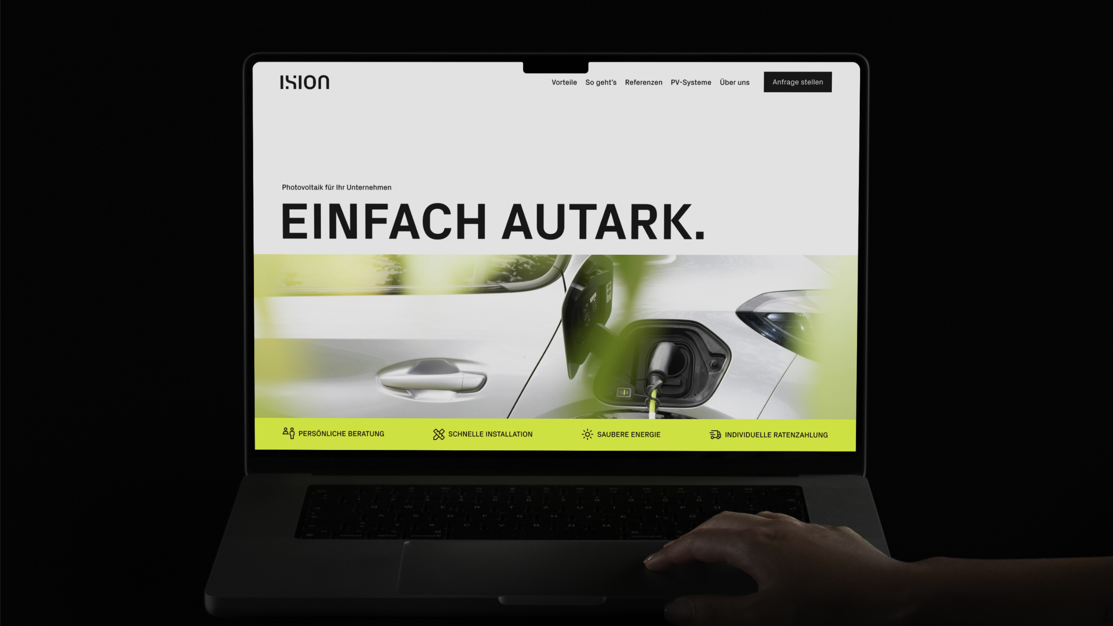
The fresh, electrifying colour palette makes it possible to express a lot with just a few colours – from light and friendly to dark and technical. The colour palette guarantees digital accessibility in accordance with the European Accessibility Act (EEA), which will be mandatory for many companies from the end of June 2025.

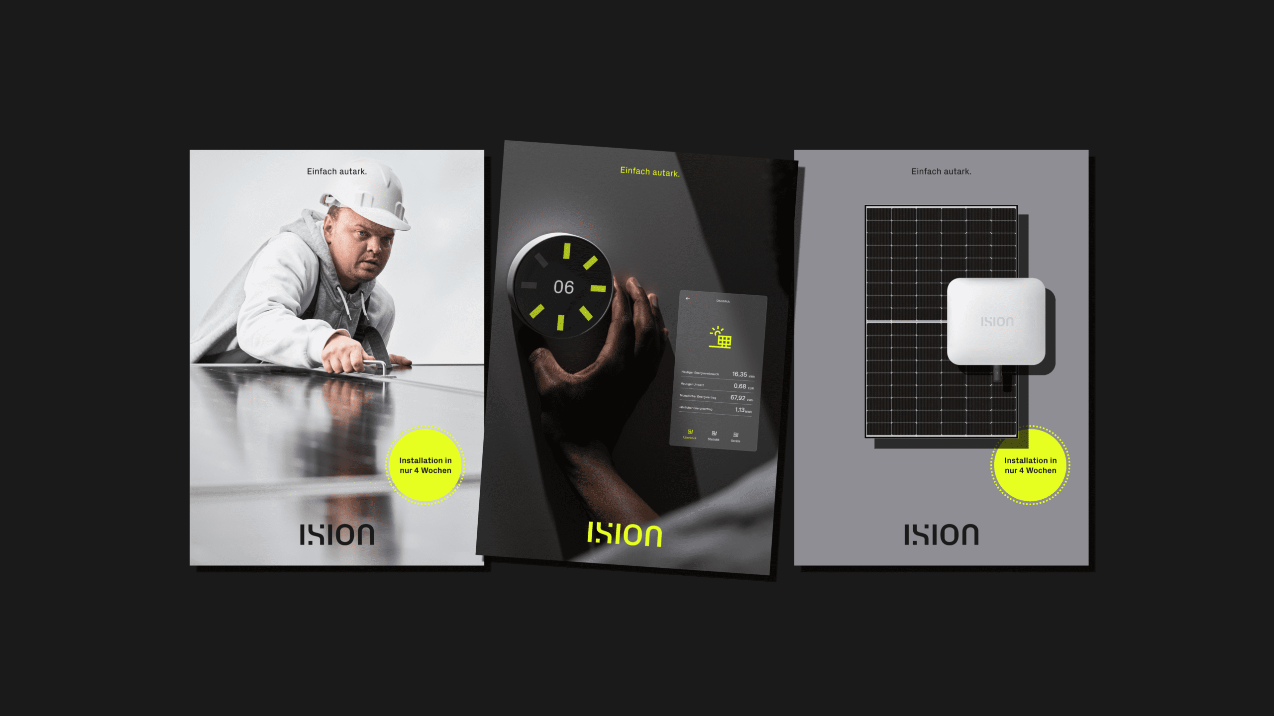
Brand experience
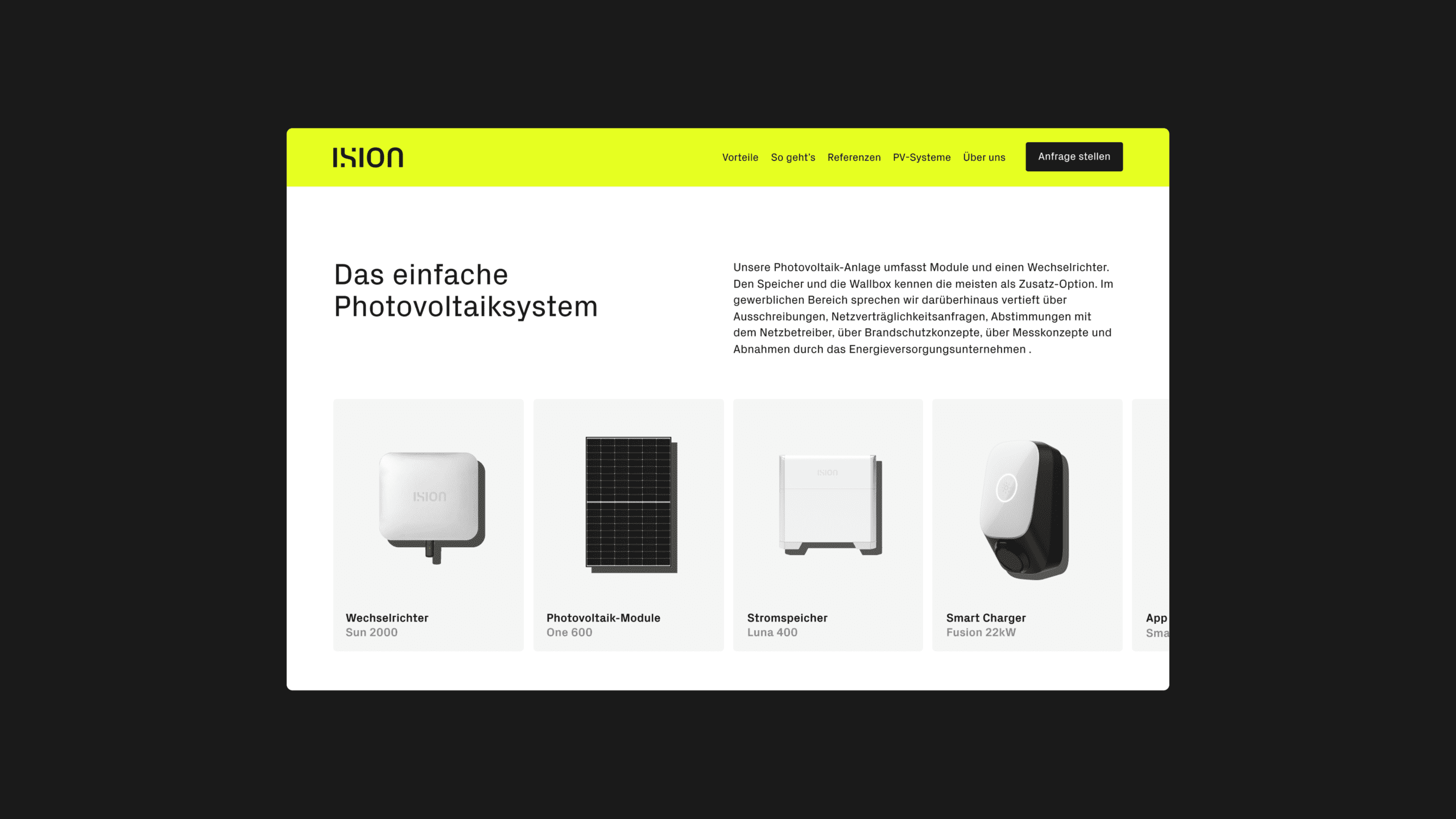
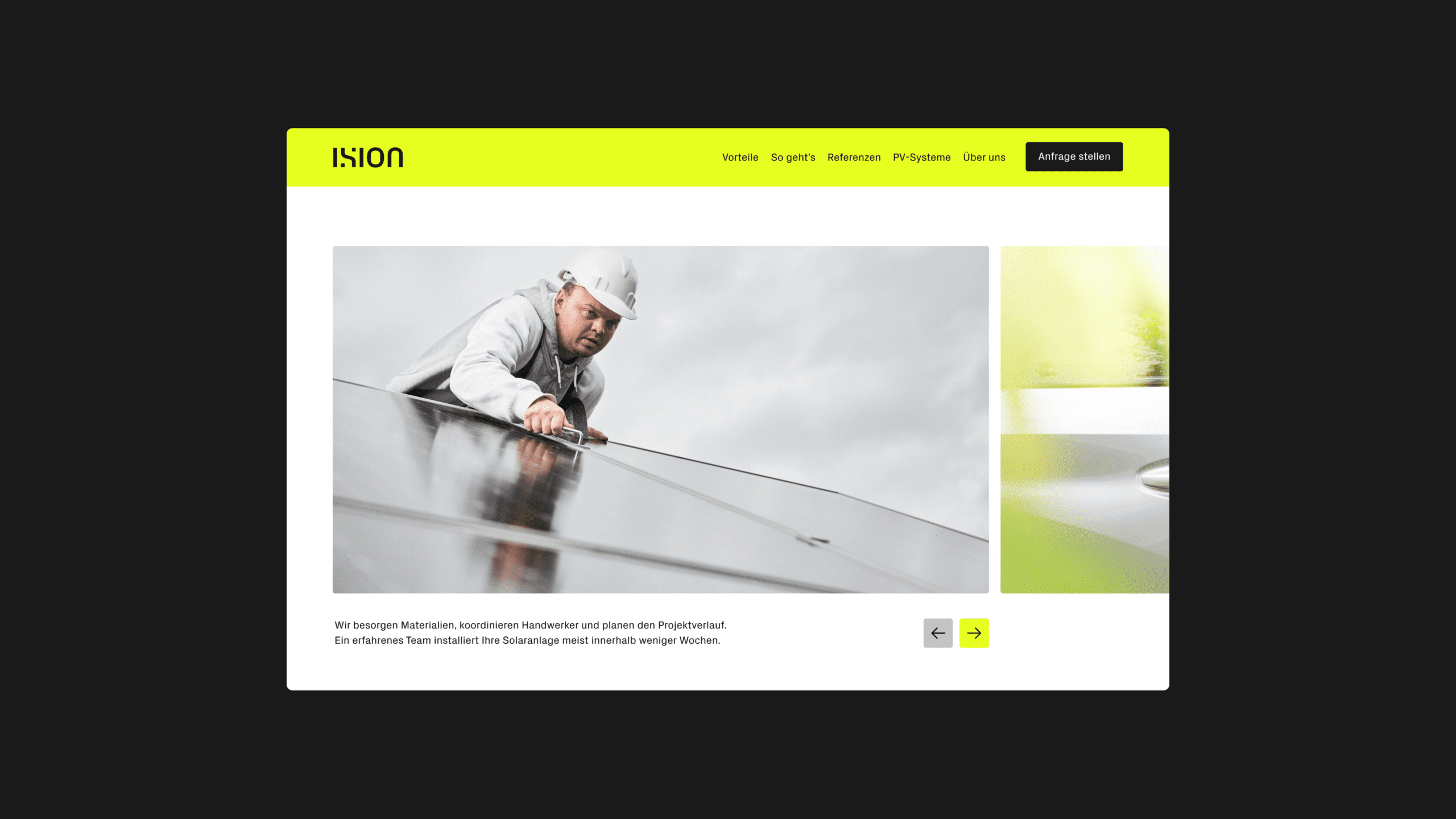
The adaptive design principle of simple and bold enables the Ision team to express different messages clearly and consistently at various contact points with just a few correctly applied design elements. At the same time, the new design toolbox and simple layout system guarantees fast, cost-effective design of touchpoints, increasing the efficiency of the team, who can access the online guidelines from anywhere to find design rules and download design assets.
The result is a modern, differentiating brand identity that supports the spin-off’s market entry and enables consistent and efficient brand management in the long term.