Farmula
Cultivating a brand to accelerate the global transition to regenerative agriculture
The Berlin-based biochemistry start-up Farmula creates sustainable agronomy products from biochar to help agricultural practices overcome challenges such as drought and water scarcity. The team aims to accelerate the global transition to regenerative agriculture and protect the climate.
With a revolutionary product formula and a great vision, the team challenged us to build their brand before an upcoming investor pitch. Together with the founders, we developed a new brand strategy, a new name, a new visual identity, and a website.
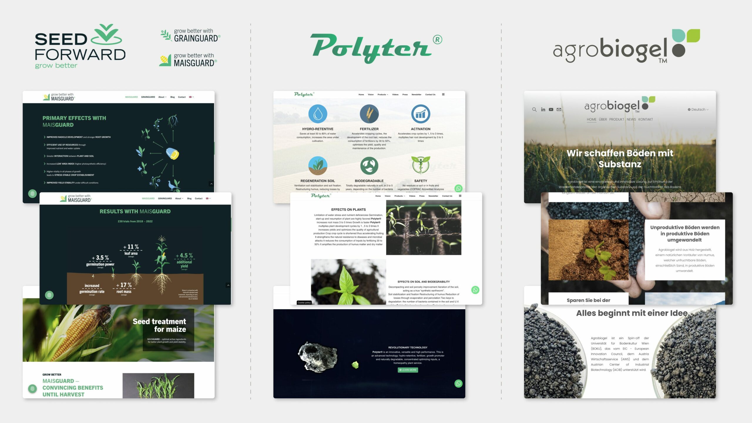
Overview of main competitors
Brand strategy
To sustainably strengthen the brand image, brand awareness and brand identity and achieve a competitive advantage, we worked with the founding team to develop the brand’s core strategy. The vision, values and position serve as a compass in future strategic decisions as well as brand and marketing activities.

Naming
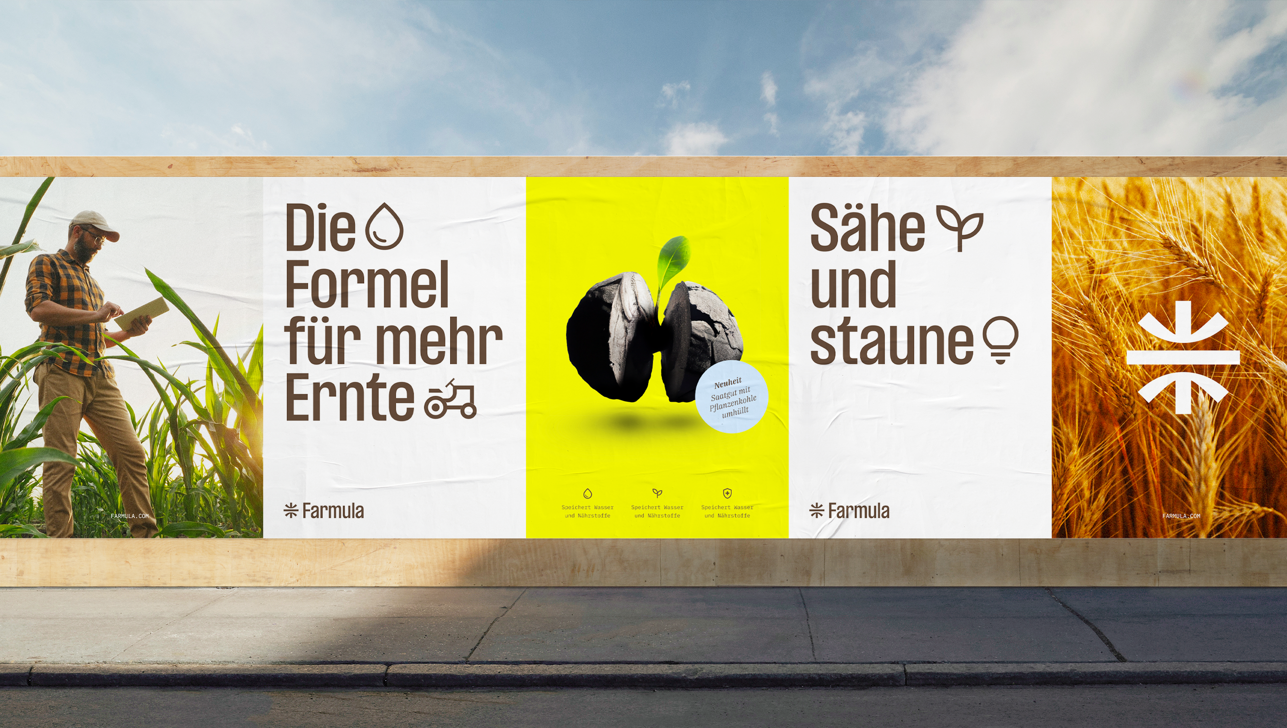
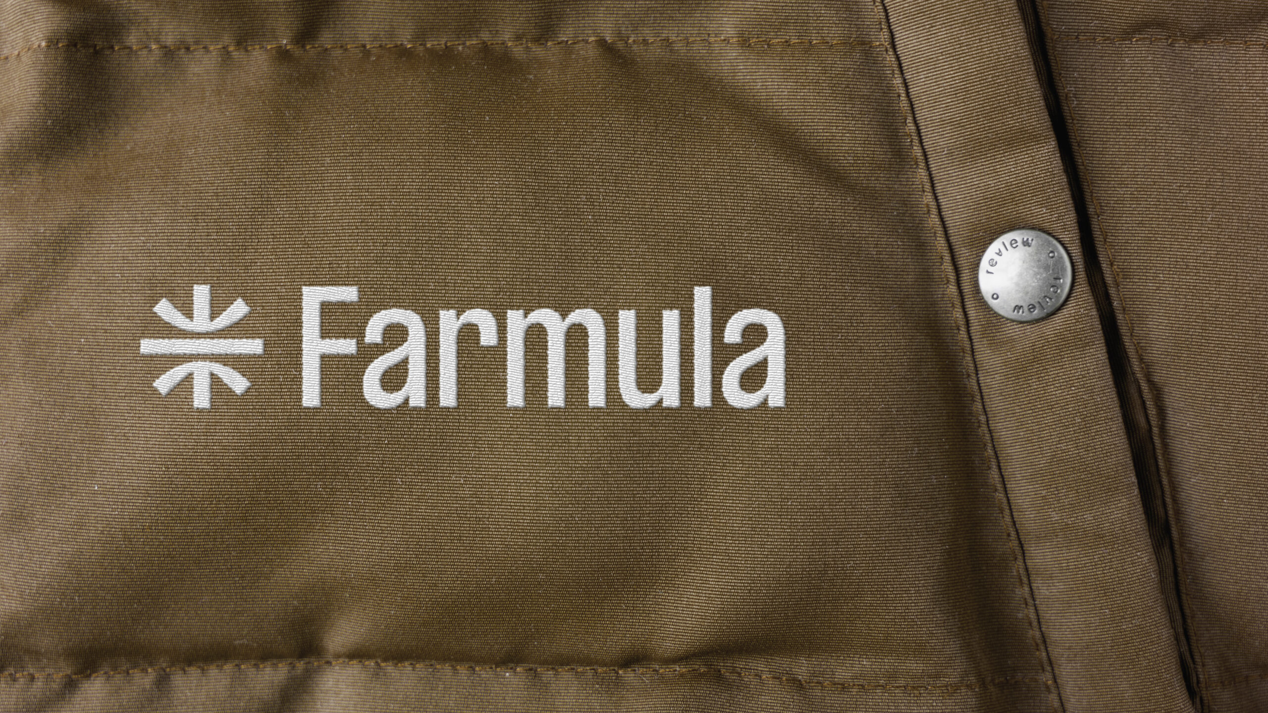
Based on the new brand strategy, we crafted a brand name that would accentuate the formula for healthy plant growth, water storage and climate protection, and establish a clear link to the industry. The neologism is easy to understand, speaks to an international audience, and is highly memorable.
Visual identity
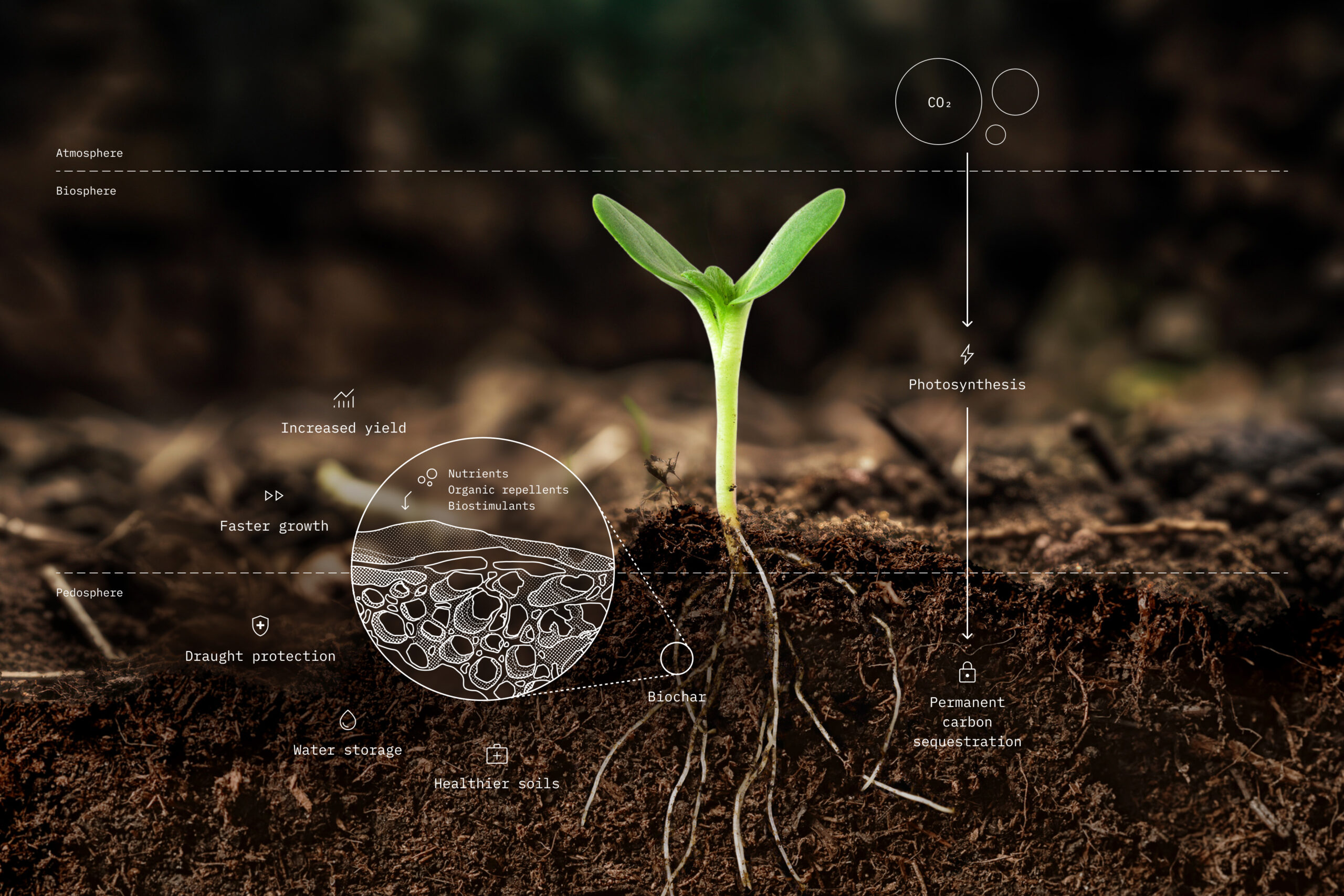
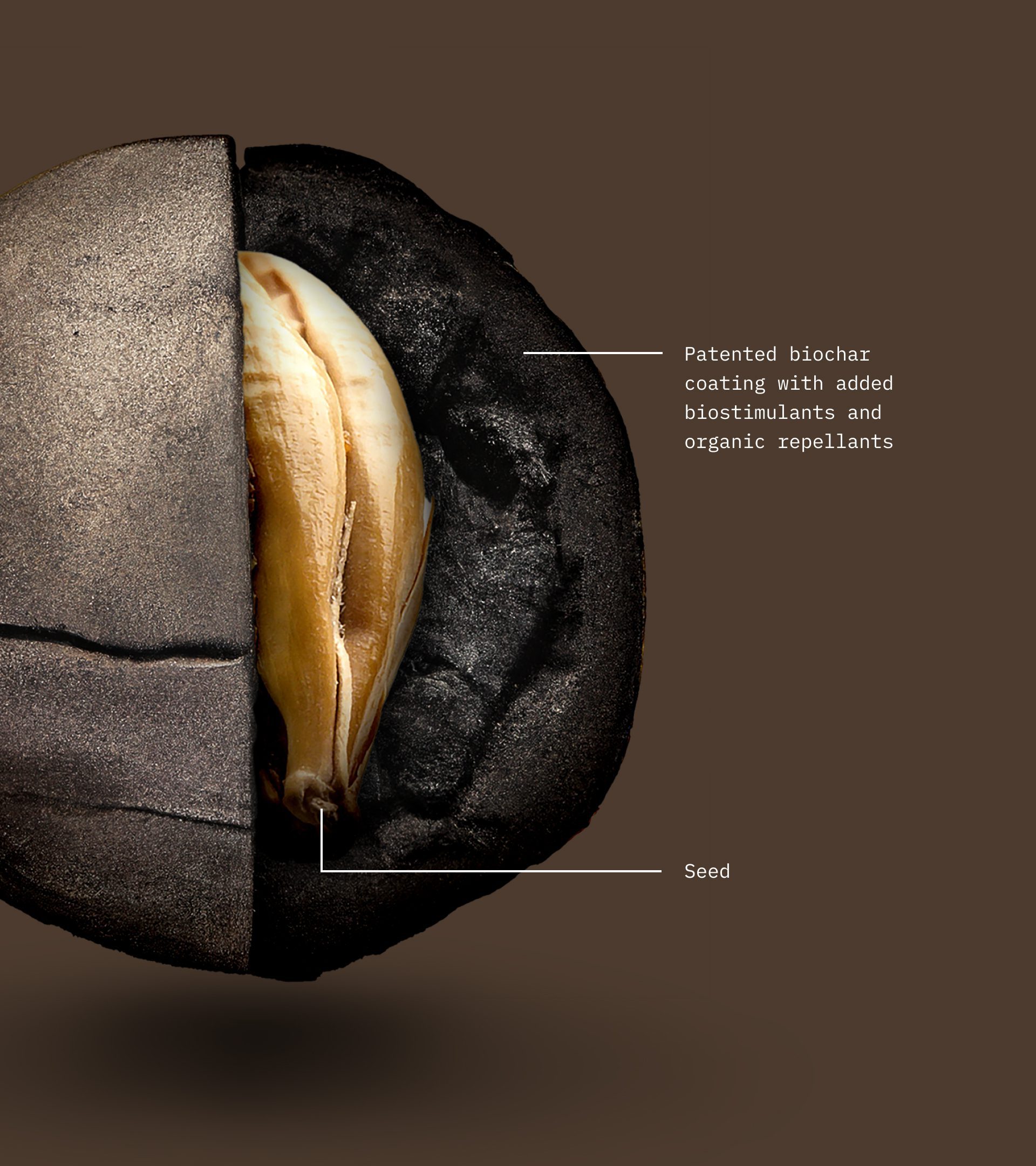
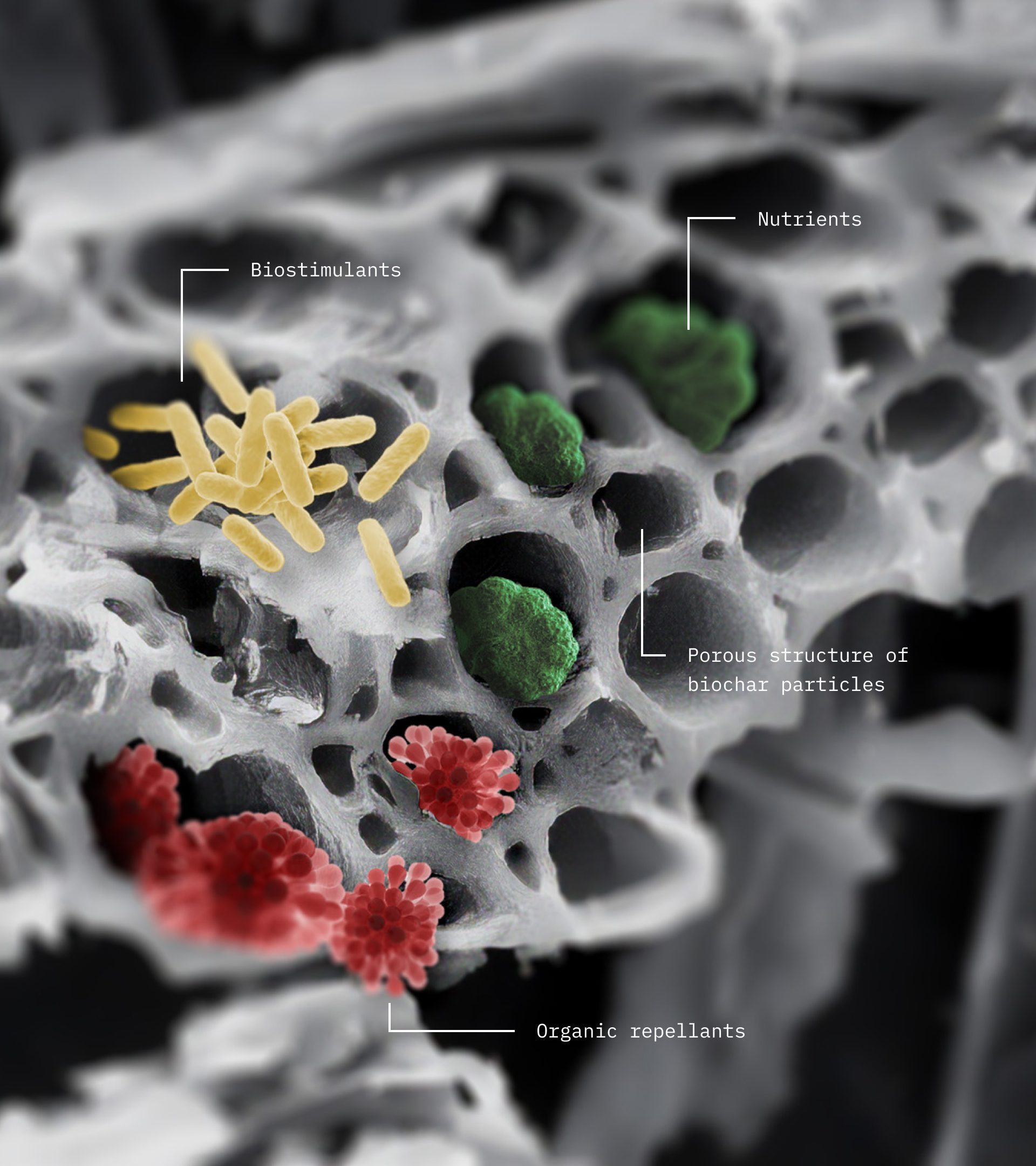
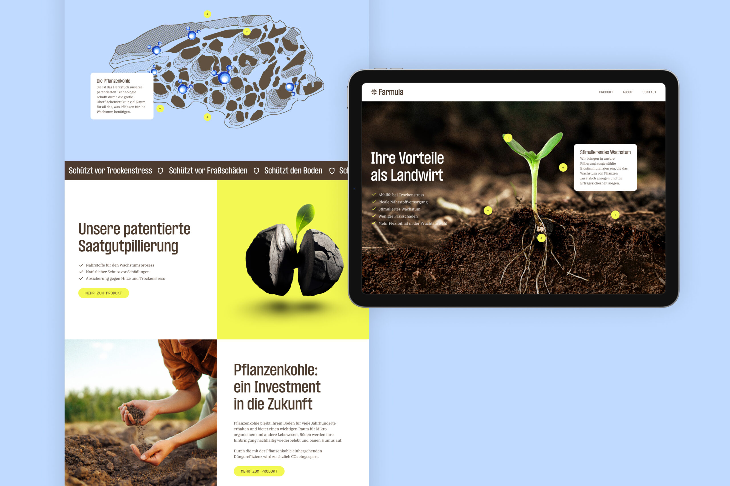
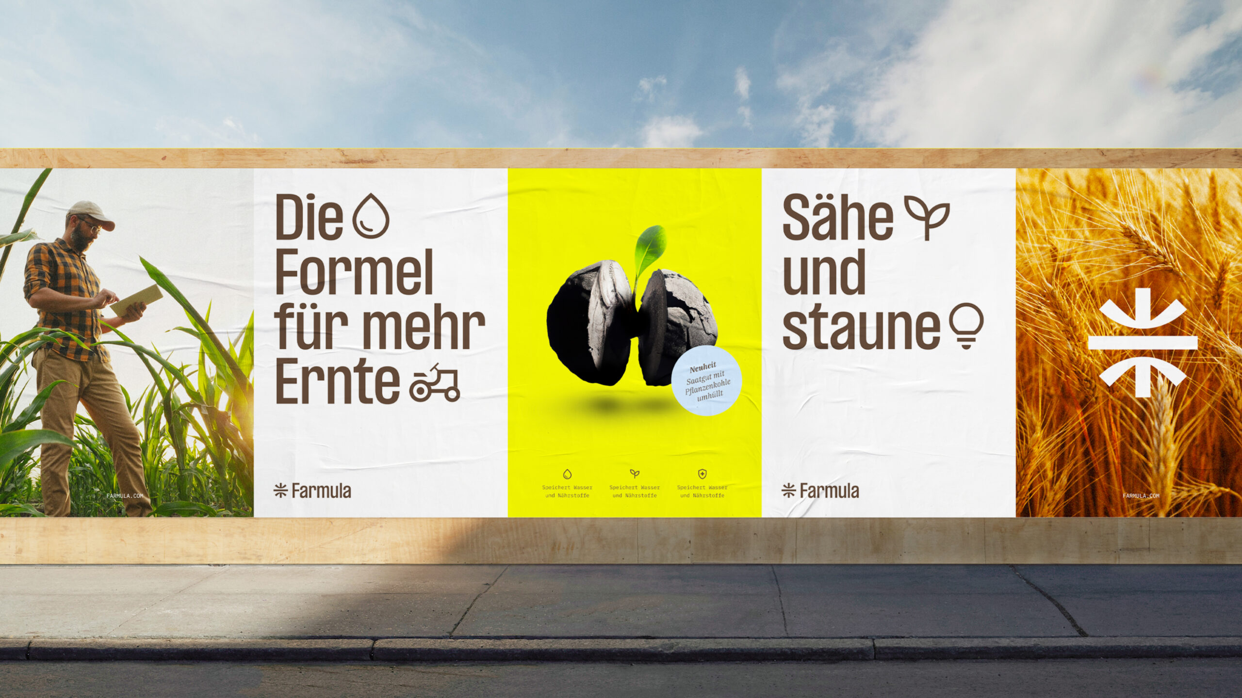
The central component in the formula for regenerative agriculture is biochar.
Its porous structure carries added biostimulants, nutrients, and organic repellents, and offers incredible water storage capacities. These properties improve the health of arable soils, protect seeds against drought stress, ensure faster plant growth and increase yield.
At the same time, biochar binds carbon dioxide absorbed by plants during respiration, reducing greenhouse gasses in the atmosphere. Combined, the process reduces the impact of industrial farming on the climate and the planet.
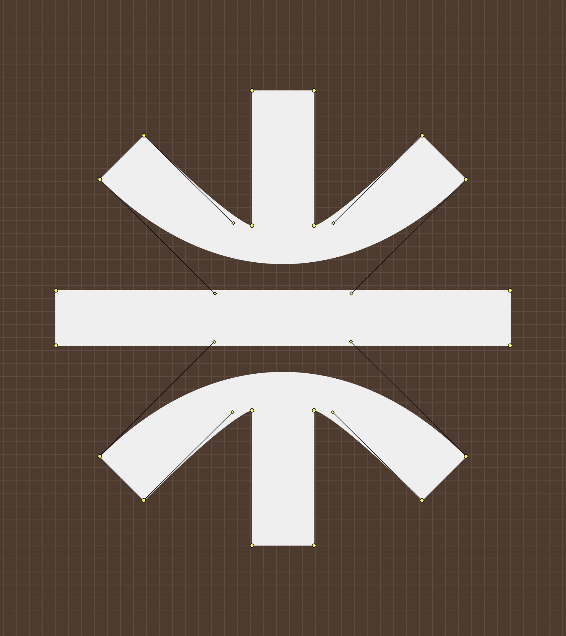
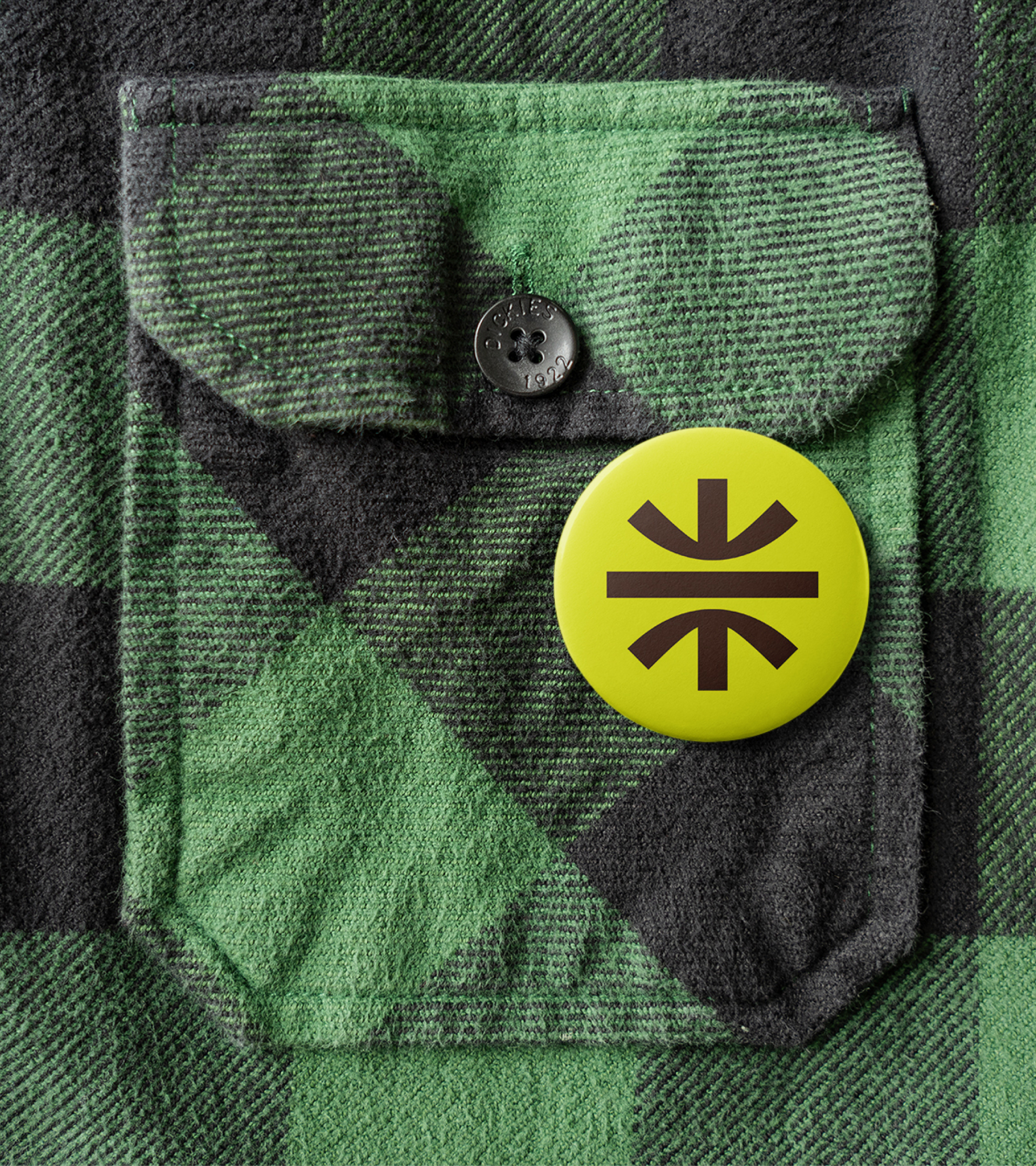
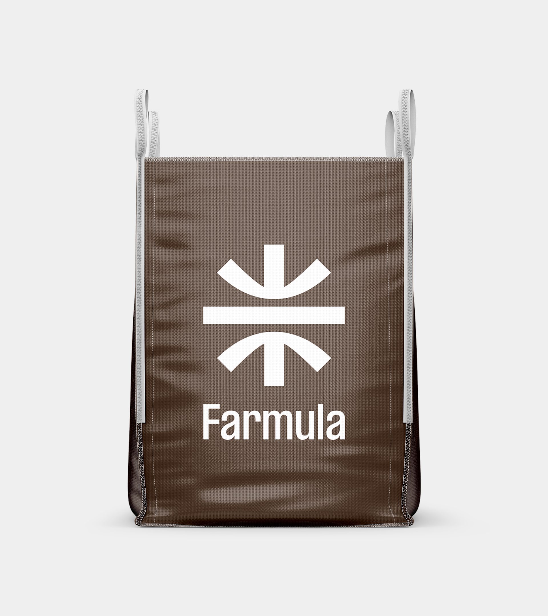
We brought these ideas together in one memorable symbol, from which an entire visual identity is spawned. Simple layouts, strong typography, bright colours and bold imagery capture and clearly express the vision of the brand, the function of its product formula, and the global impact in a confident authentic and credible manner.
Horizontal stroke symbolises the horizon, agricultural fields, and the ecological balance
Crop symbol in the form of a downward arrow suggests the motion of sowing seeds, fertilising, and storing CO2 in the ground
Root symbol in the form of an upward arrow to suggest faster growth and increased yield at harvest
A round overall footprint represents circular resources, regenerative farming practices and planet earth
Colours inspired by the countryside
We deliberately steered clear of industry-norm colours overused by competitors. Instead of green, we drew inspiration from the farmlands of the countryside and curated a palette consisting of an activating rapeseed yellow, and a calming sky blue, along with an airy grey and bold contrasting earth brown. The result is a differentiated visual identity that is optimistic, youthful, and friendly.
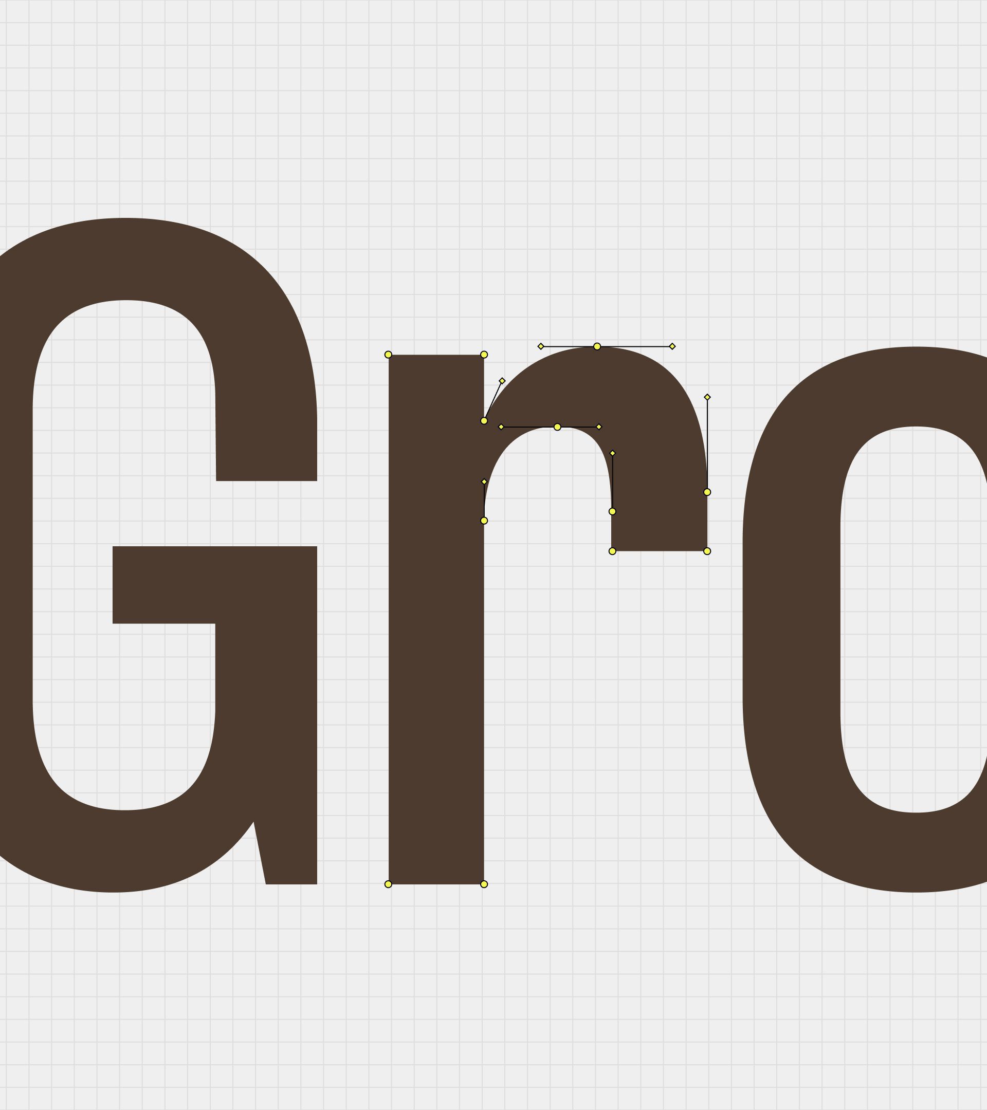
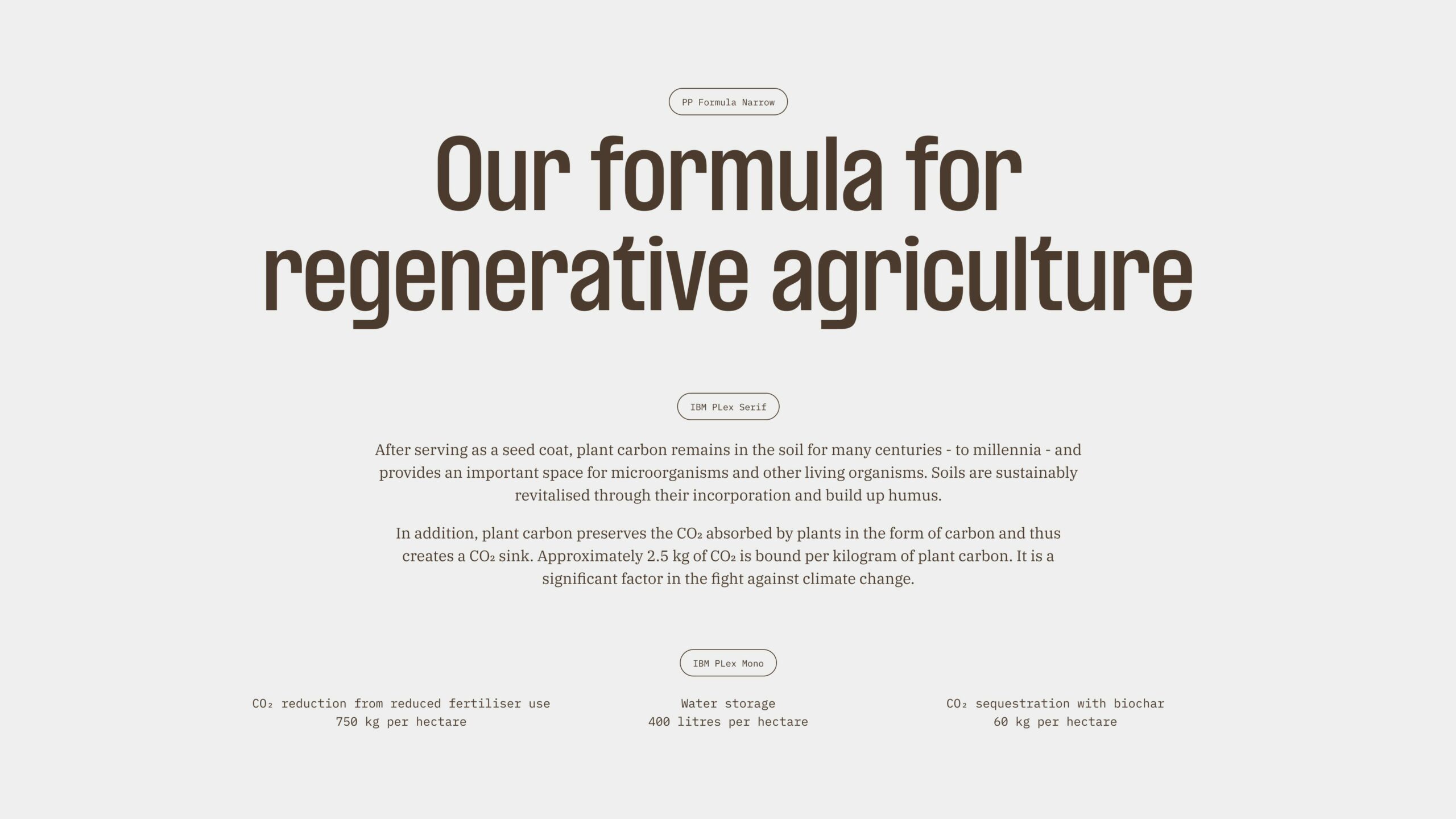
The typographic formula
Formula Narrow by PangramPangram perfectly echoes the details found in the Farmula symbol. The sans-serif display typeface is compact and geometric in construction, yet remains soft and friendly. At the body level, the highly legible IBM Plex Serif ensures a no-nonsense and accessible reading experience. Finally, IBM Plex Mono is used for captions, data and UI elements for a scientific, rational appearance. The typographic formula created the basis for a distinct, memorable, and functional visual identity
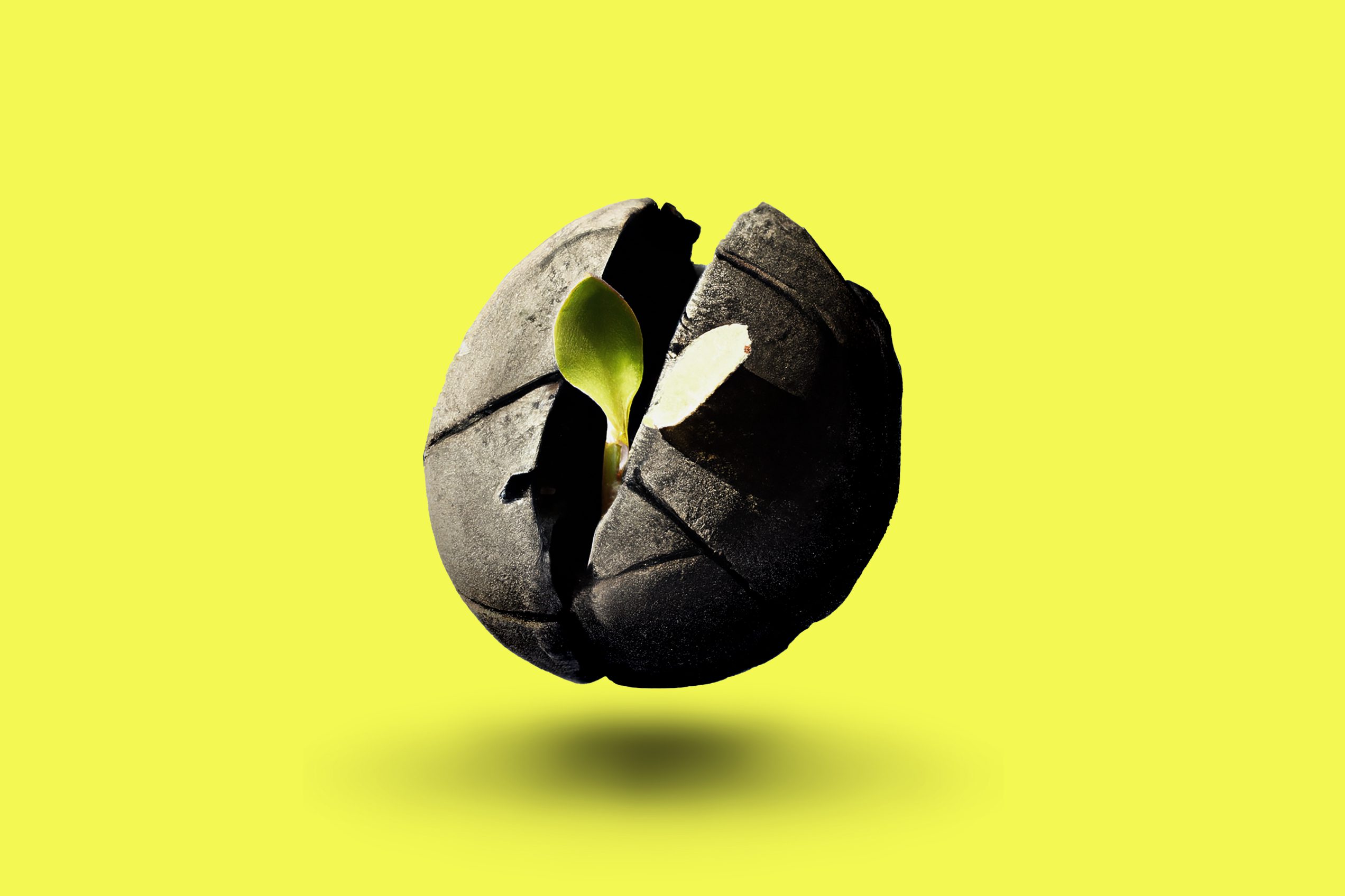
Imagery with a touch of AI
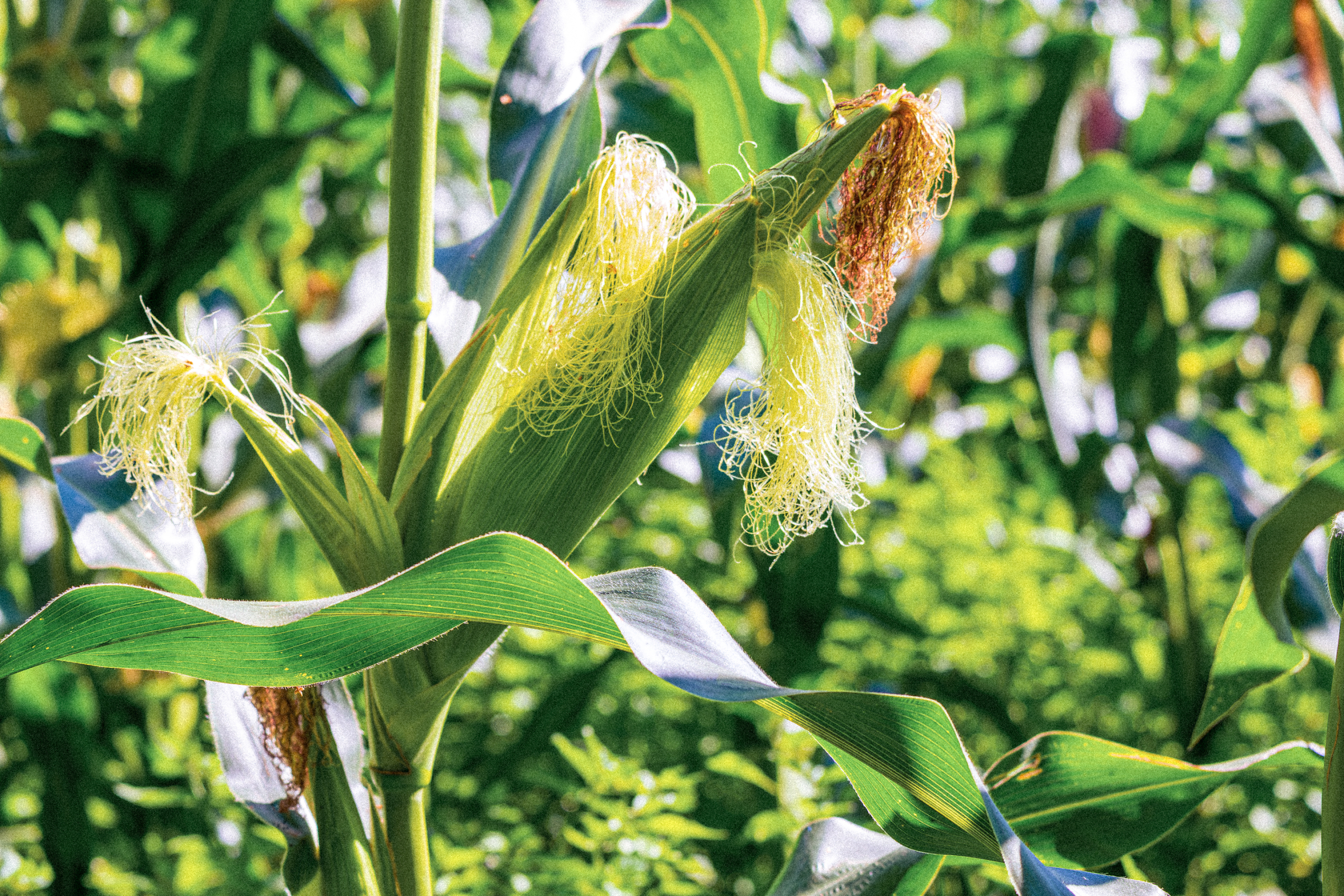
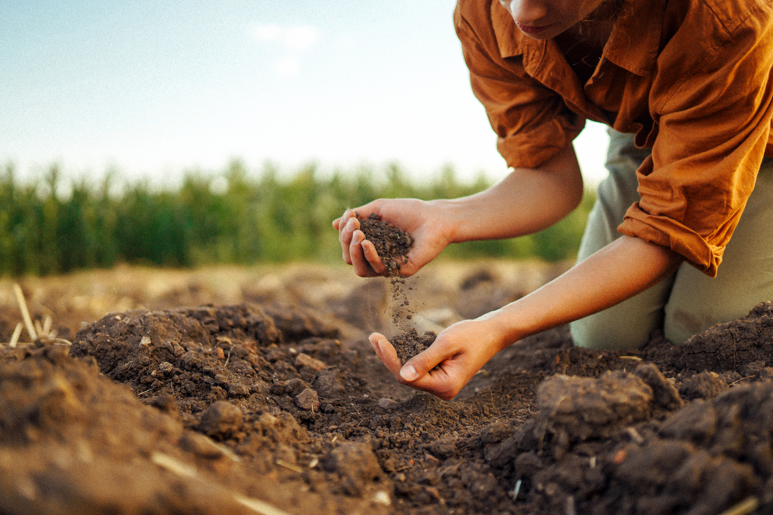
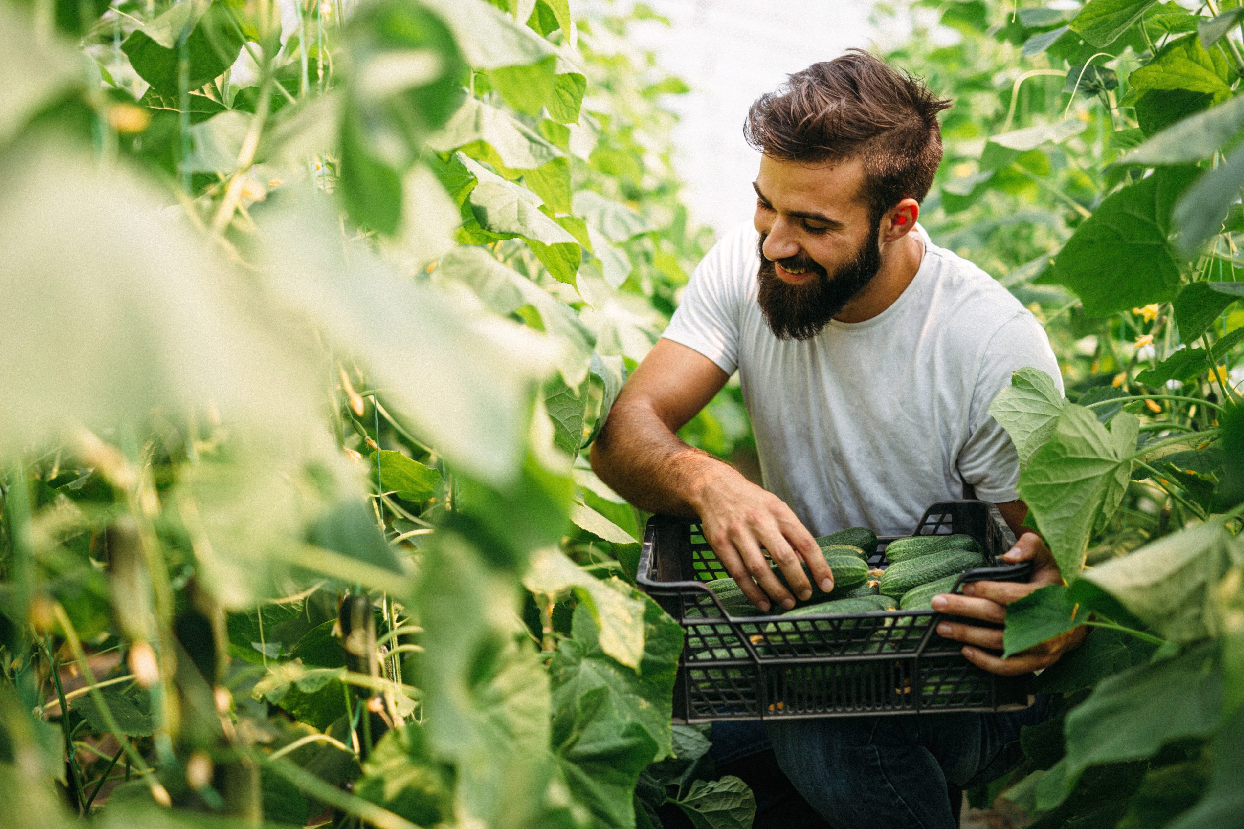
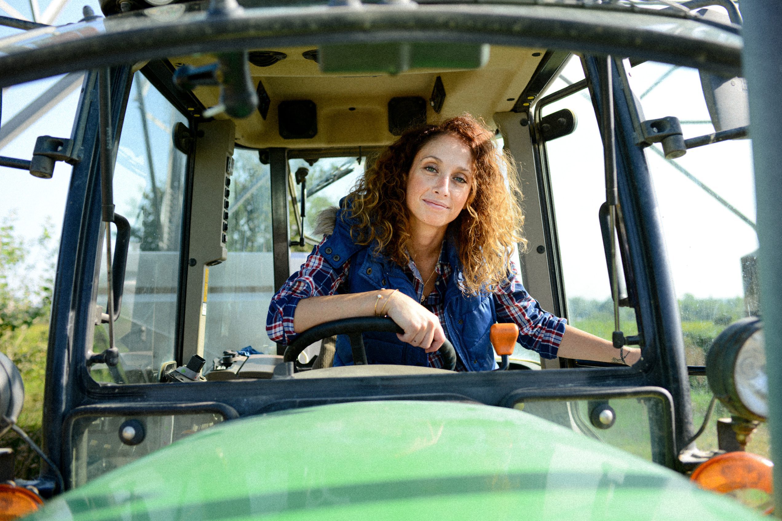
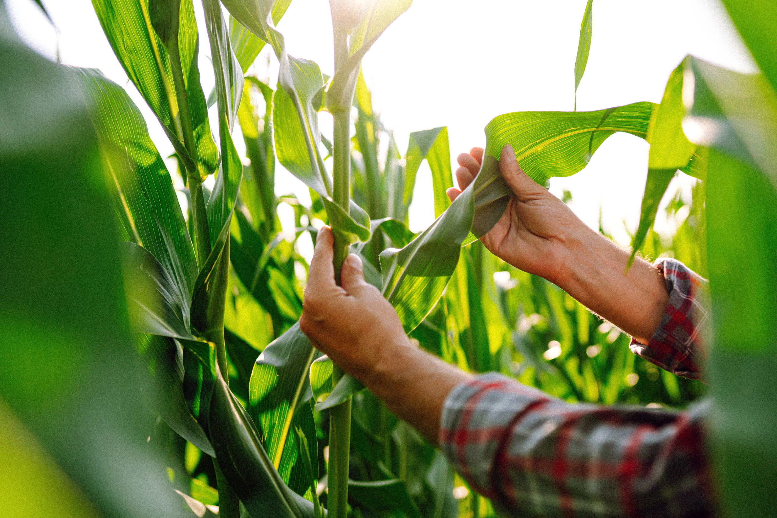
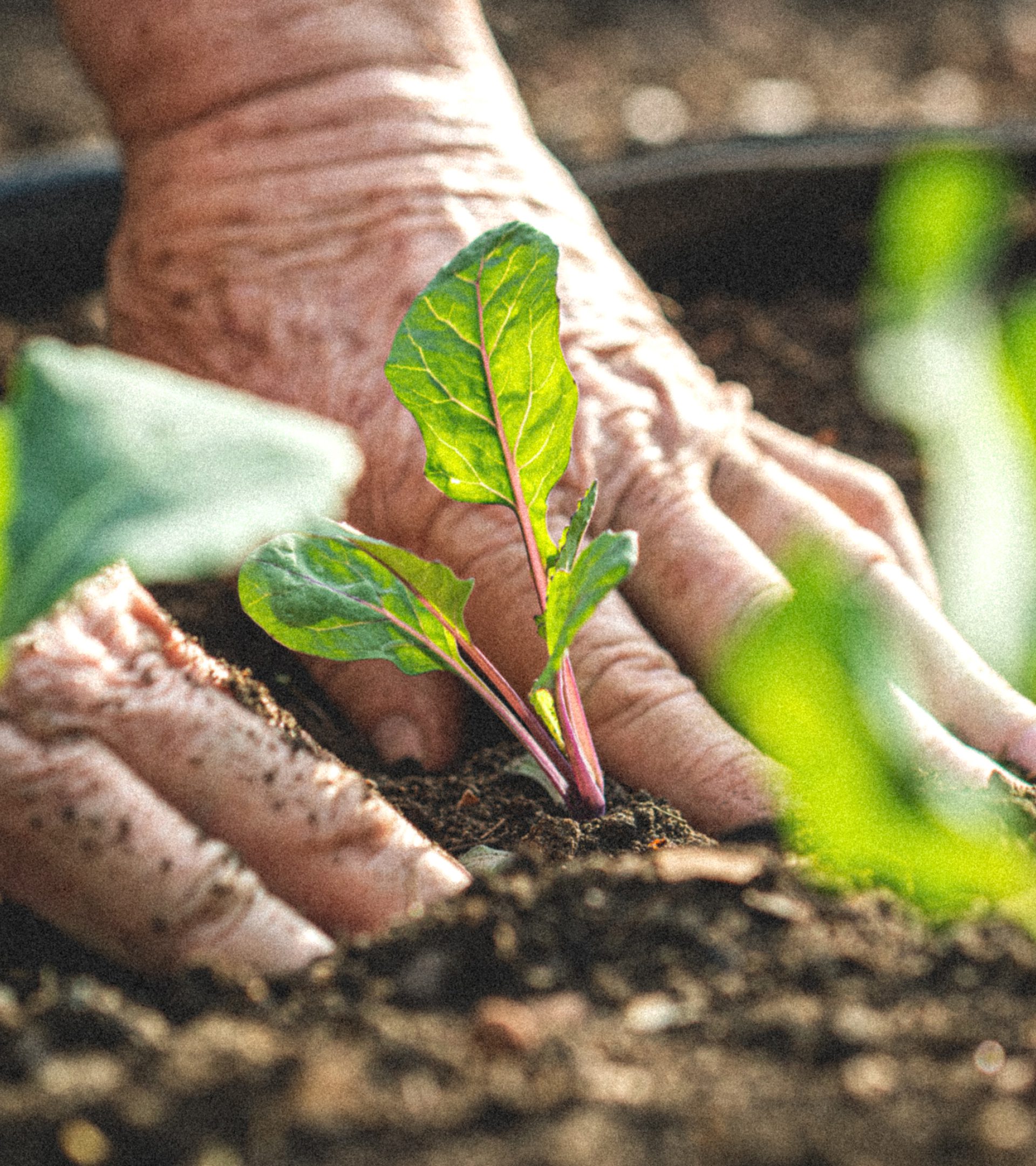
The brand imagery focuses on the hardworking people behind the machines and in the fields. Whether it’s the classic hero shot or a farmer harvesting produce, photos capture and express a sense of optimism, pride and confidence through warm, natural sunlight, rich, saturated colours and clean composition. Imagery is overlayed with a grain texture to create a rugged effect, adding contrast to the overall visual expression.
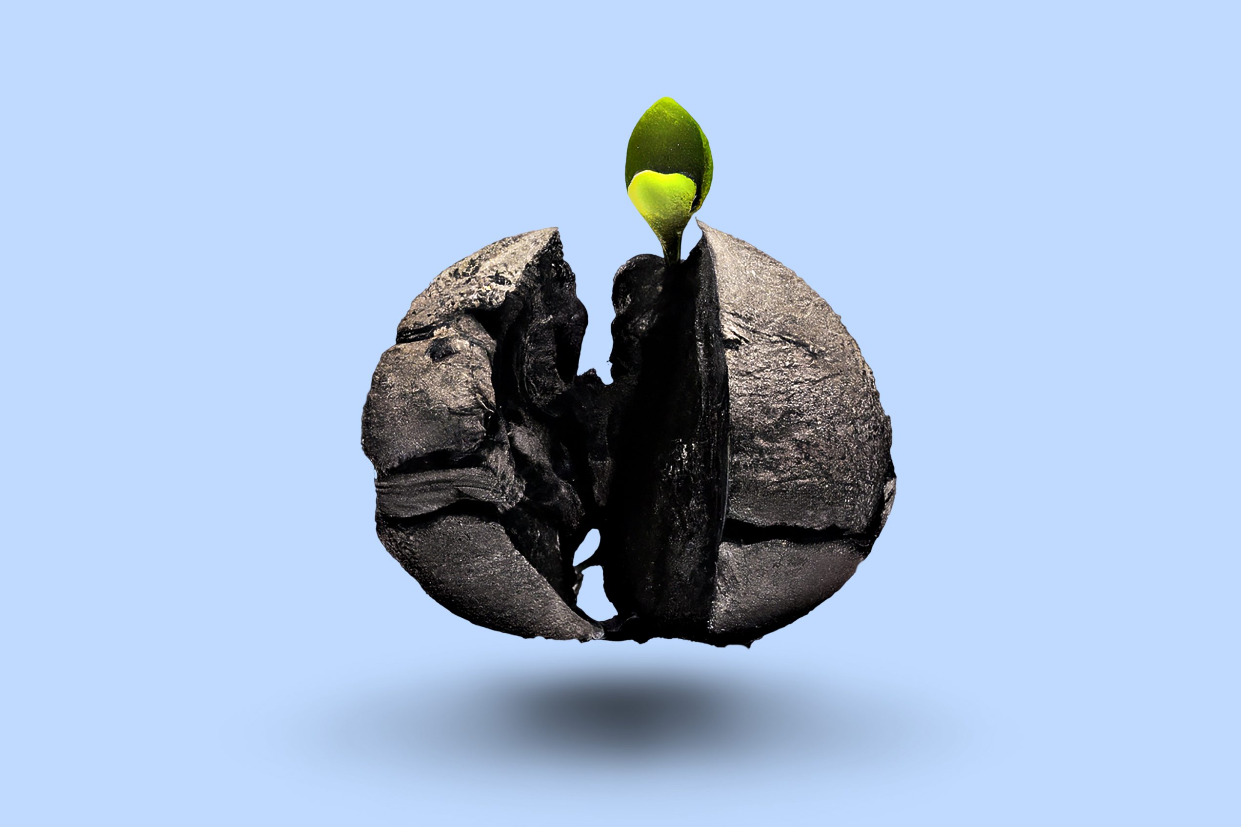
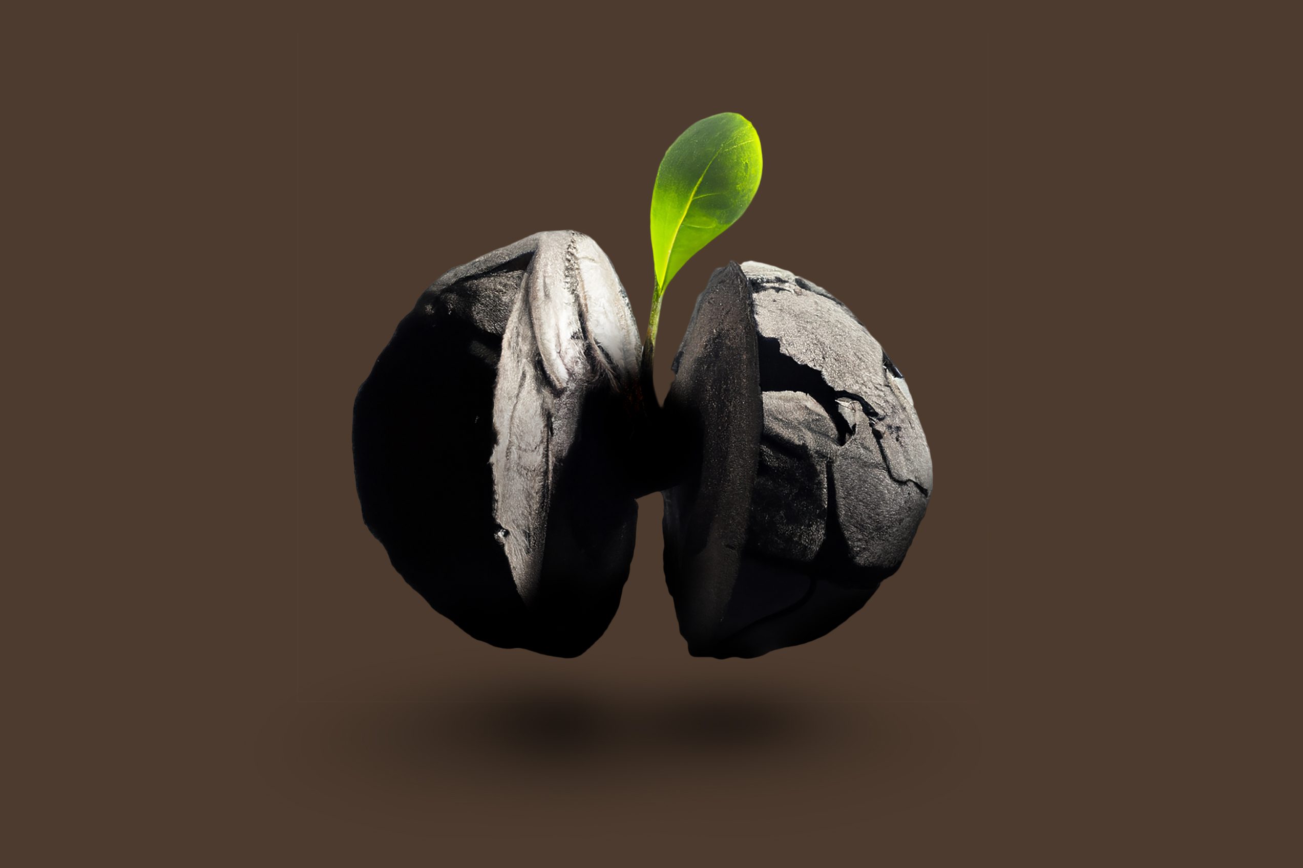
In addition, we utilised deep-learning text-to-image AI systems to create a basis for product artworks. Through a process of trial and error, we finessed our prompts for the system to generate a series of photorealistic artworks for Farmula’s biochar-coated seeds. The experiment offered an alternative way to studio photography or CGI production and resulted in high-quality commercial-use assets for the project.
Brand experience
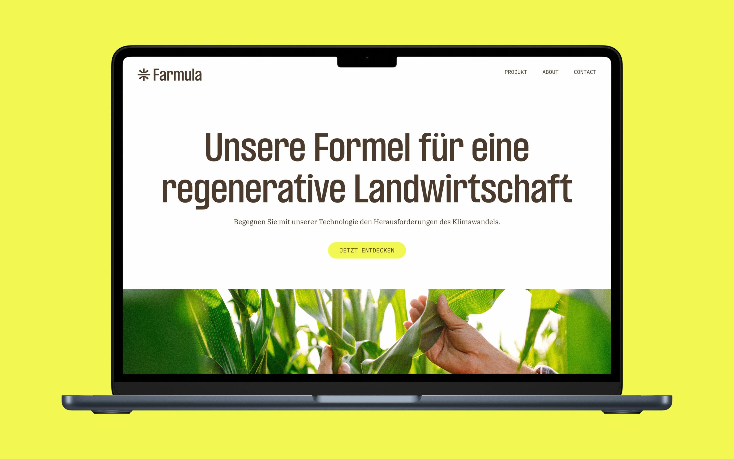
We designed and developed a website to introduce Farmula to the world for the first time, bringing the new brand to life in the digital landscape. Logo, typography, colours and imagery came together to form a coherent and dynamic component library for the user interface, through which customers can learn about the formula for regenerative agriculture, the effects of biochar, and the products on offer. As the start-up grows to tackle bigger challenges, the website will become a testing ground for the rapid prototyping and iteration of design and communication practices.
We’re amazed by our new brand. It was exciting to see the strategic groundwork, name development and design come together in such a short period of time. Monospace guided us through the project with a lot of know-how and the results exceeded our expectations at every turn. The new identity and website means we are a huge step closer to realising our vision.
Torben Schierbecker
Co-Founder