Hama
Elevating a leading B2B retailer into a global consumer electronics brand
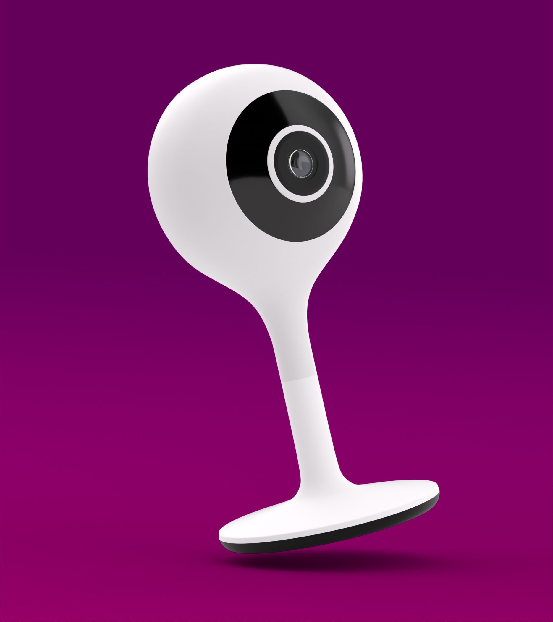
With over 18,000 products, Hama is one of the world’s leading manufacturers and distributors of smartphone, smart home, smart-wearables, audio hi-fi, TV, computer, photo and video accessories. The company employs around 2,500 people at 20 locations worldwide, including 1,500 at its headquarters in Monheim, Bavaria.
Like many companies, Hama is reacting to changing market conditions and user habits. After replying on fixed-location sales via retail partners for years, Hama is looking to expand and develop their online retail presence and become a direct-to-consumer business. As a result, the brand is to be transformed into the foundation for future growth.
Country rollouts
12
Agencies involved
7
Collaboration in years
2
For over 2 years, we worked with trusted agency partners alongside the team at Hama on an extensive modernisation project, empowering its transformation into a brand ready for the future.
An analysis of the old brand appearance highlighted the need for a thorough overhaul in order to become a more attractive, desirable end-consumer organisation. Furthermore, after years of autonomous work, the brand identity is becoming fragmented and varied greatly across communication channels and touchpoints. This lack of consistency has resulted in a weakened brand perception.
Taking trends and their competitors into account, a set of strategic requirements are defined at the start. They form the basis for designing a new visual identity and enhancing the brand experience.
Samples from the old identity
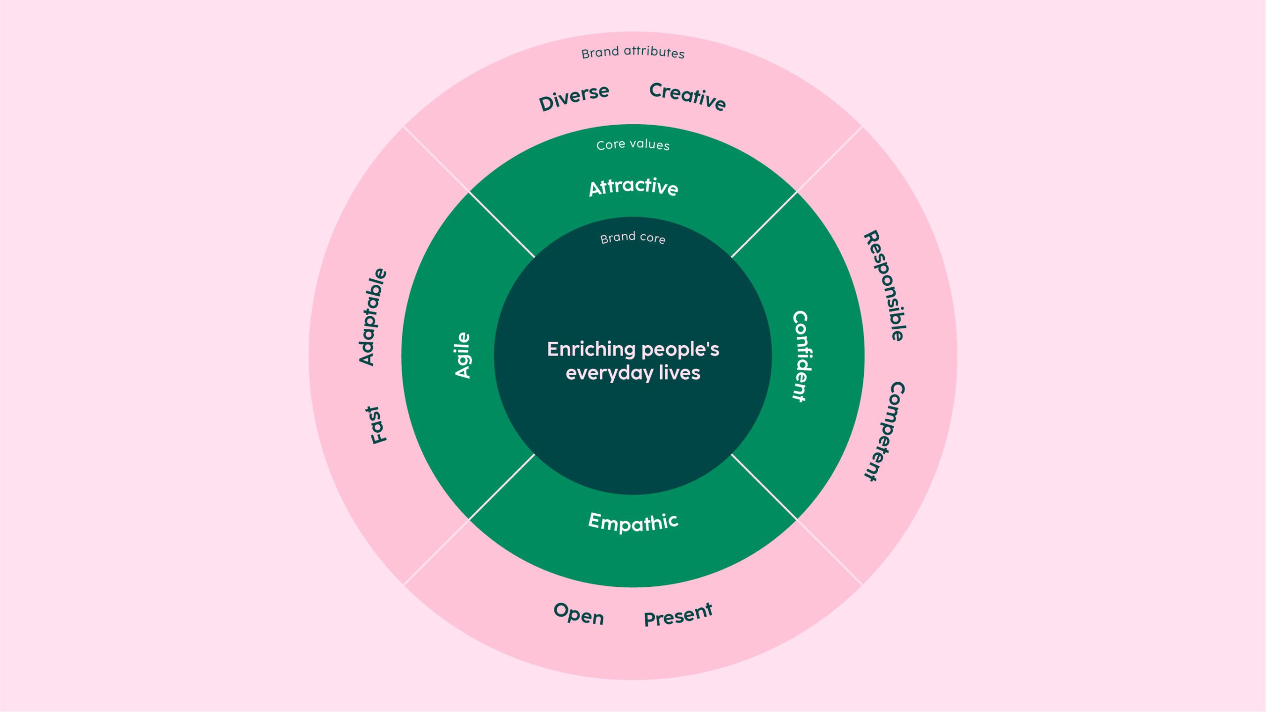
To strengthen its position as a market leader, Hama is on a mission to enrich people’s everyday lives. Four core values act as the compass for creating a more holistic brand experience
We simultaneously crafted, tested and deployed the new brand design system to efficiently navigate the multi-faceted scope of the project involving numerous touchpoints. Design guidelines are documented and updated in a new Frontify brand management portal as part of the process.
An iconic trademark remastered
The Hama trademark has continuously evolved over the last 100 years. The latest version has underpinned the brand’s appearance since 1968 – that is, for 55 years. As a key component of the new visual identity, we redrew the logo, enhancing key details and fixing technical weaknesses.
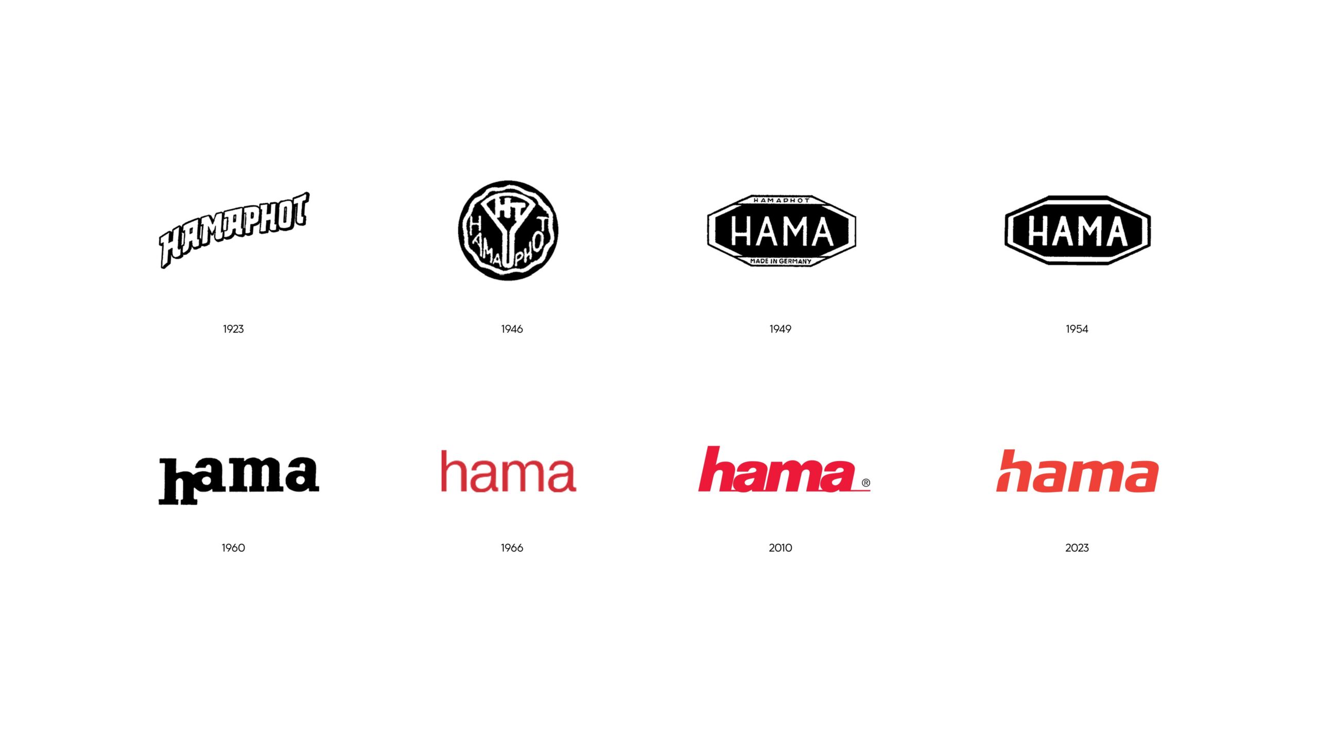
The revised logotype represents the new as well as the traditional. The modified “h” created a more distinct and dynamic appearance.
By keeping the slanted italics, removing the connecting stroke and opening up the double-storey “a”, we crafted a fresh, new trademark that is formally contemporary, yet characteristically reminiscent of the original trademark.
We omitted the registered trademark symbol for a clearer, more confident overall footprint, and developed a separate variant to ensure legibility on very small applications.
The subtle but ultimately liberating logo redesign at the start was immensely valuable. Our trademark remained highly recognisable, allowing us to transfer brand's perception and visibility from old to new, from analogue to the digital, so that we can be where our target audience is most active.
Stefan Zinsmeister
Marketing Manager
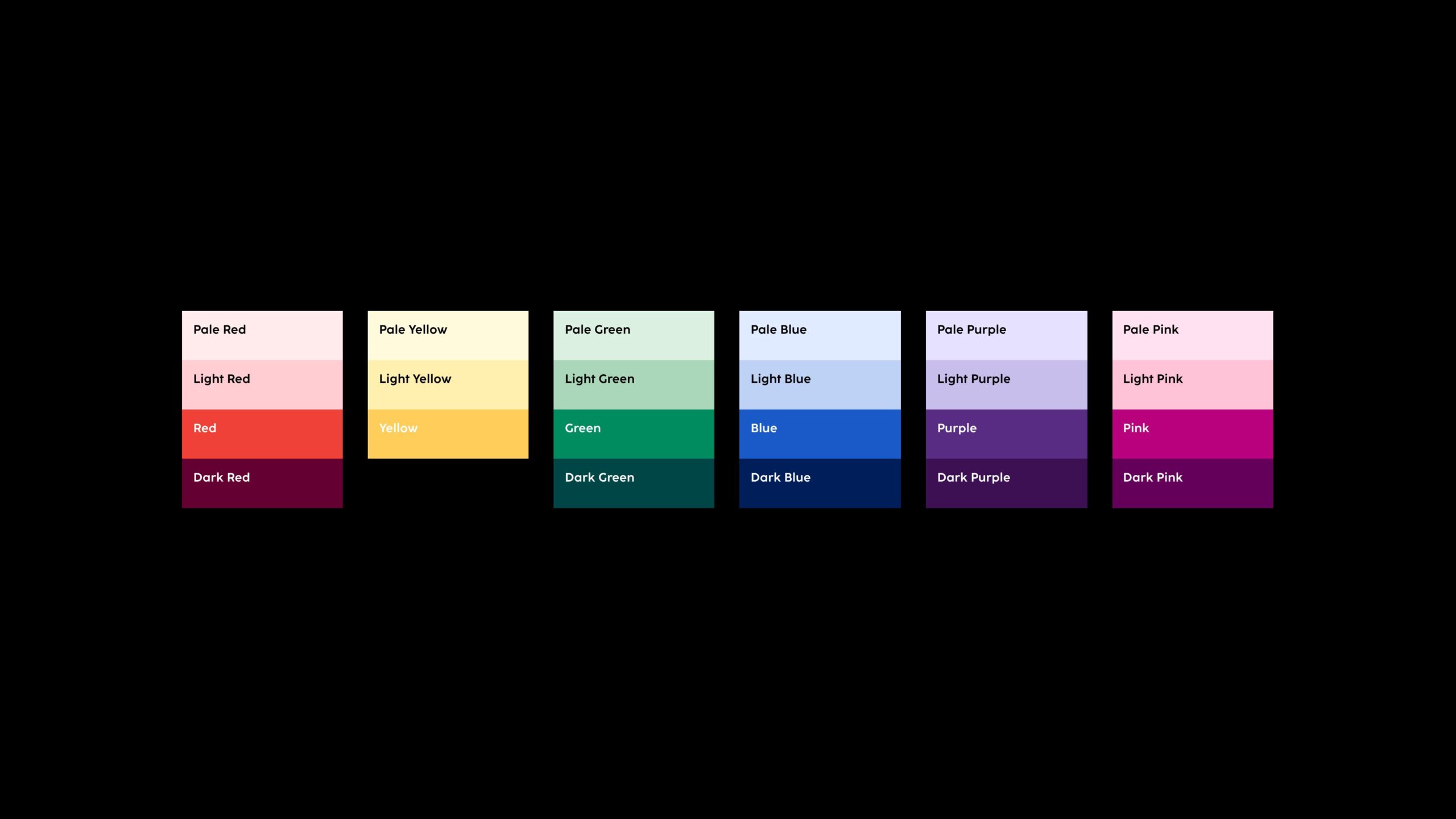
Diversity is one of the overarching brand attributes. It is expressed through an extensive colour palette offering countless combinations and variable proportions. The colour system makes it possible to design for specific target groups, channels or touchpoints while maintaining brand recognition.
The logo, headlines and texts also work with the new colour palette, and follow the guidelines for colour contrasts to ensure accessibility.
The colour system is also applied to set dressing, lighting and wardrobe, incorporating the same rules and proportions into photography and film to create a consistent visual expression.
Since the colour groups do not directly correspond to specific products or themes, new colour combinations can be selected for each project.
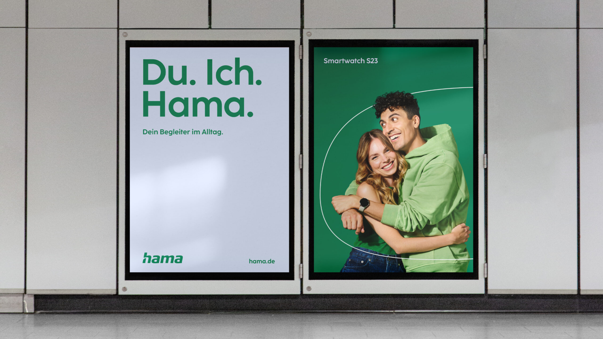
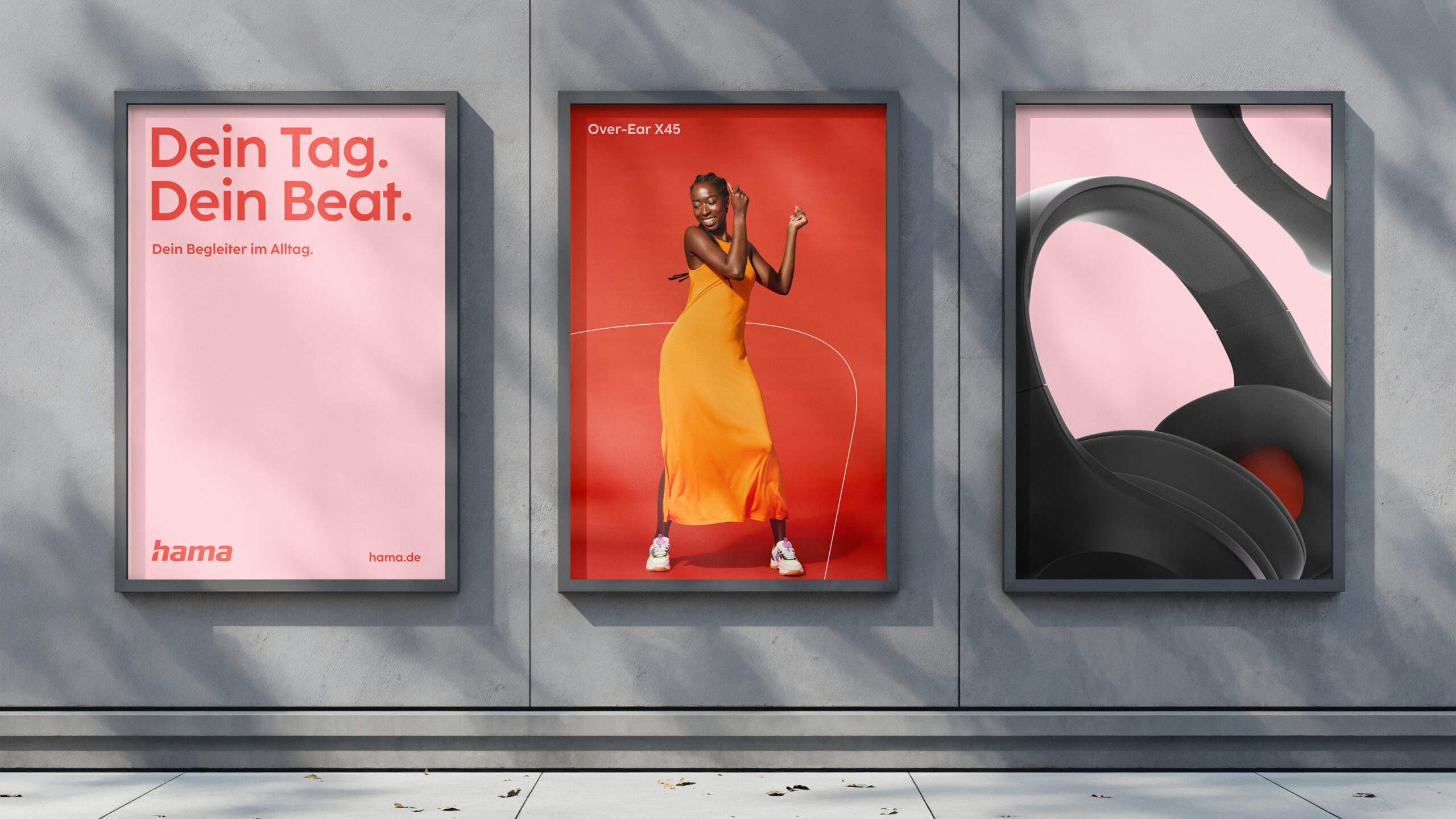
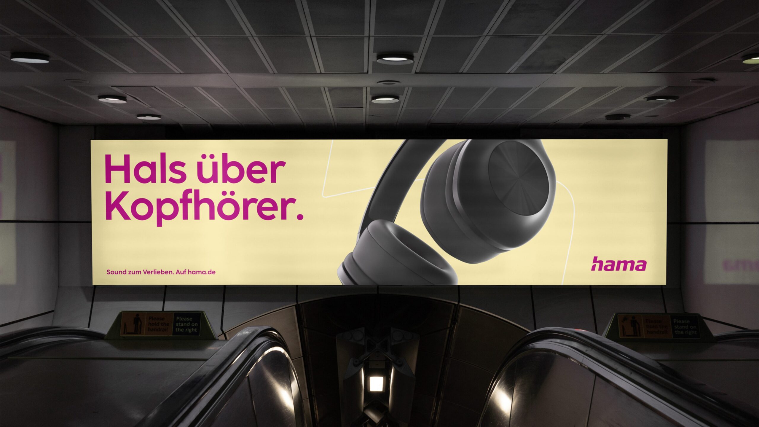
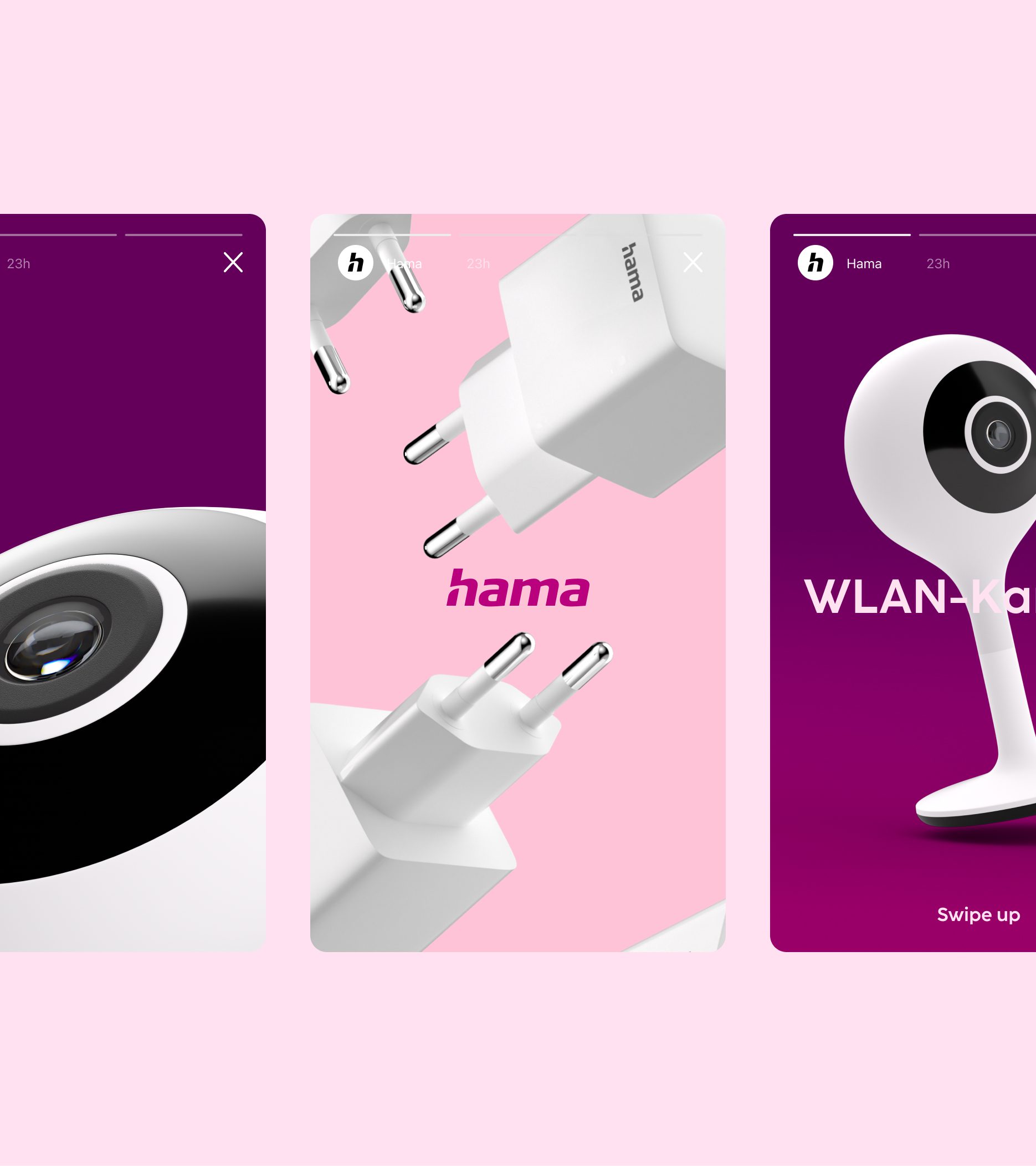
Division of space in both the horizontal and vertical orientation form the basis for layout design. Simple and bold is the name of the game. Populated with colours, typography, striking imagery and graphic elements, layouts remain engaging and uncluttered, conveying messages in a clear and open manner regardless of format and media.
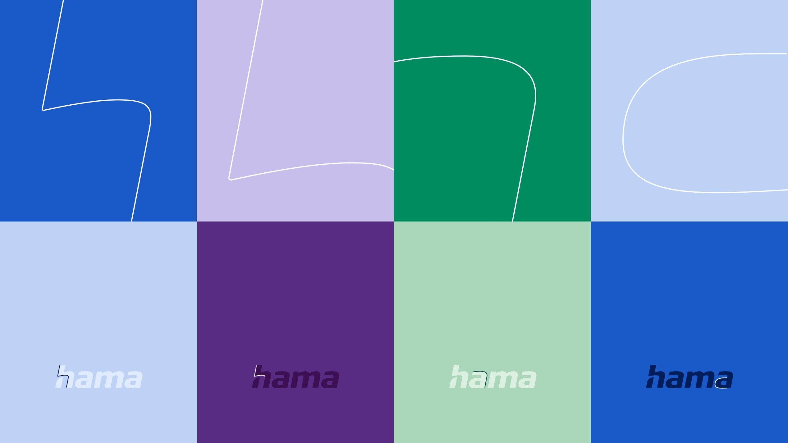
A cord is worth a thousand words
Hama is unmistakably present in people’s everyday lives. To emphasise this idea visually, four cord elements are derived from the logo and can be inserted into layouts to add depth and movement.
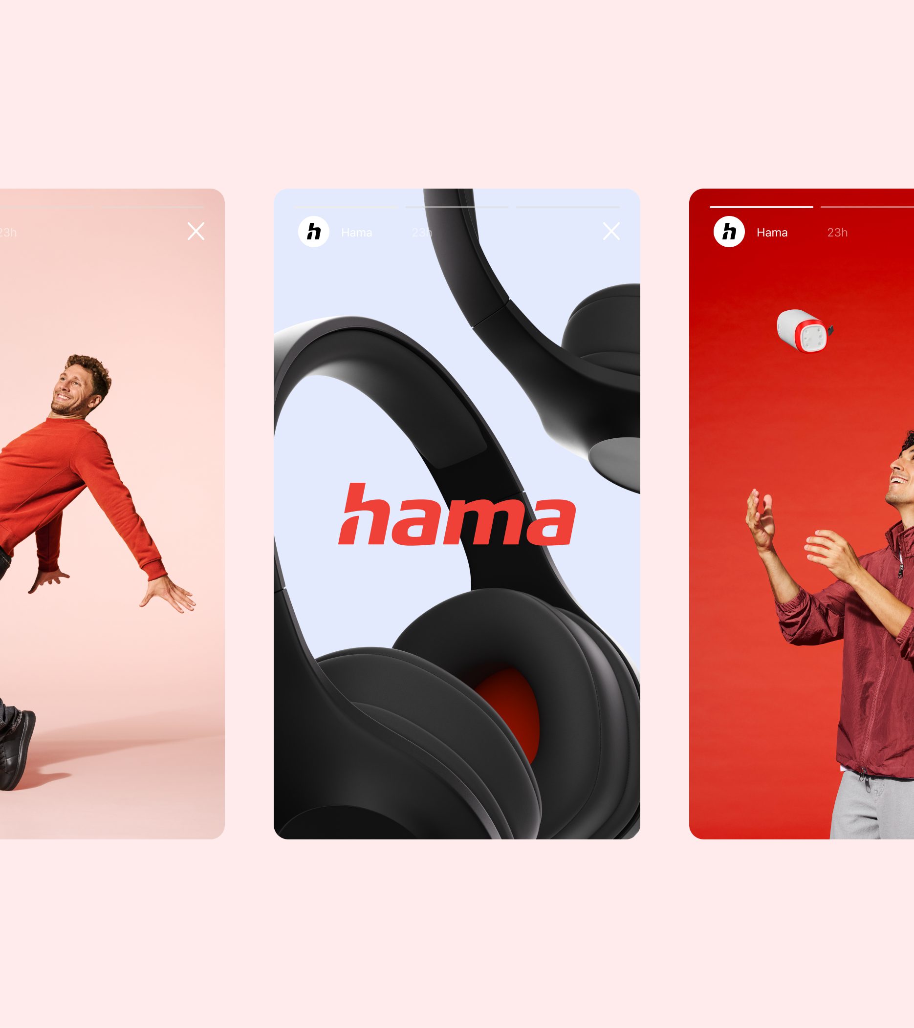
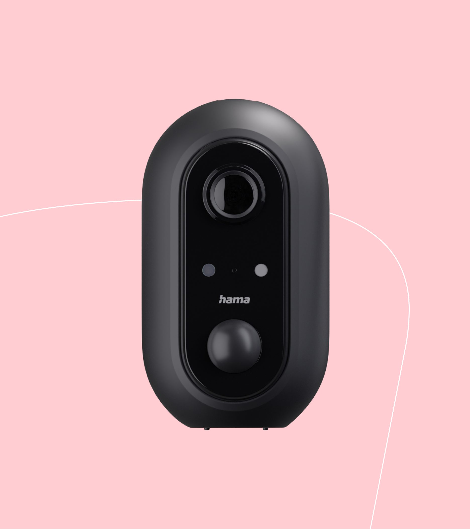
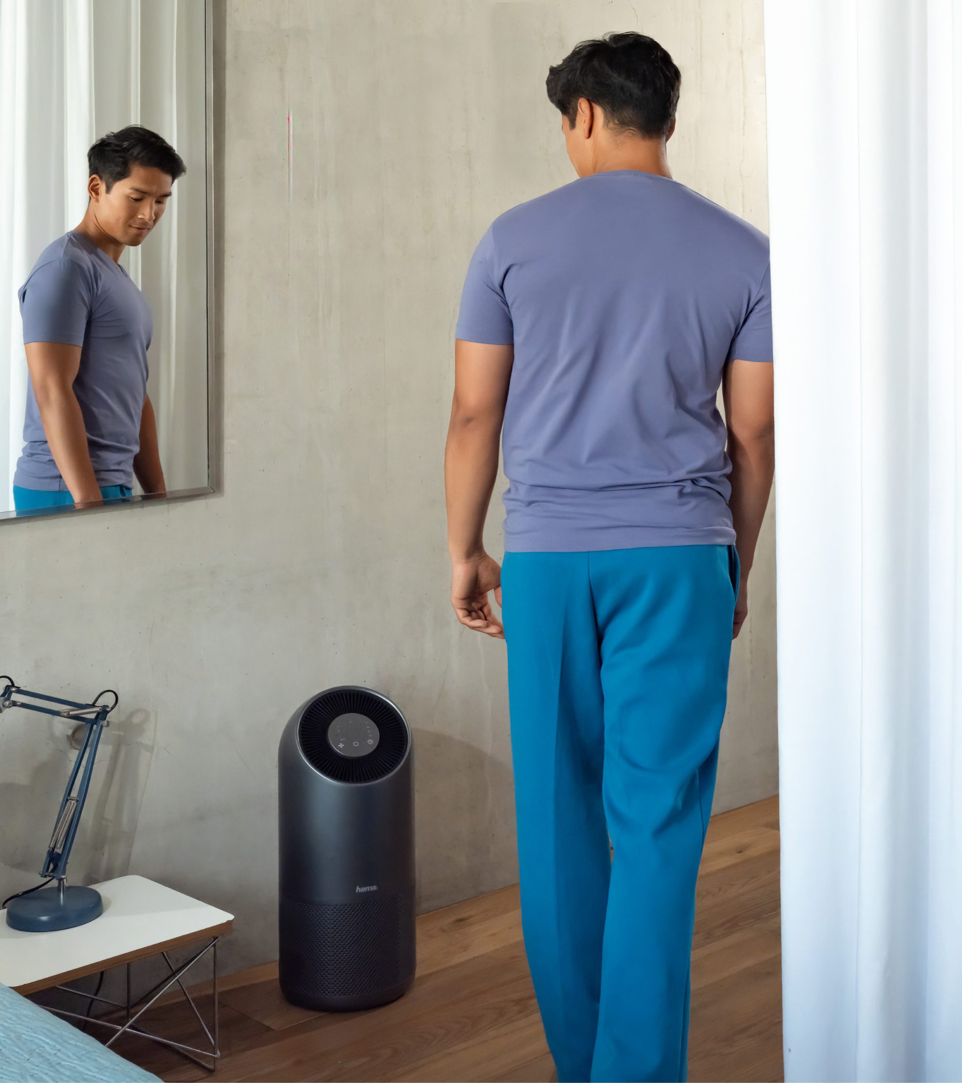
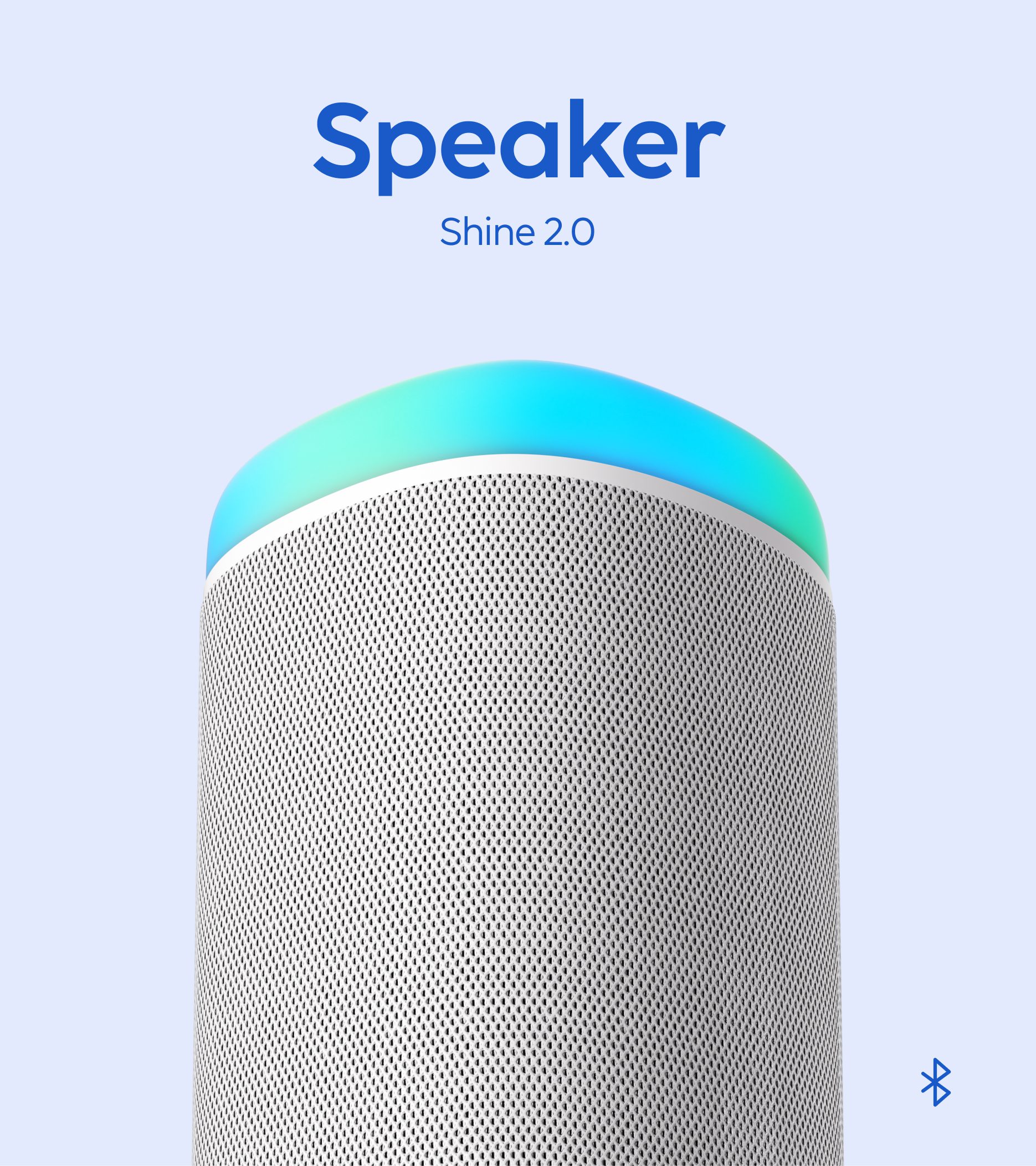
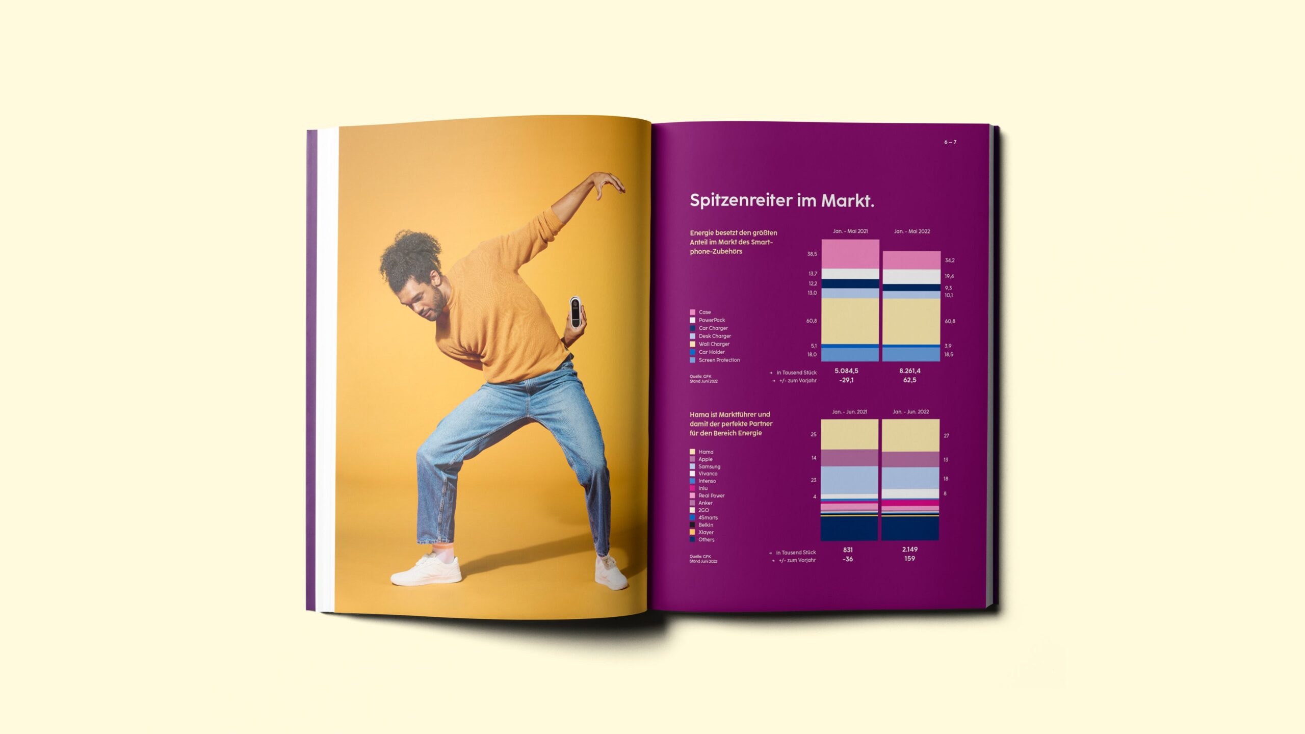
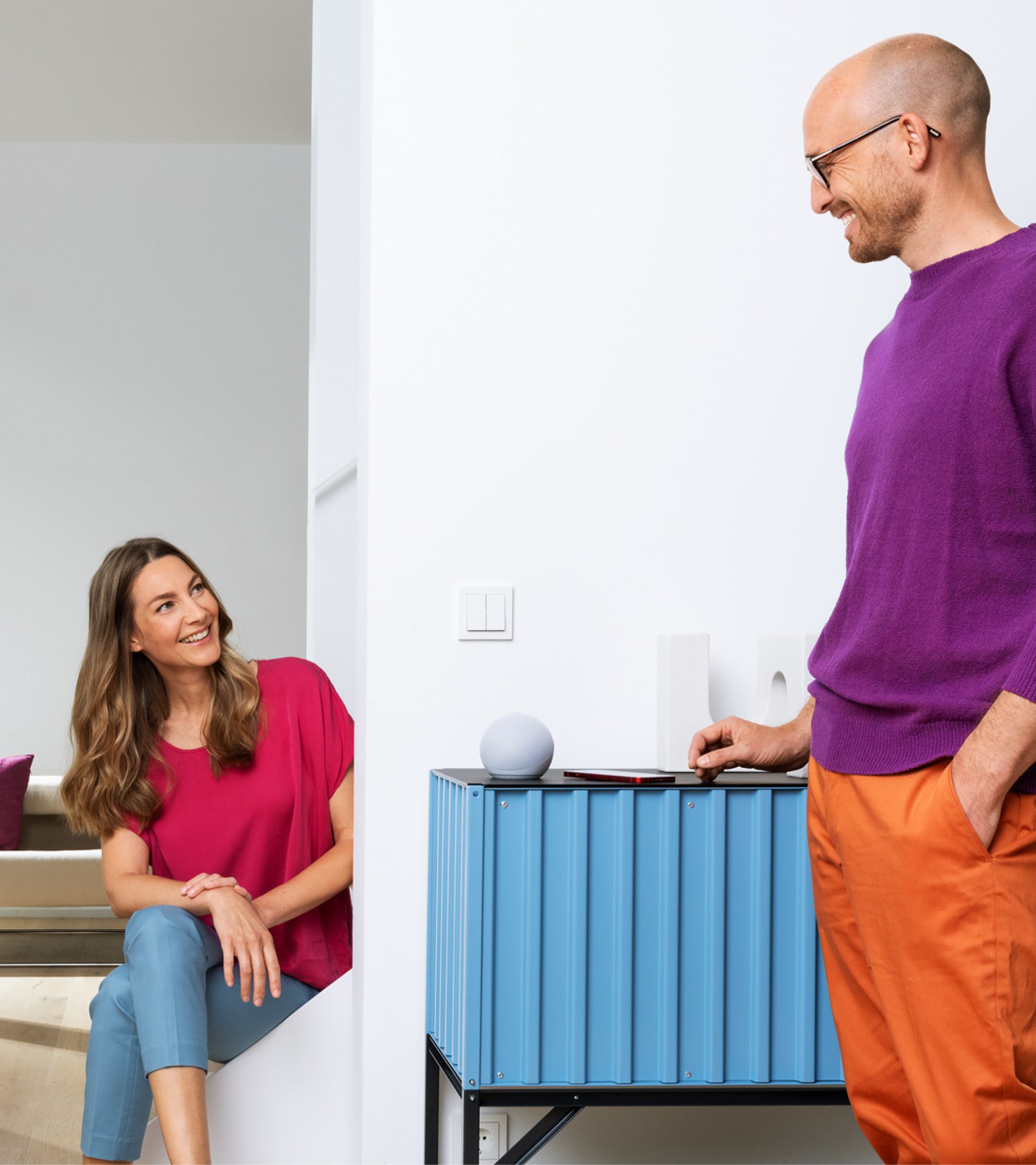
The same colour and design principles characterise the photography style. Vivid, engaging visual content highlight diversity within the brand’s offering and illustrate their function in our everyday life. Realistic sets and authentic real-life moments build empathy and establish an emotional connection between the brand and the audience. As a result, photography highlights the quality, aesthetics and desirability of products, underpinning the brand’s transformation to a direct-to-consumer organisation.
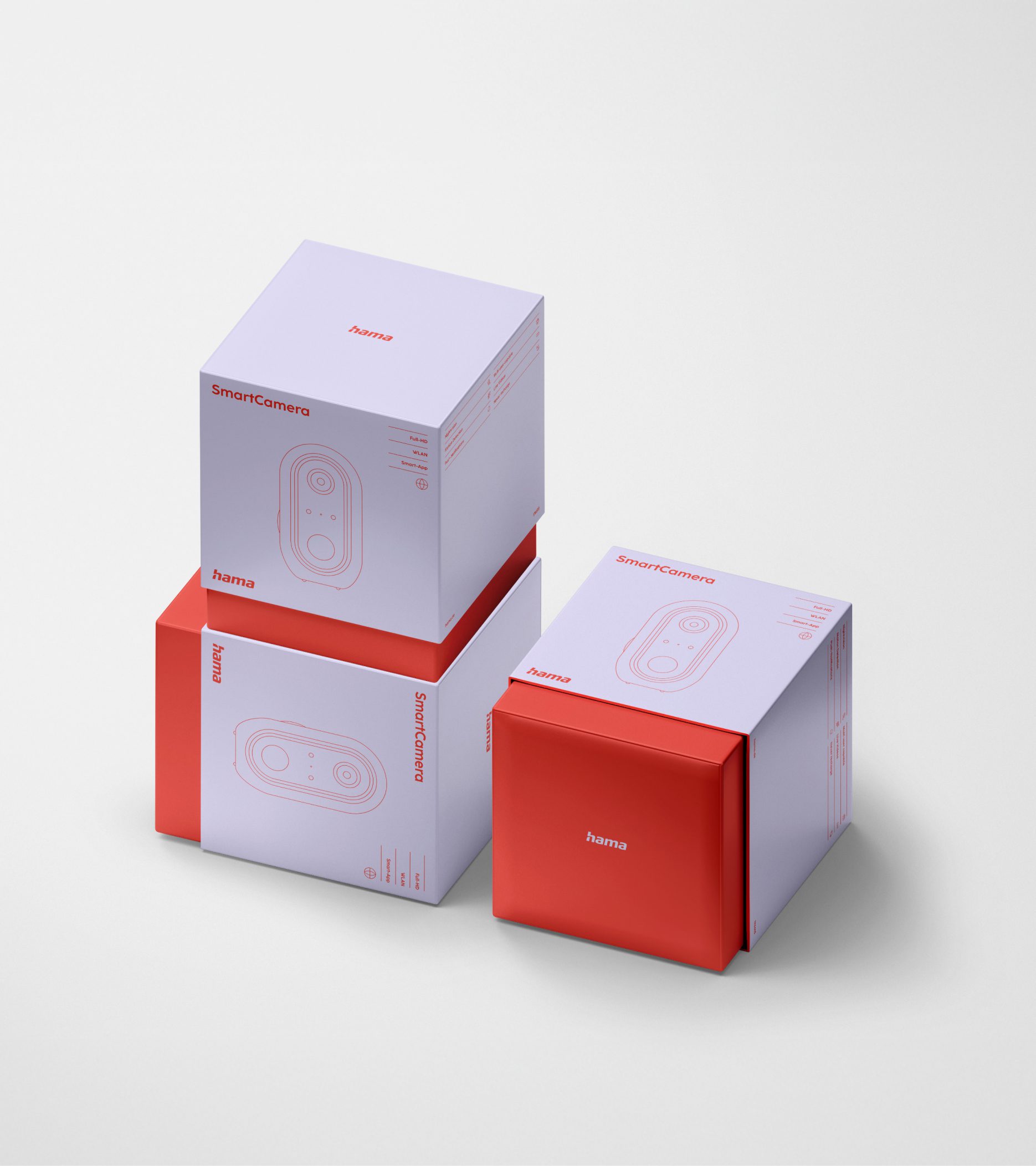
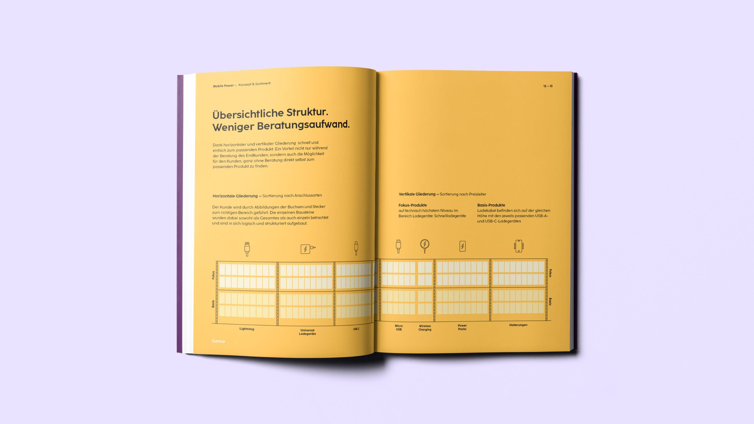
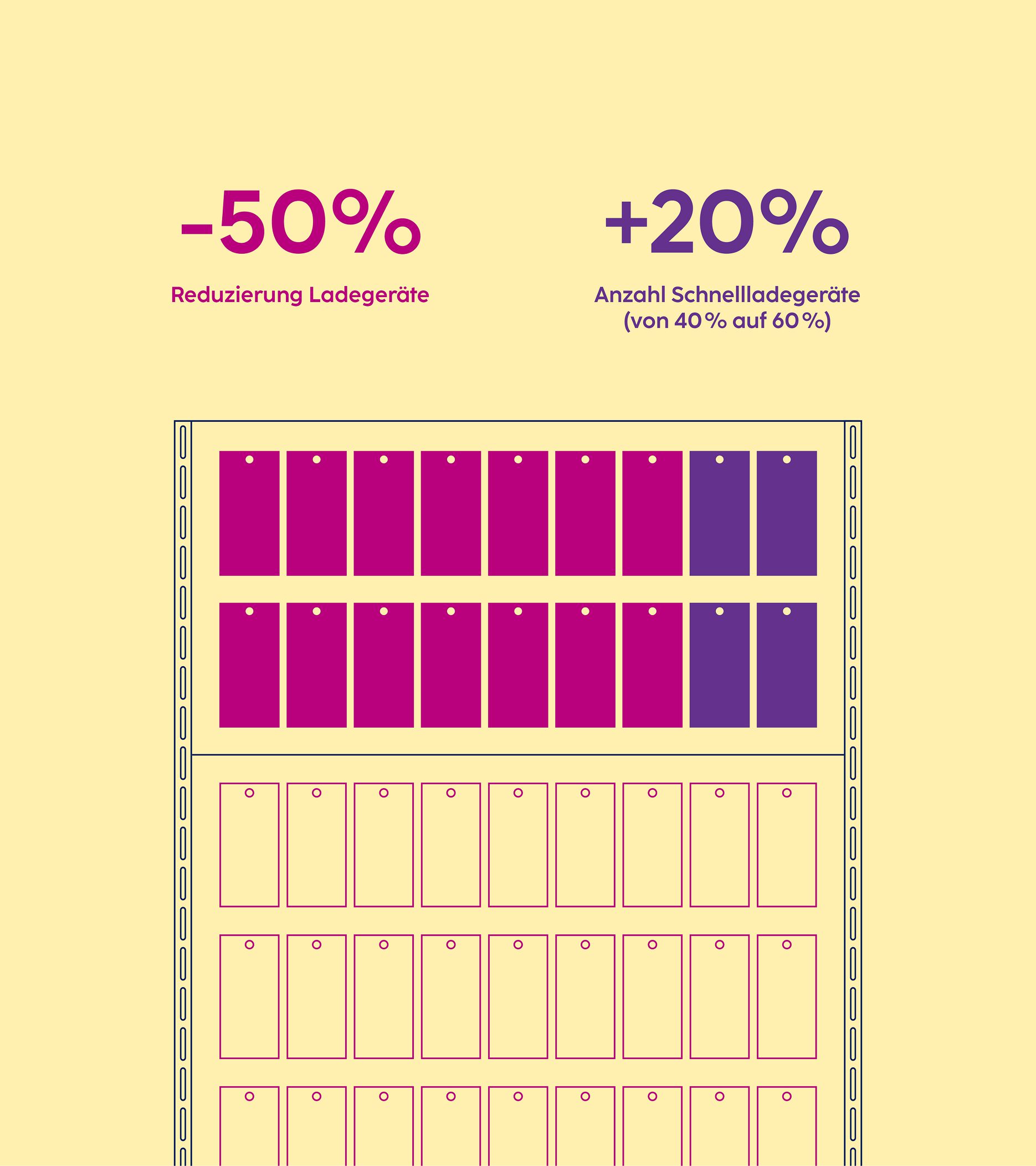
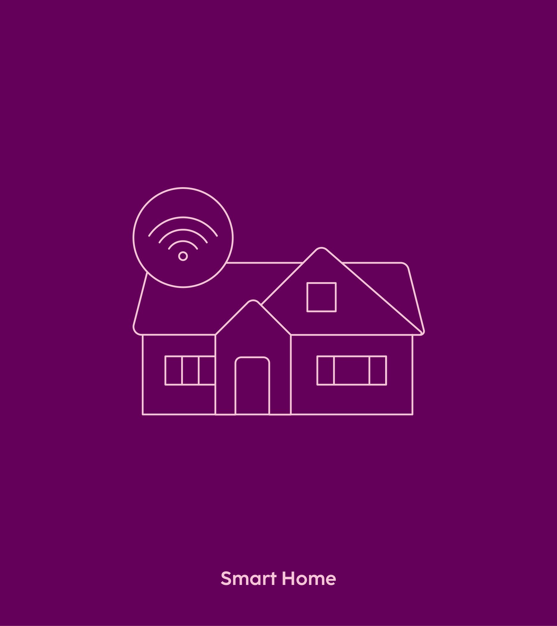
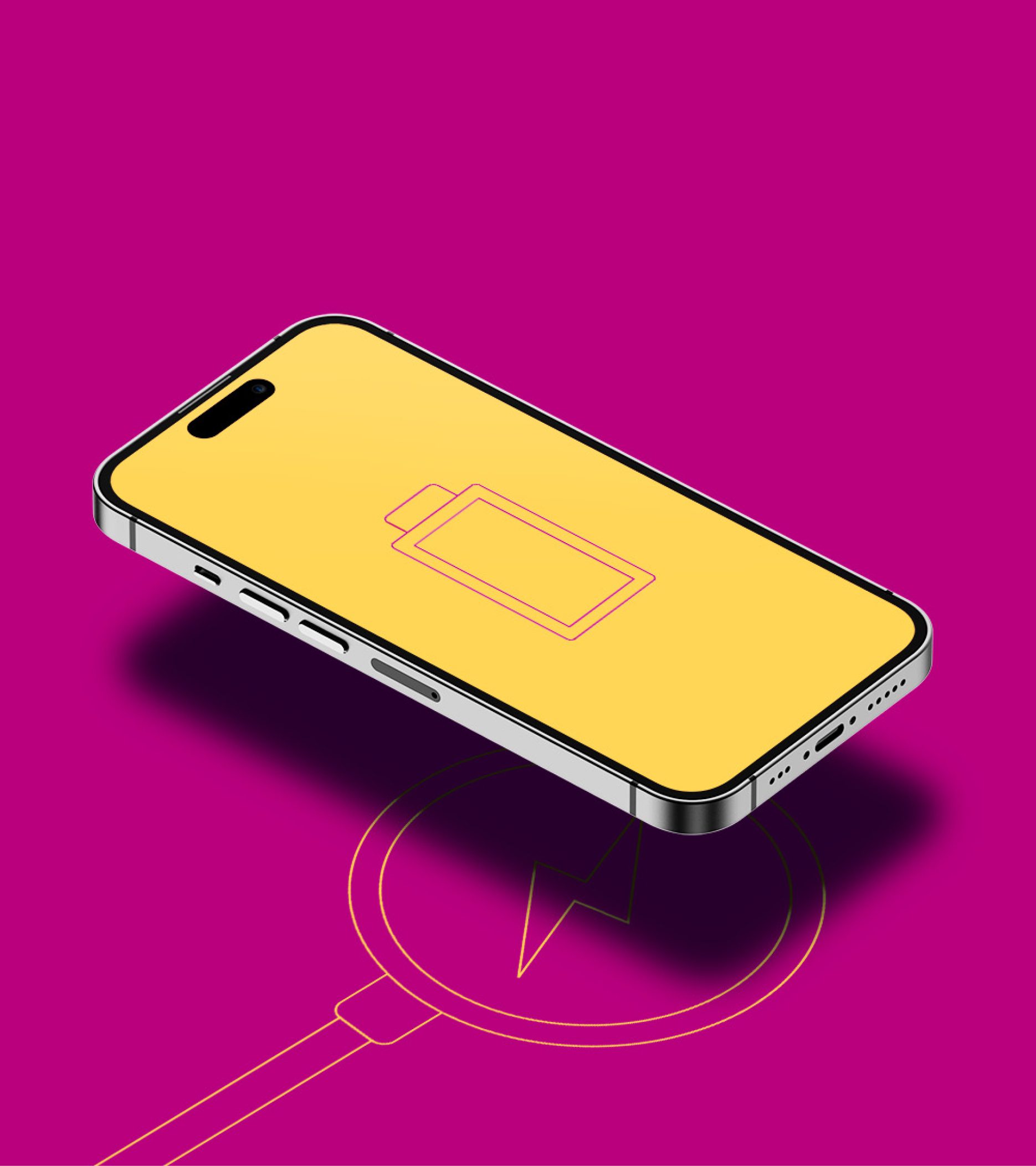
Thanks to the isometric perspectives and uniform strokes, products and their features can be illustrated to convey technical affinity and clarity. Line-art style diagrams harmonise with the overall visual identity without the need for photography and computer-generated graphics.
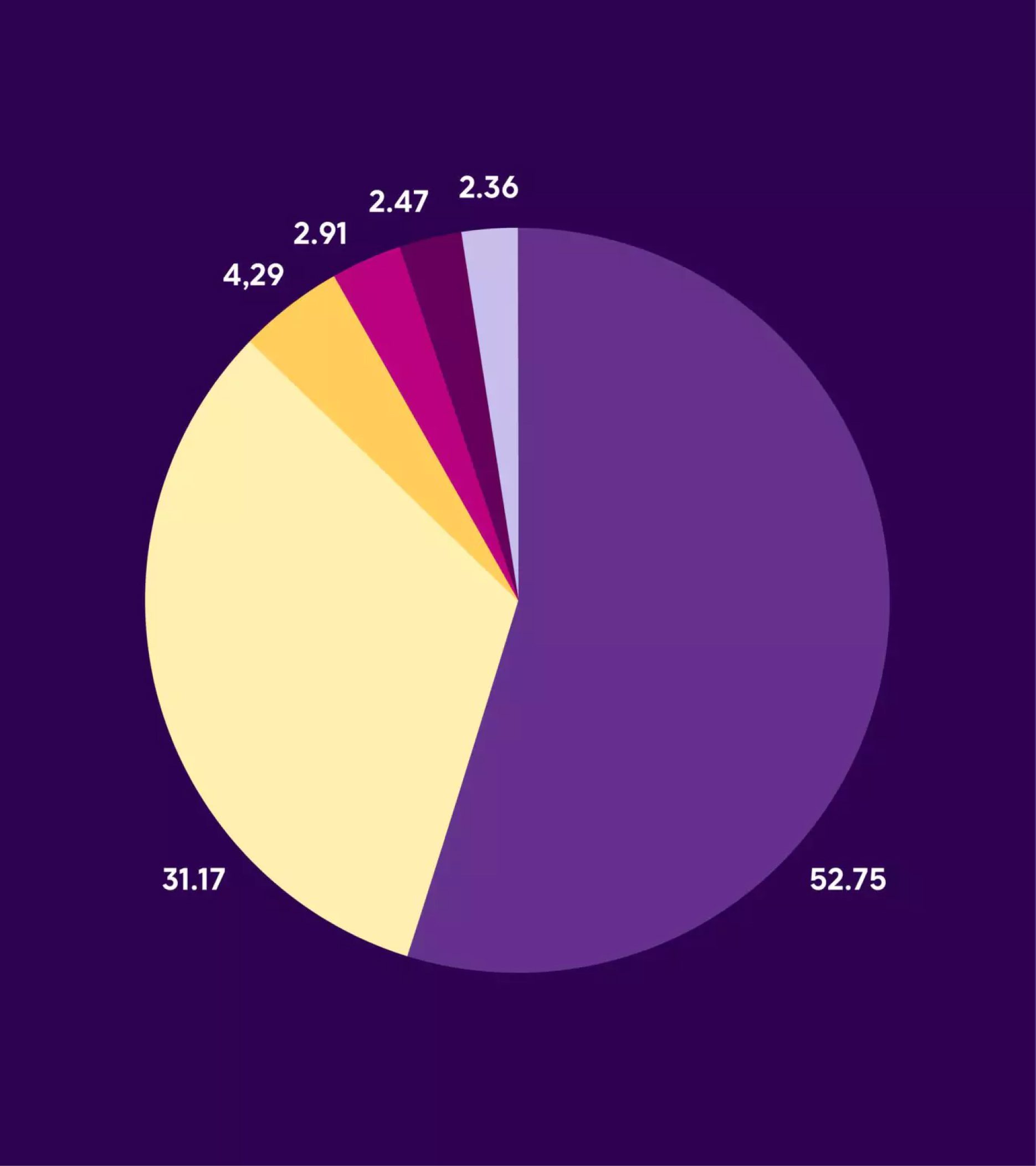
Statistical data can be illustrated using the same style, with text and colours added to make complex information visible and understandable to internal and external stakeholders alike.

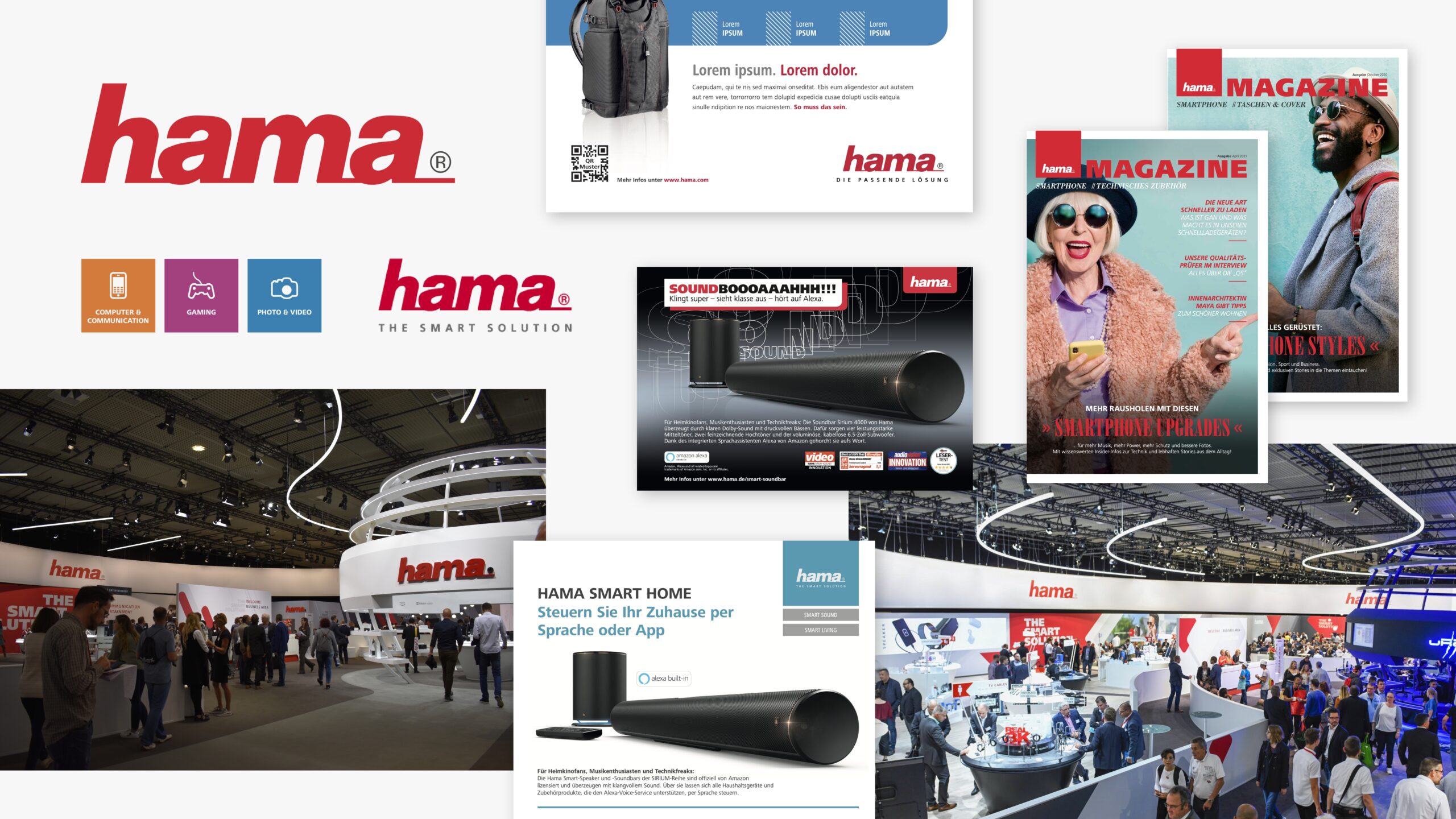
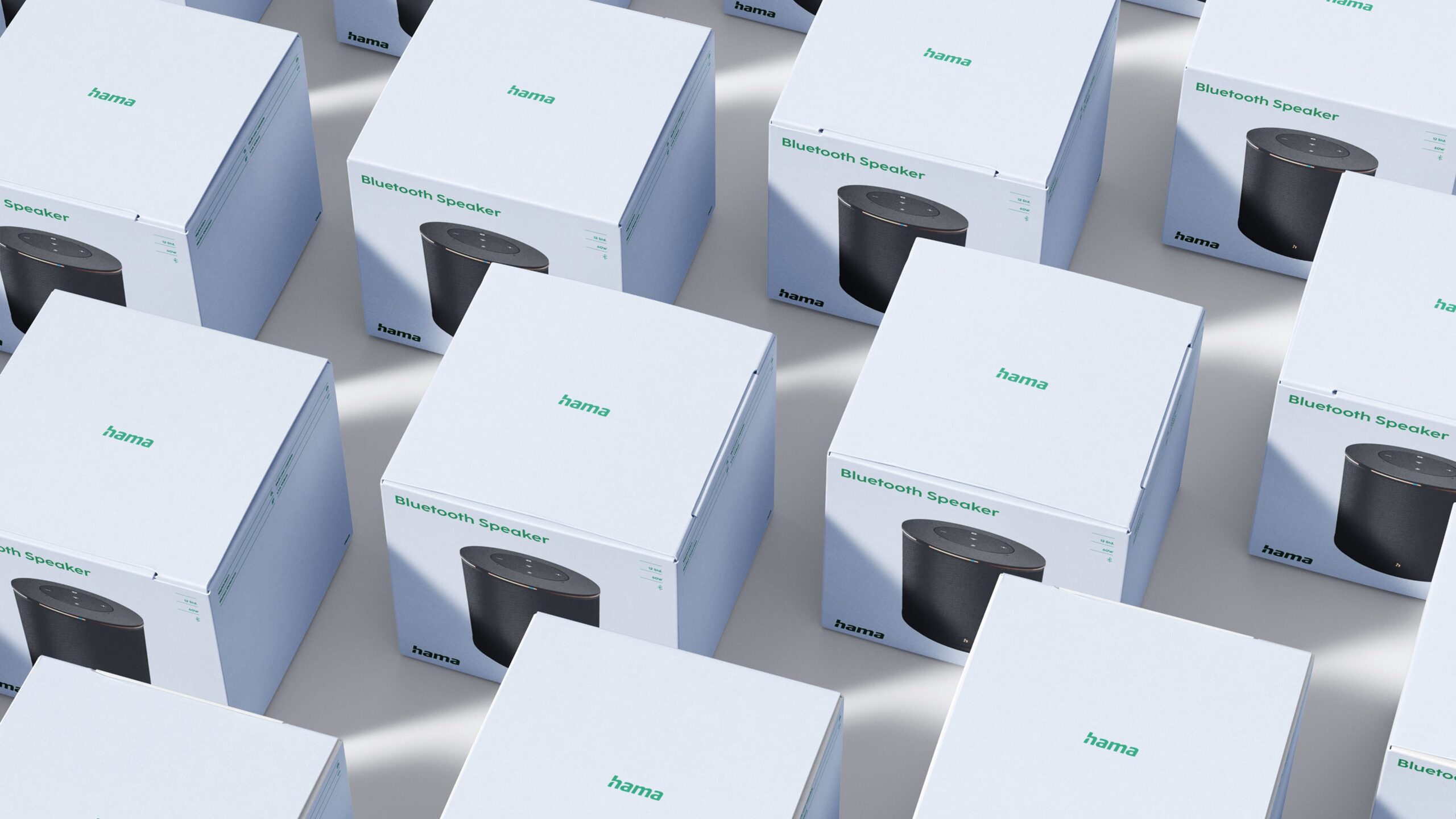
Applying the extensive yet simple design system resulted in an appealing, emotional and differentiating brand experience. Whether it’s brochures, social media posts, digital campaigns or a trade fair, the visual identity is quick and easy to use and guarantees a high level of consistency.
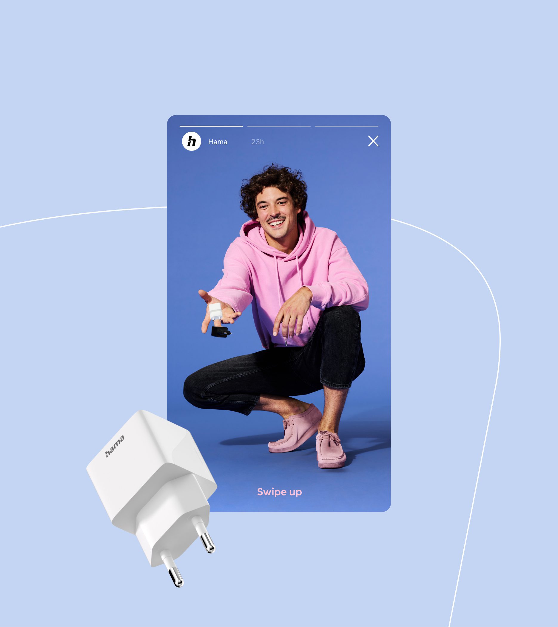
Less is more when it comes to the fast-paced social media landscape. By reducing details and placing emphasis on strong visuals and clear messages, we follow the “simple and bold” motto to gain attention and traction.


Monospace was the perfect choice for our centennial milestone. Young, motivated talents gave our brand an attractive, fresh and consistent appearance across all touchpoints in a very short time. The implementation process has been smooth and a lot of fun for the teams involved. And the response from employees, retail partners and consumers have been overwhelmingly positive.
Stefan Zinsmeister
Marketing Manager

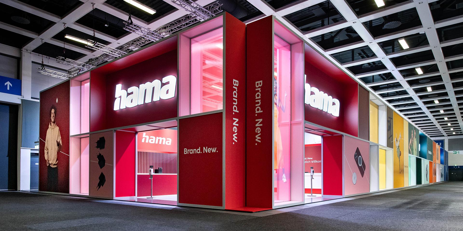
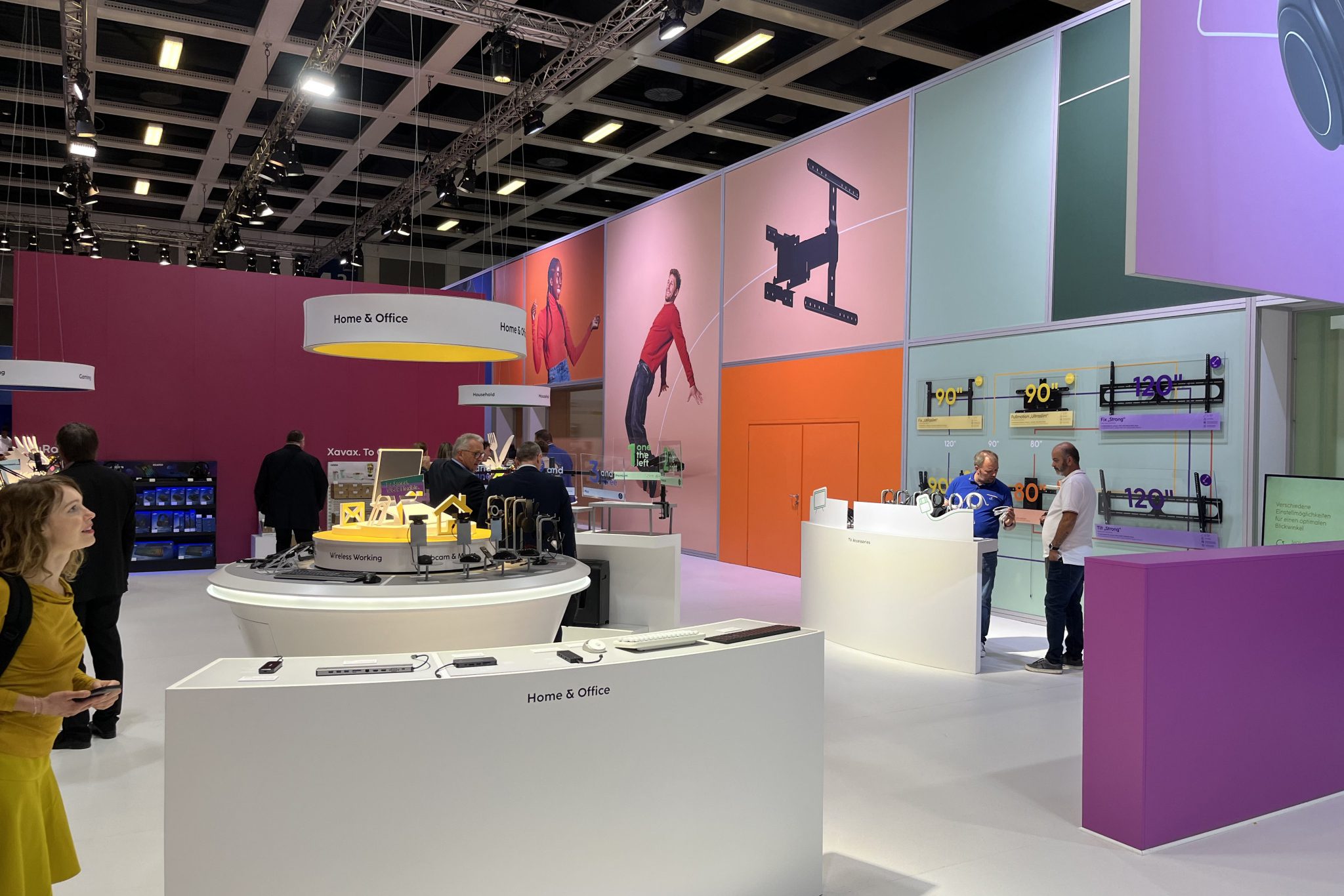
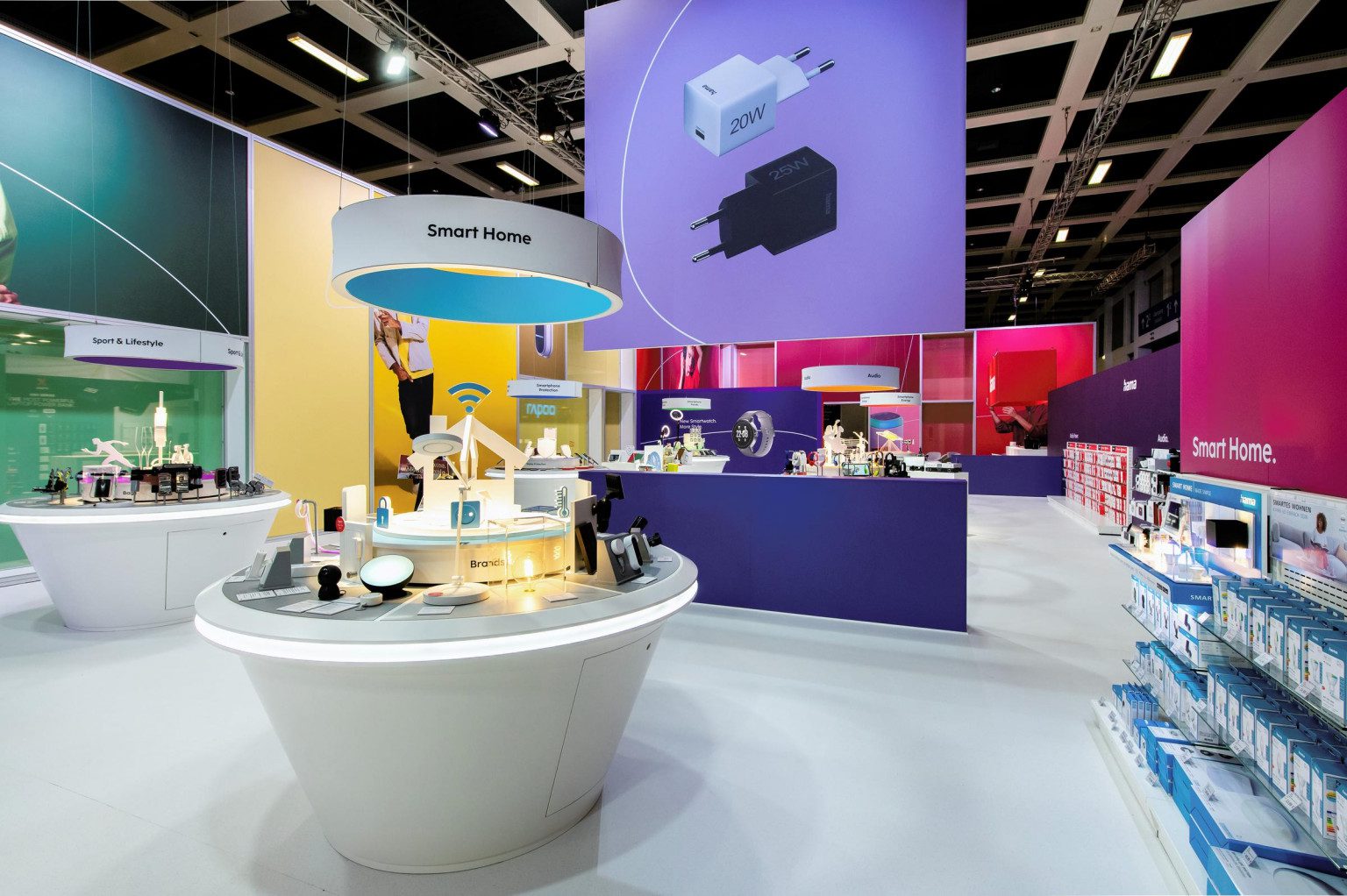
Brand space at IFA Berlin 2022
Hama debuted its new design in full at the International Consumer Electronics Fair (IFA) in 2022. We worked with Uniplan to translate the new visual language into spacial design, allowing partners and consumers to experience the new Hama brand for the first time.
First campaign in the new design
“Simple. Magnetic. MagLine.” To promote the MagLine range of MagSafe-compatible accessories, we curated a mix of key design components based on the new visual identity for partner agencies to create a series of 20-second video spots. We also created a family of Progammatic real-time ads, Meta video and link ads, and Google responsive display ads to further promote the campaign across diverse channels.
MagLine campaign "Einfach Magnetisch"
MagLine spot "MagCharge FC15"
MagLine spot "MagCharge Car FC15"