Shieldex
Transforming a hidden champion to the forefront of the technical textiles industry
The Bremen-based family business has been an international leader in the metallisation of yarns and textiles for 43 years. By working extensively with silver, copper, tin and nickel to exploit their antibacterial, antiviral, fungicidal, conductive and shielding properties, Shieldex researches and develops individual technical solutions for countless industries such as medical technology, EMC shielding, aerospace and consumer electronics.
A recent generation change at the management level of the business highlighted the need for Shieldex to grow and develop in a new direction. The aging brand and its image no longer adequately conveyed the company’s expertise and position as a market leader. The goal of the redesign was to develop a consistent brand that would strengthen Shieldex’s international position as a high-end innovator, and emphasize their relevance and impact on a variety of stakeholders beyond professional niches.
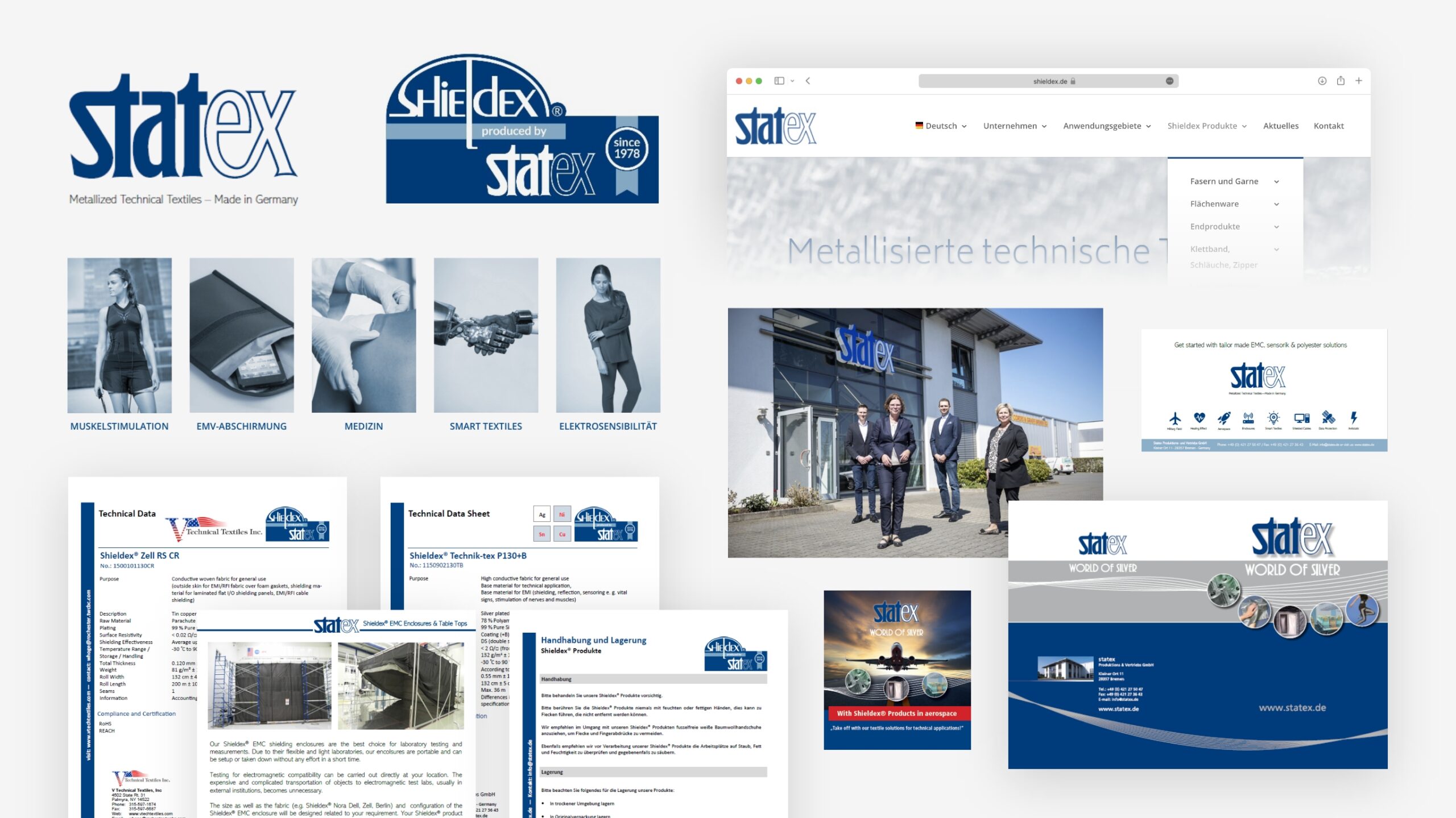
Samples from Shieldex's old corporate design
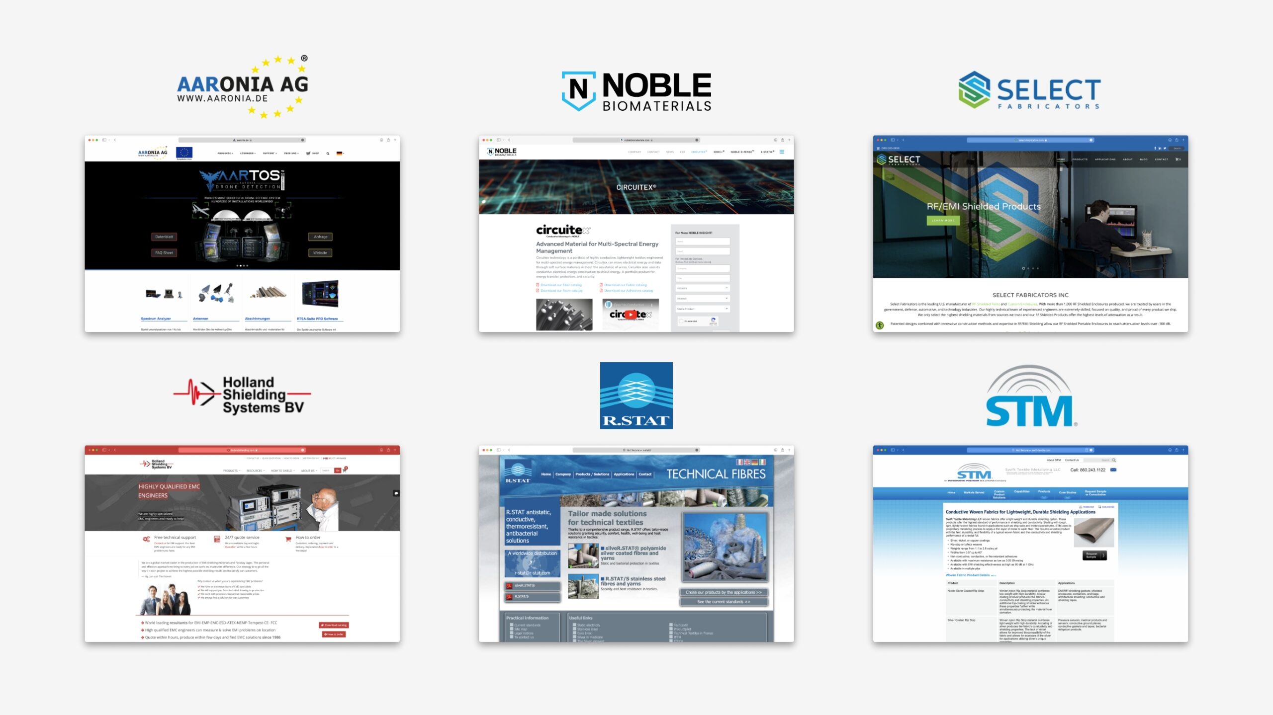
Competitive landscape
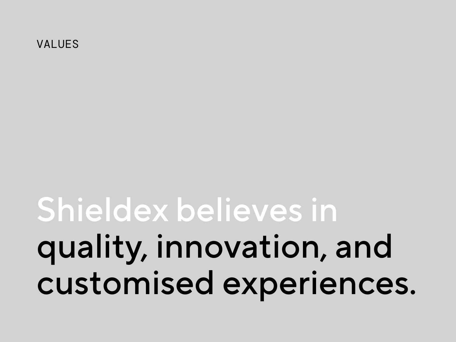
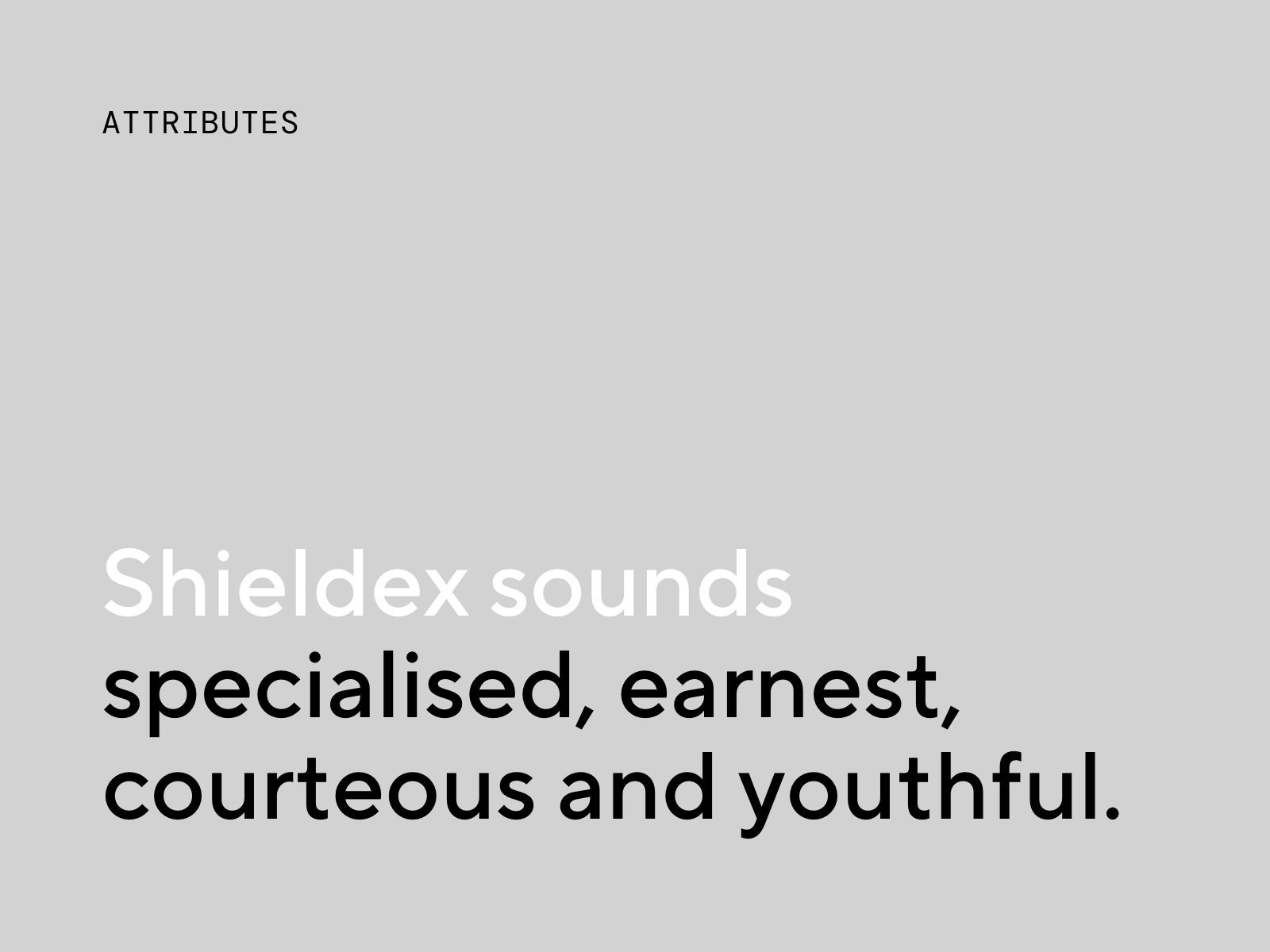
Brand strategy
With the good of society in mind, and driven by creating added value in everyday as well as specialised products of tomorrow, the brand is relaunched with the message “Customised solutions for challenges that matter” at its core. The young, dedicated and technology-driven team of specialists is moving their focus onto people and personal connections, without compromising on their guarantee of quality made in Germany. The new brand design aims to project and communicate the brand’s promise of excellence, their spirit of innovation and passion for developing unique solutions.
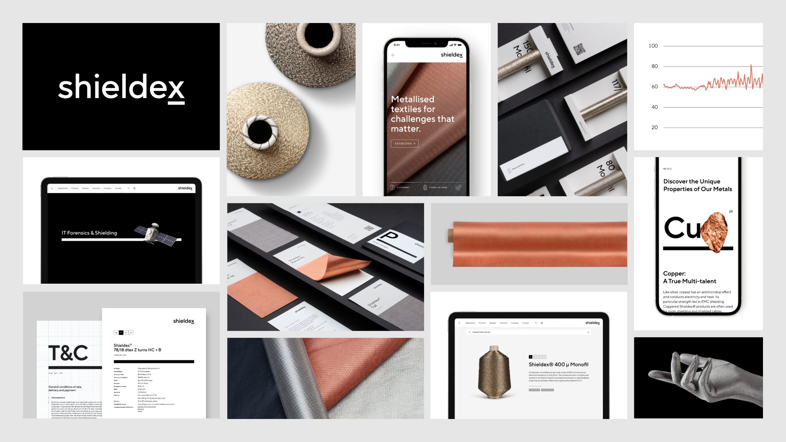
A bold visual identity with infinite possibilities
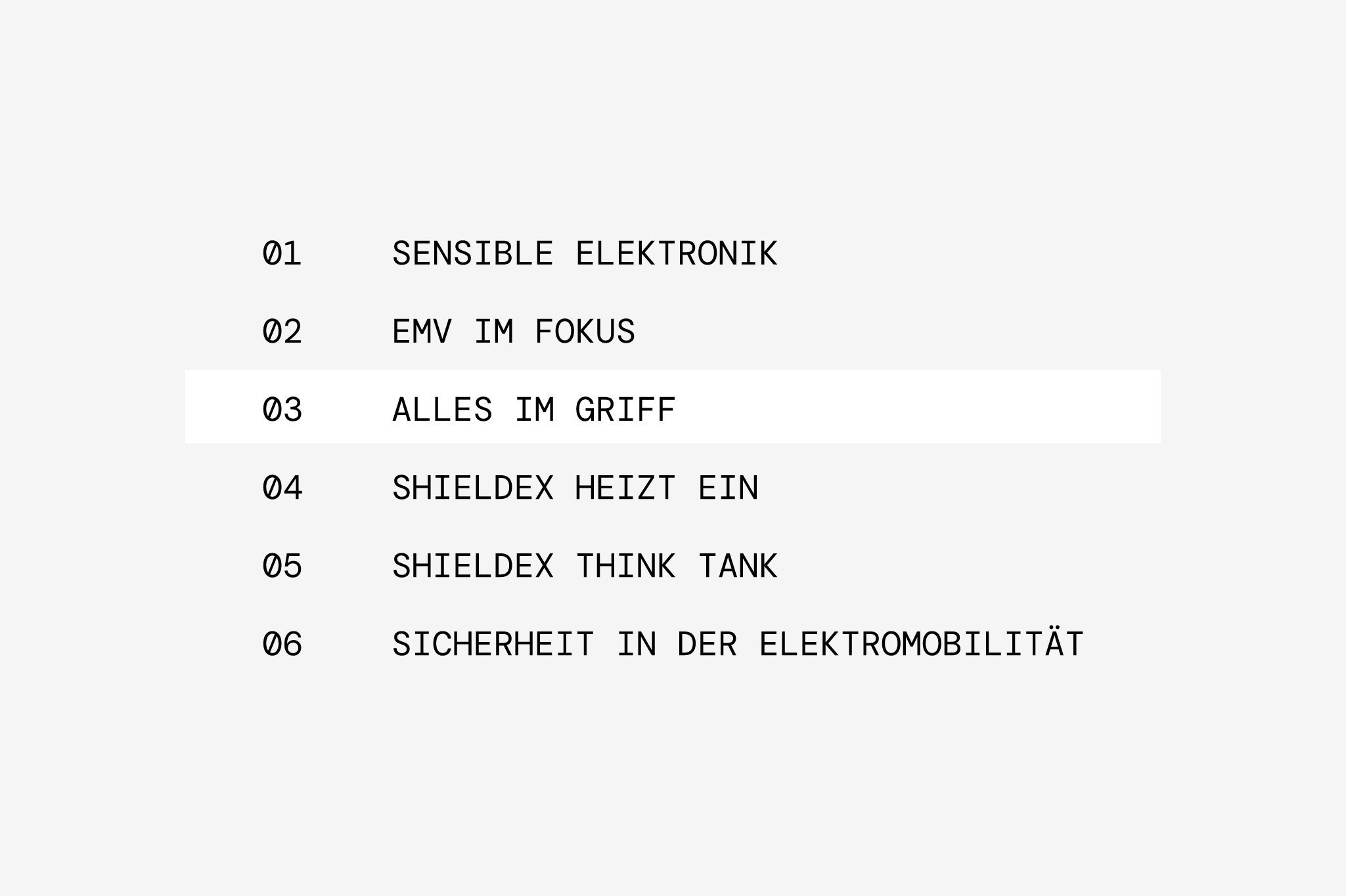
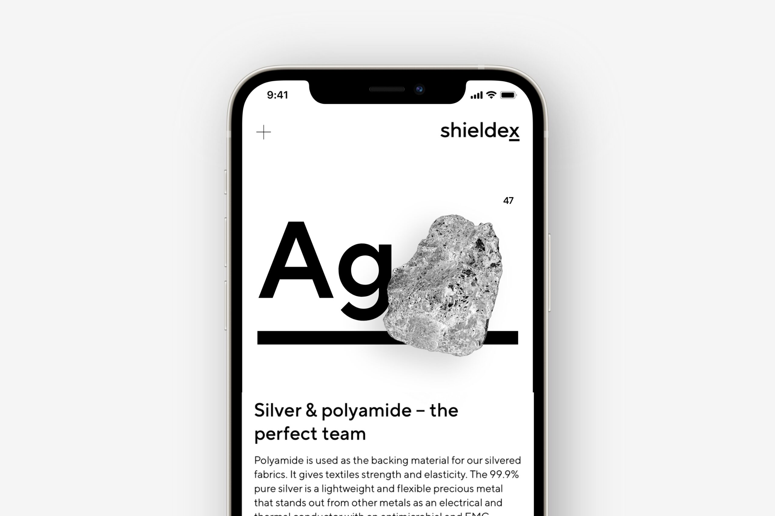
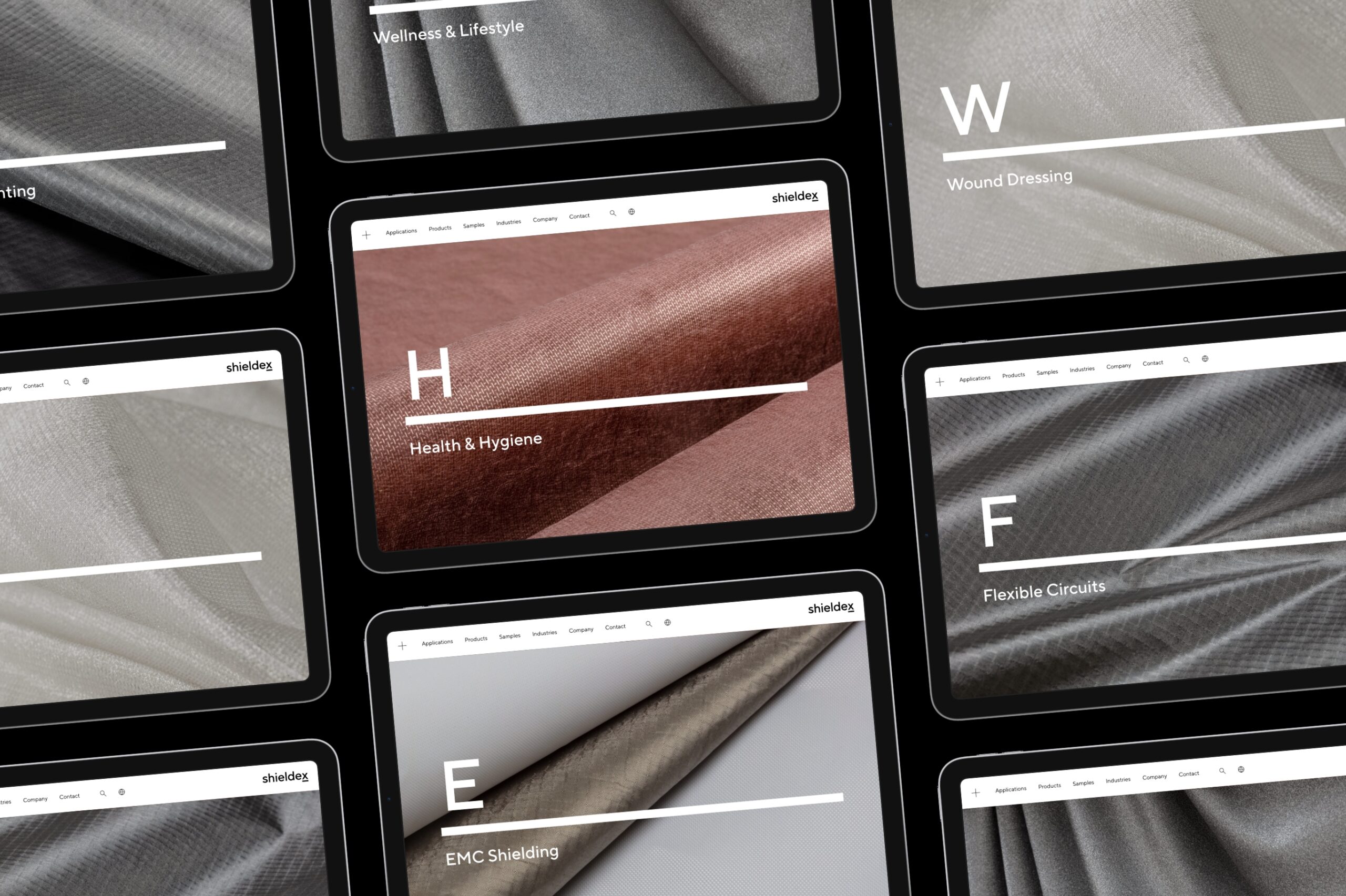
Formally derived from element symbols within the periodic table, typography and the line element brings structure to the new design system. The formula for success is perpetuated in the name: The line emphasises the X as a placeholder for the infinite possibilities textile solutions create.
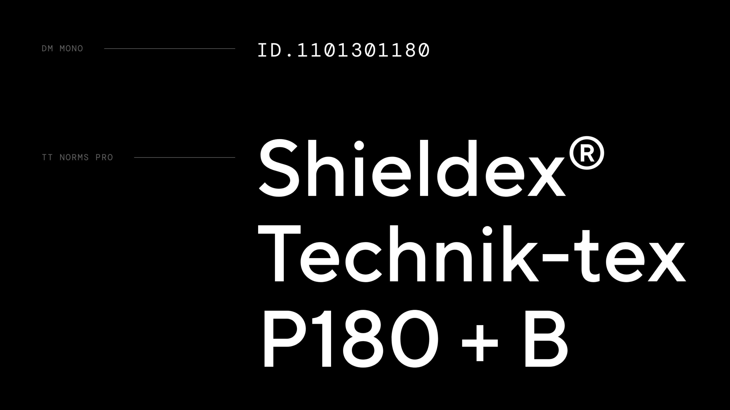
Clarity and order in written communication reflect the scientific precision that drive the innovation process at Shieldex. Two fonts are used in the design system. Headlines and texts are set in the geometric sans-serif TT Norms Pro. Small texts and supplementary information is set in DM Mono to complete the scientific look of the design system.
Clear, typographic, pure: in keeping with this character, the new wordmark is used only in black and white. The underlined “x” has its own meaning: like in a chemical formula, it stands as a placeholder for the countless solutions that make metallised textiles possible. The “x” also serves as a a short form of the logo.
The line element is placed horizontally in different weights and works in conjunction with type and imagery. As a key visual component of the new visual identity, the line element brings hierarchy to layouts, structures written text and unifies the visual experience for stakeholders.
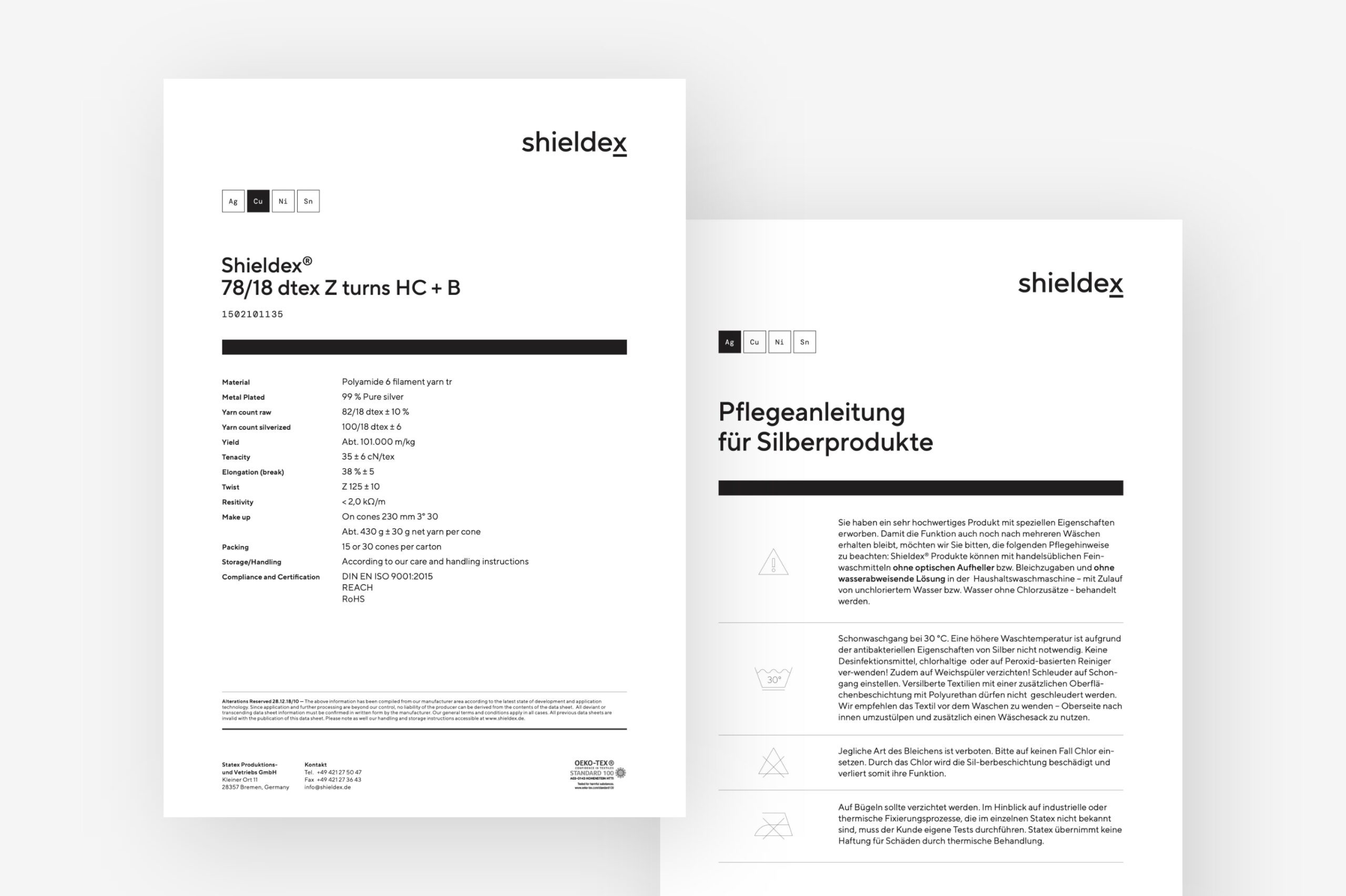
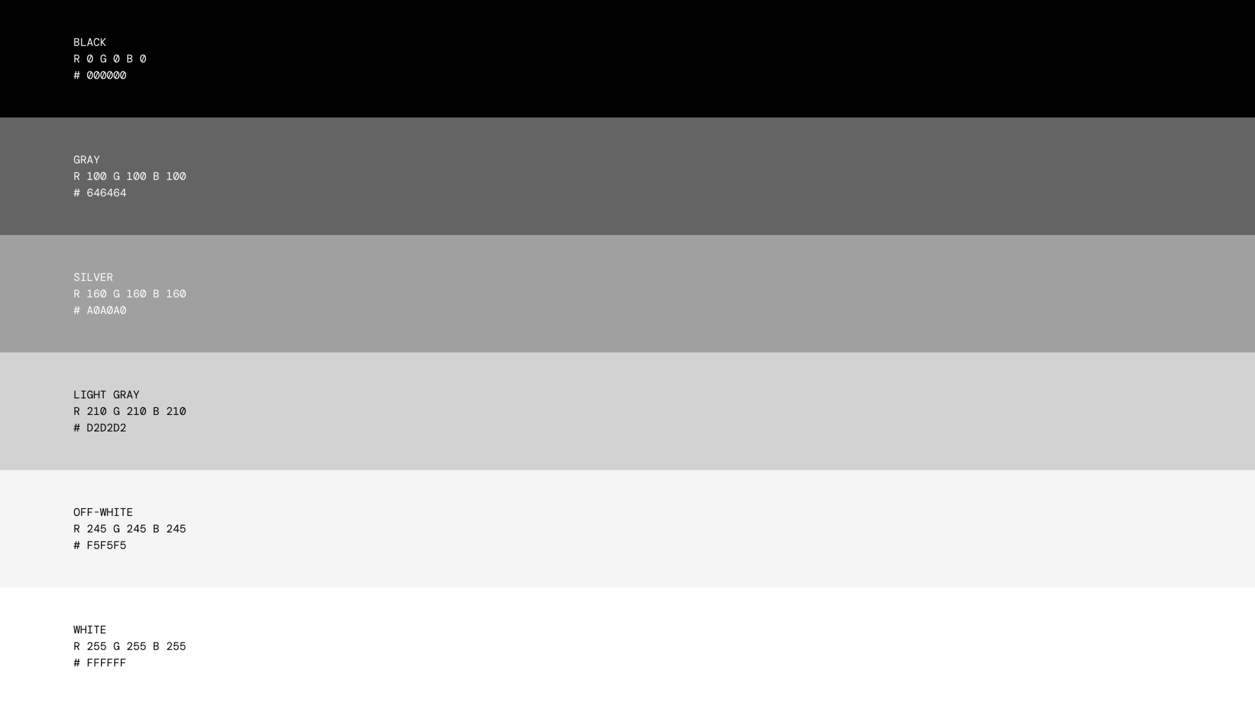
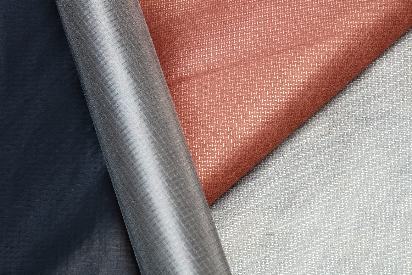
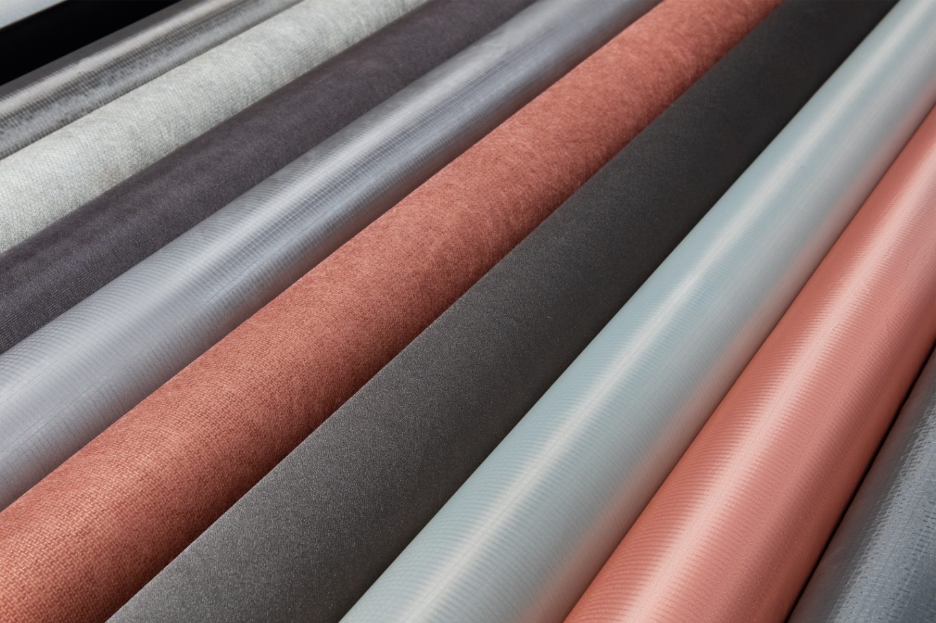
A restrained color palette consisting of black and shades of gray directs the focus to the products, their materials and finishes. The new modular design system ensures a consistent customer experience at all analogue and digital touchpoints.
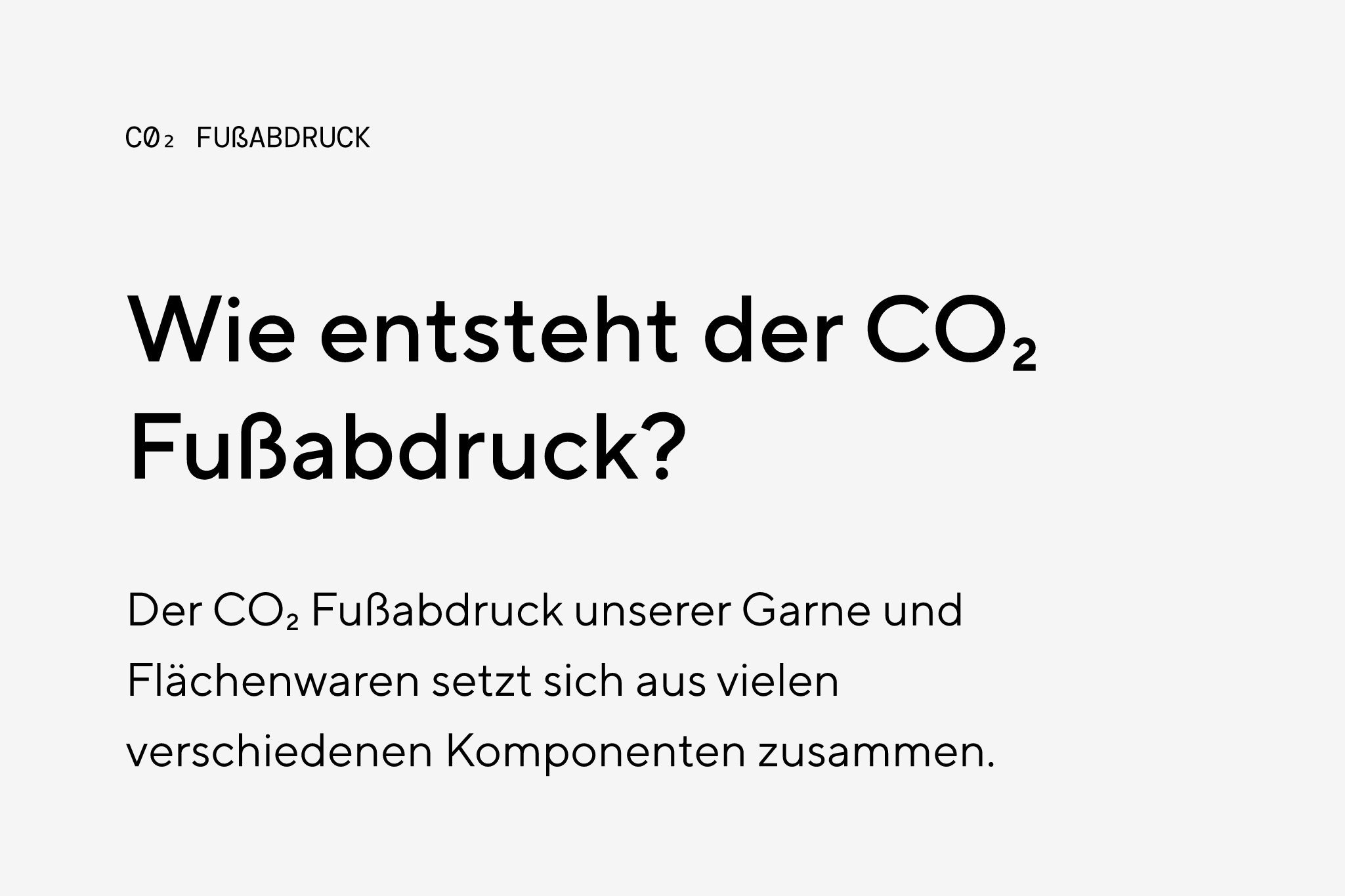
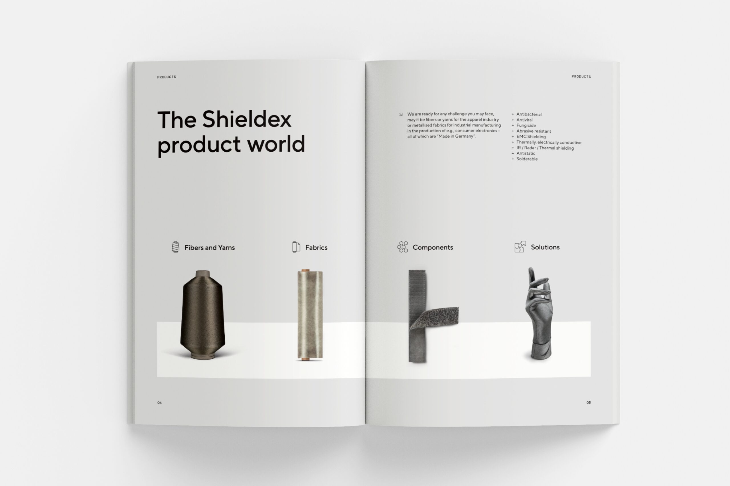
Icons, diagrams and infographics convey technical expertise and are characterised by a simple, clear, grid-based design.
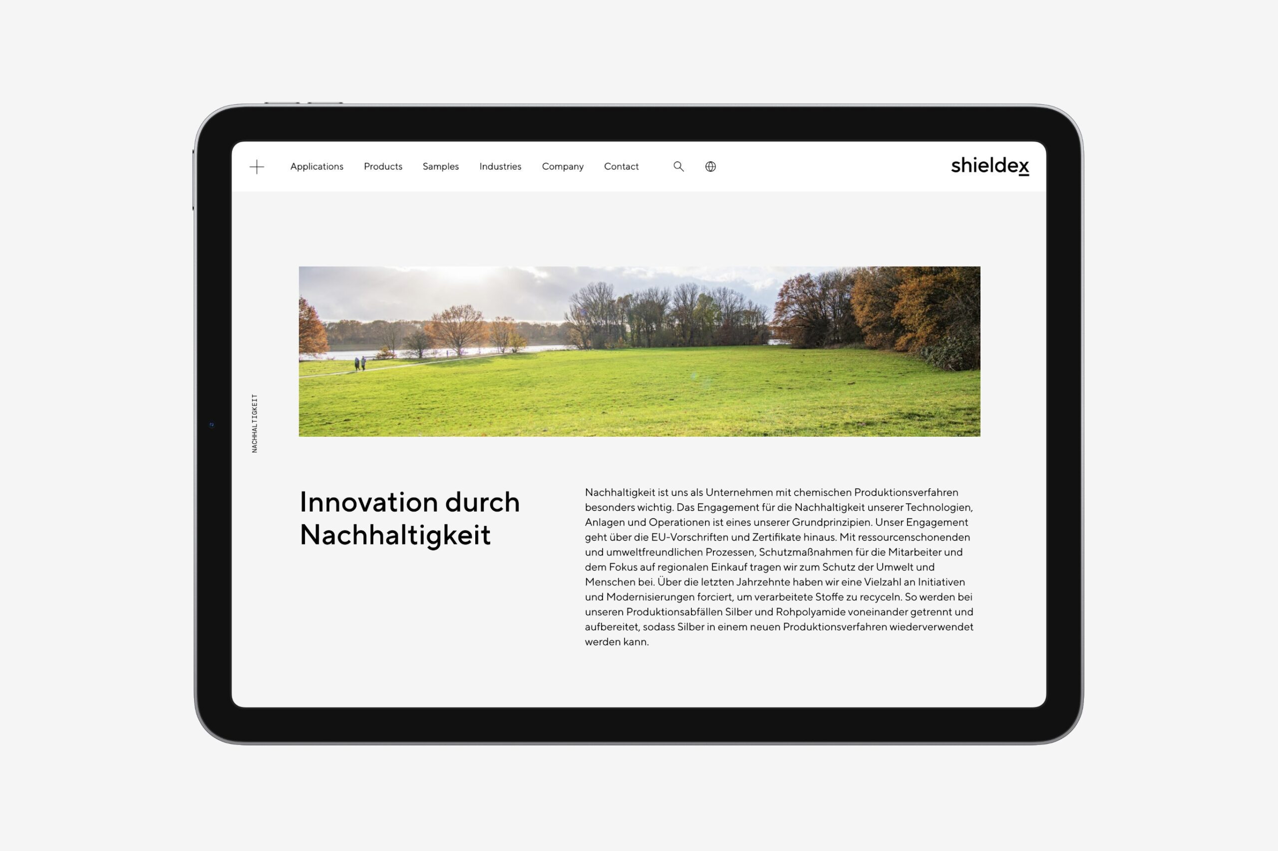
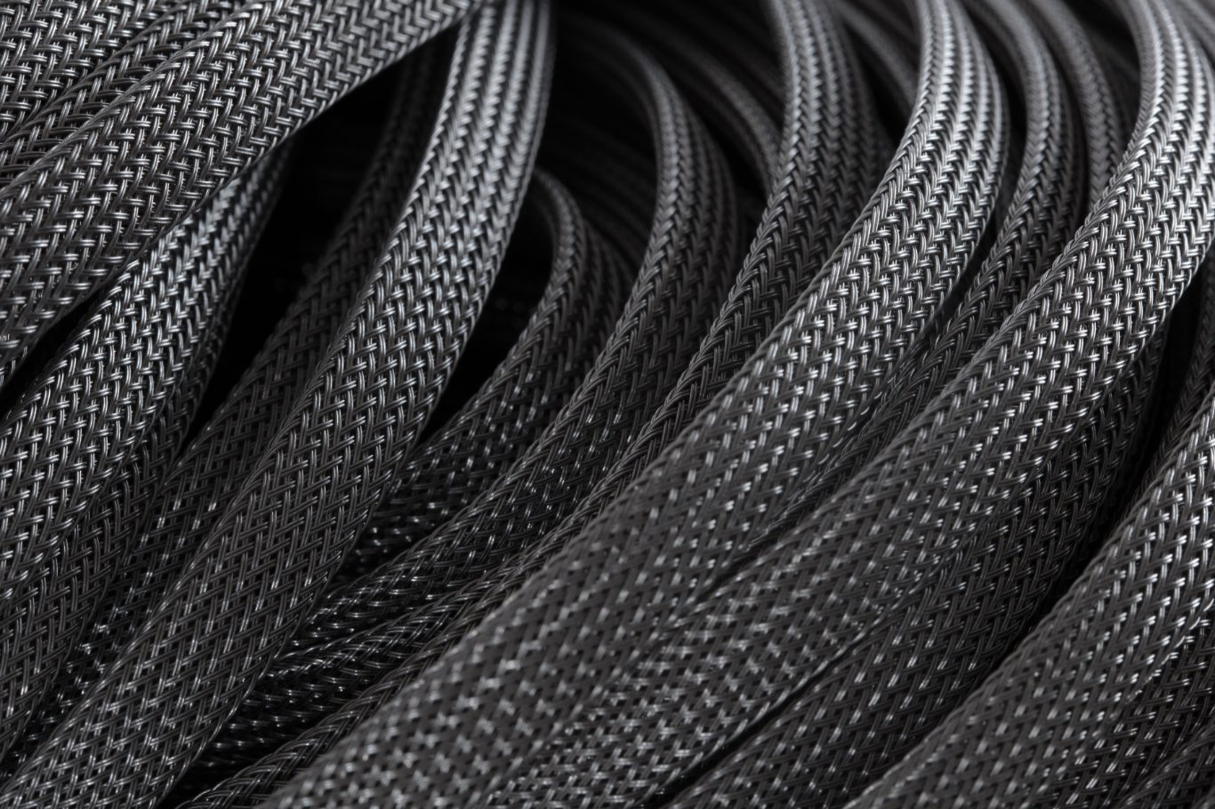
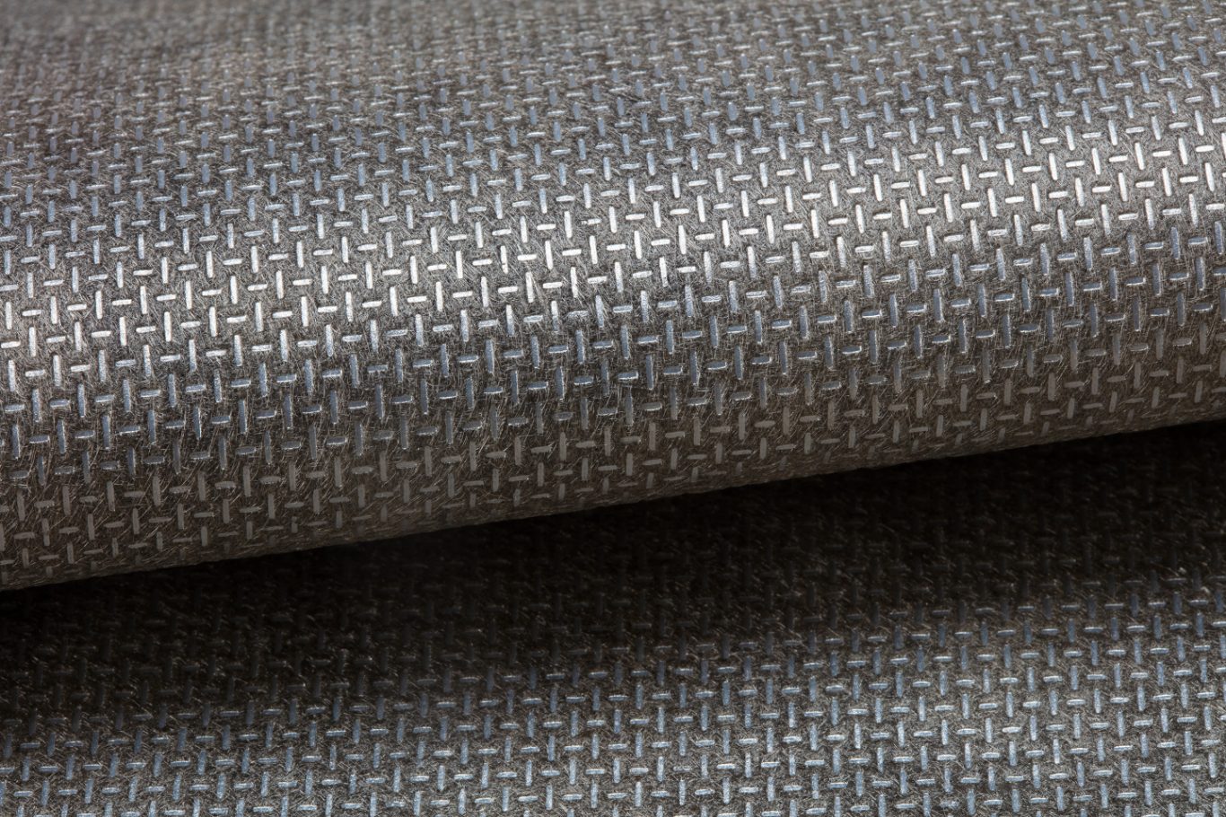
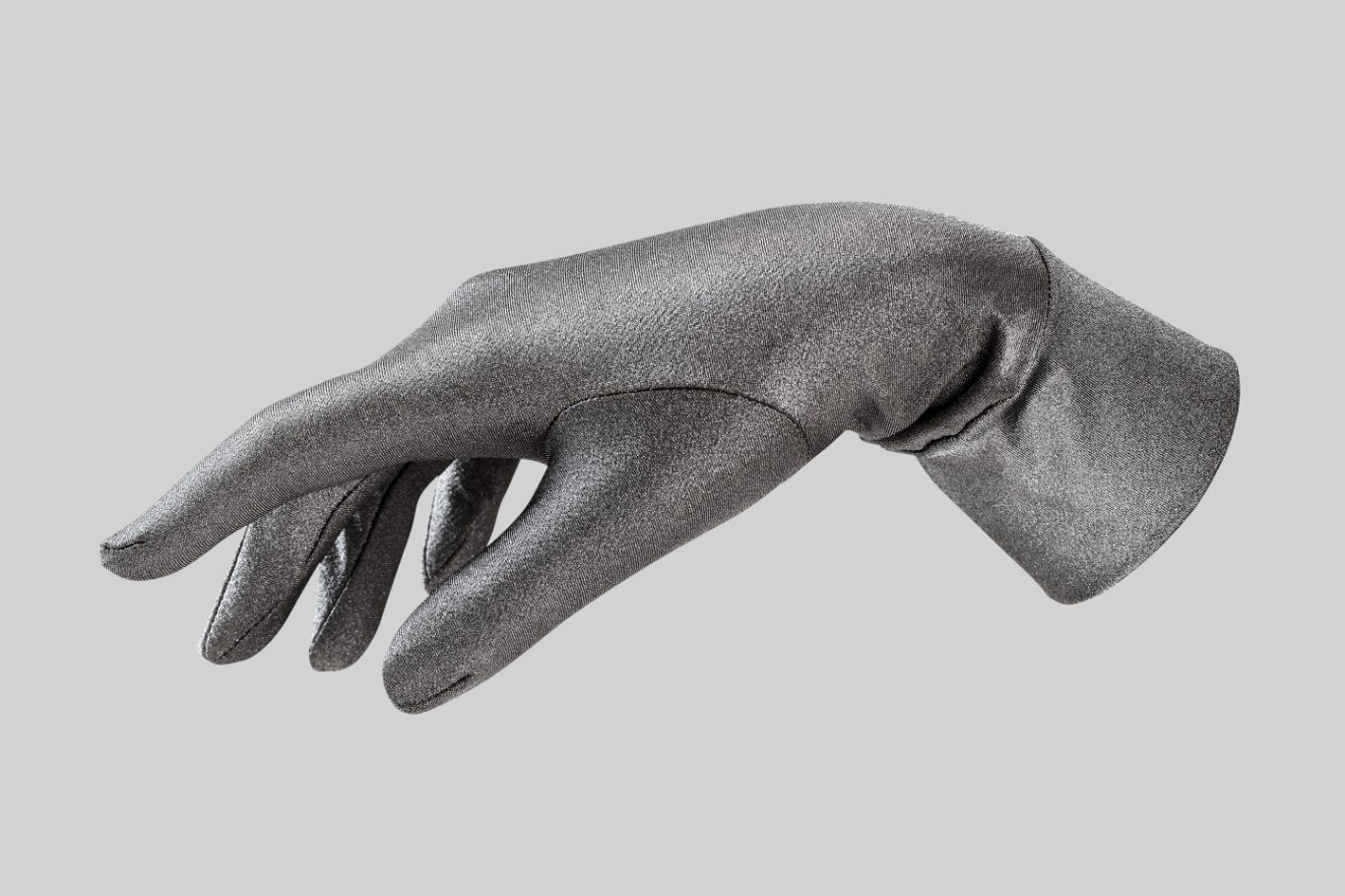
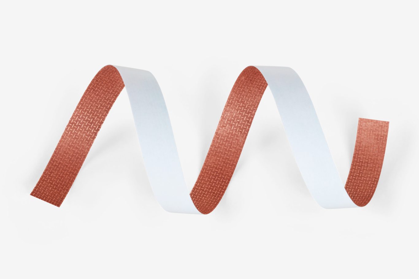
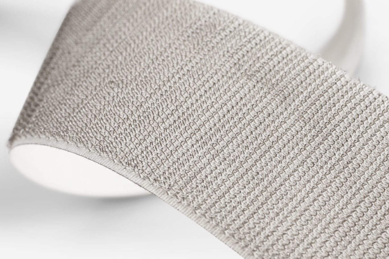
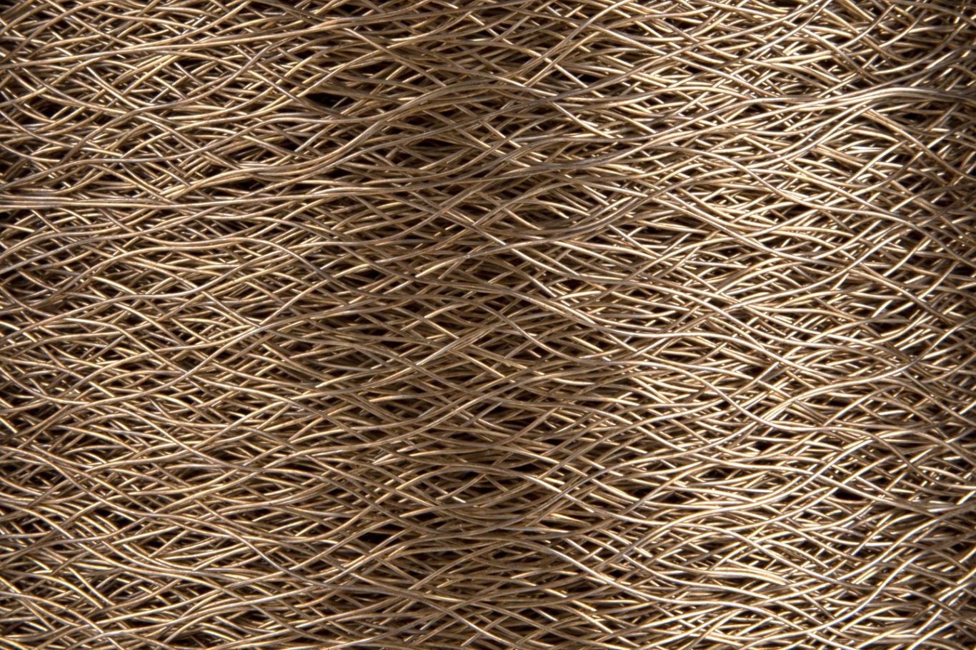
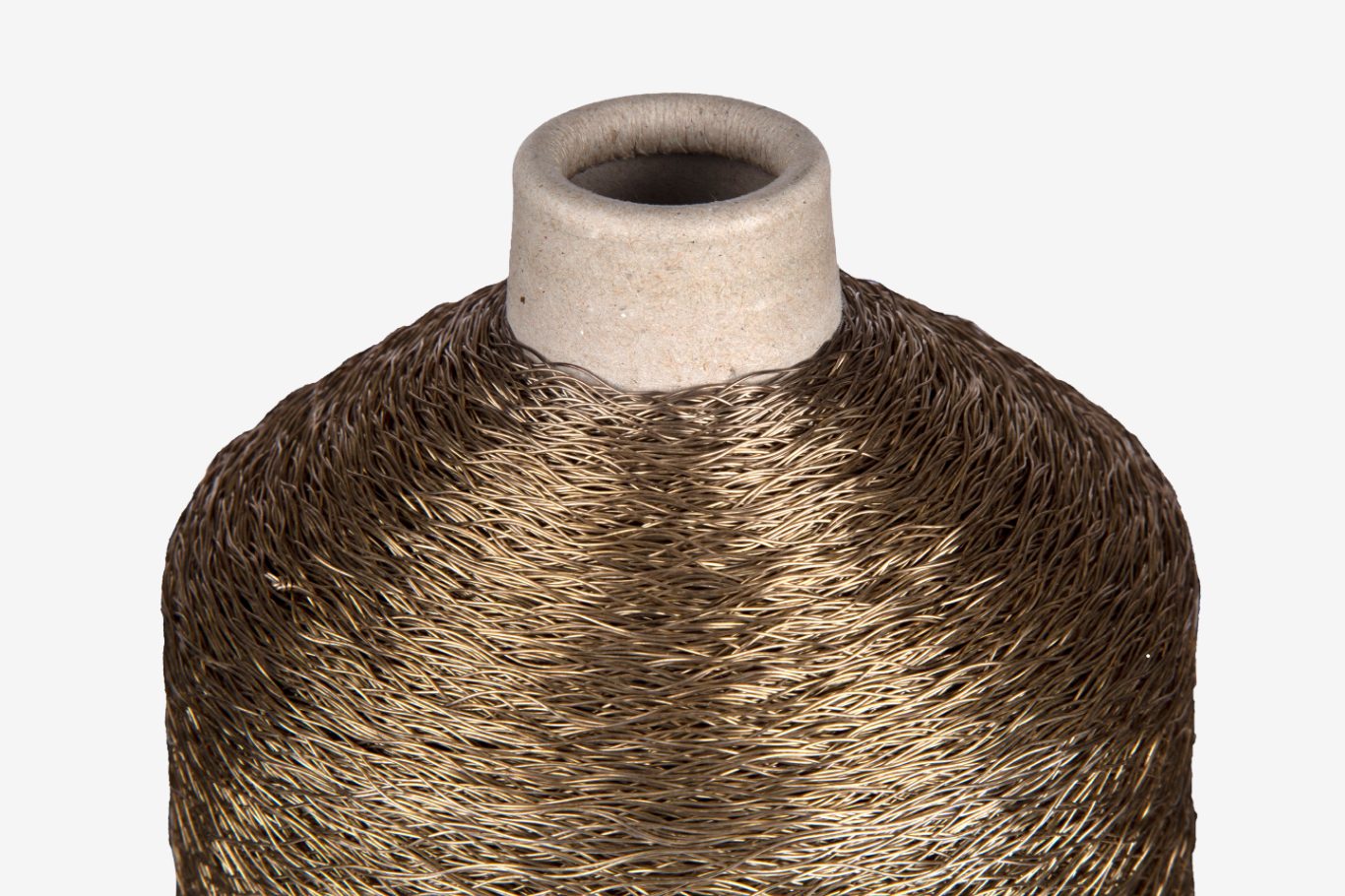
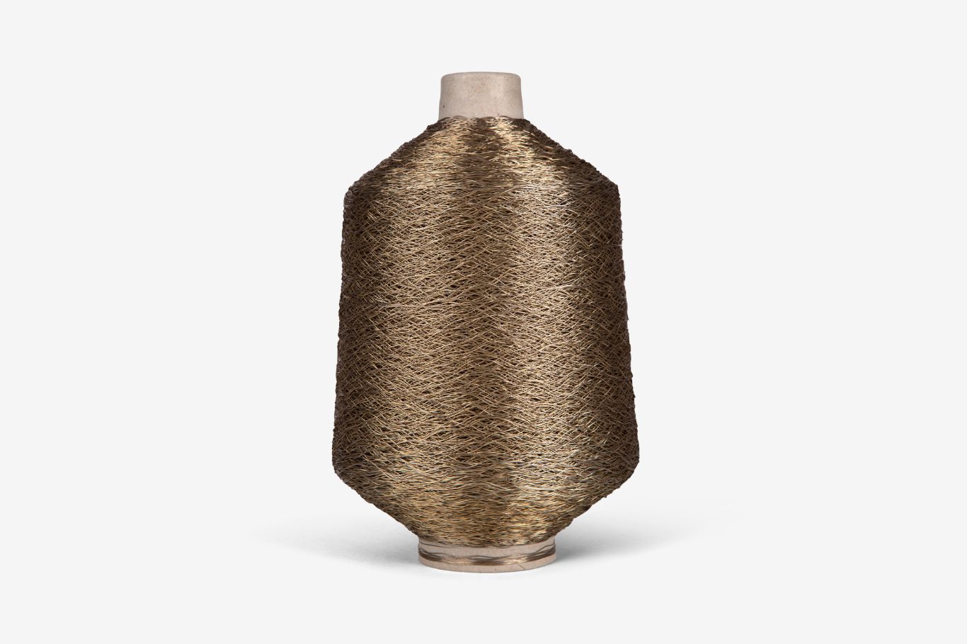
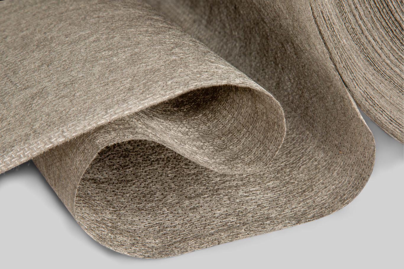
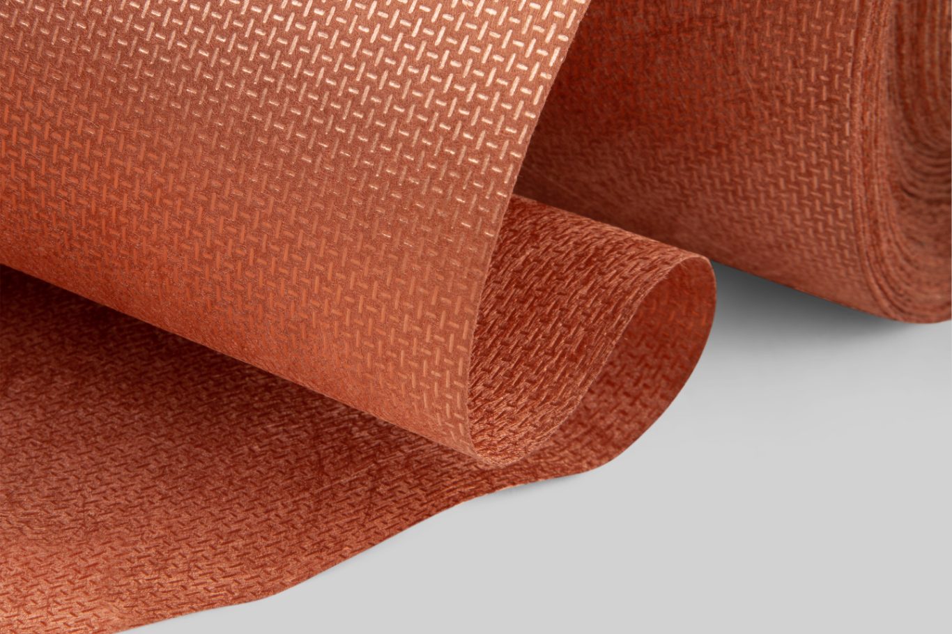
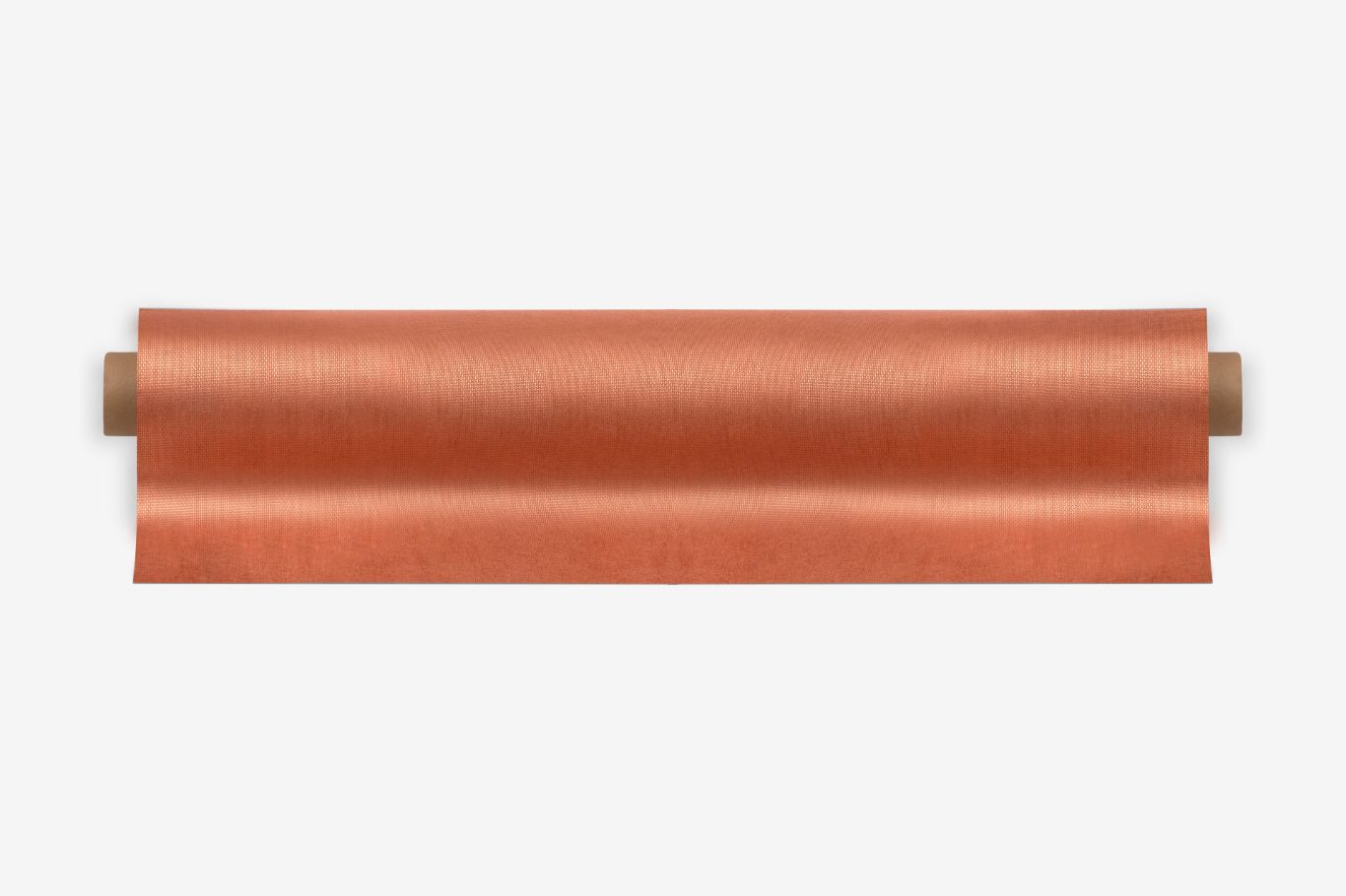
Photography plays a pivotal role in the new design system. They focus on the colours, textures and surfaces of the products, always presenting the product in the best possible light.
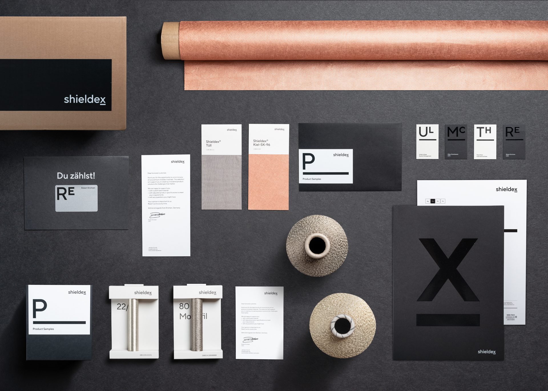
Finally, the new brand strategy framework, extensive design principles, guidelines and all visual assets are painstakingly documented and presented in an online brand management portal to ensure a single source of truth for the team and external partners.

Brand experience
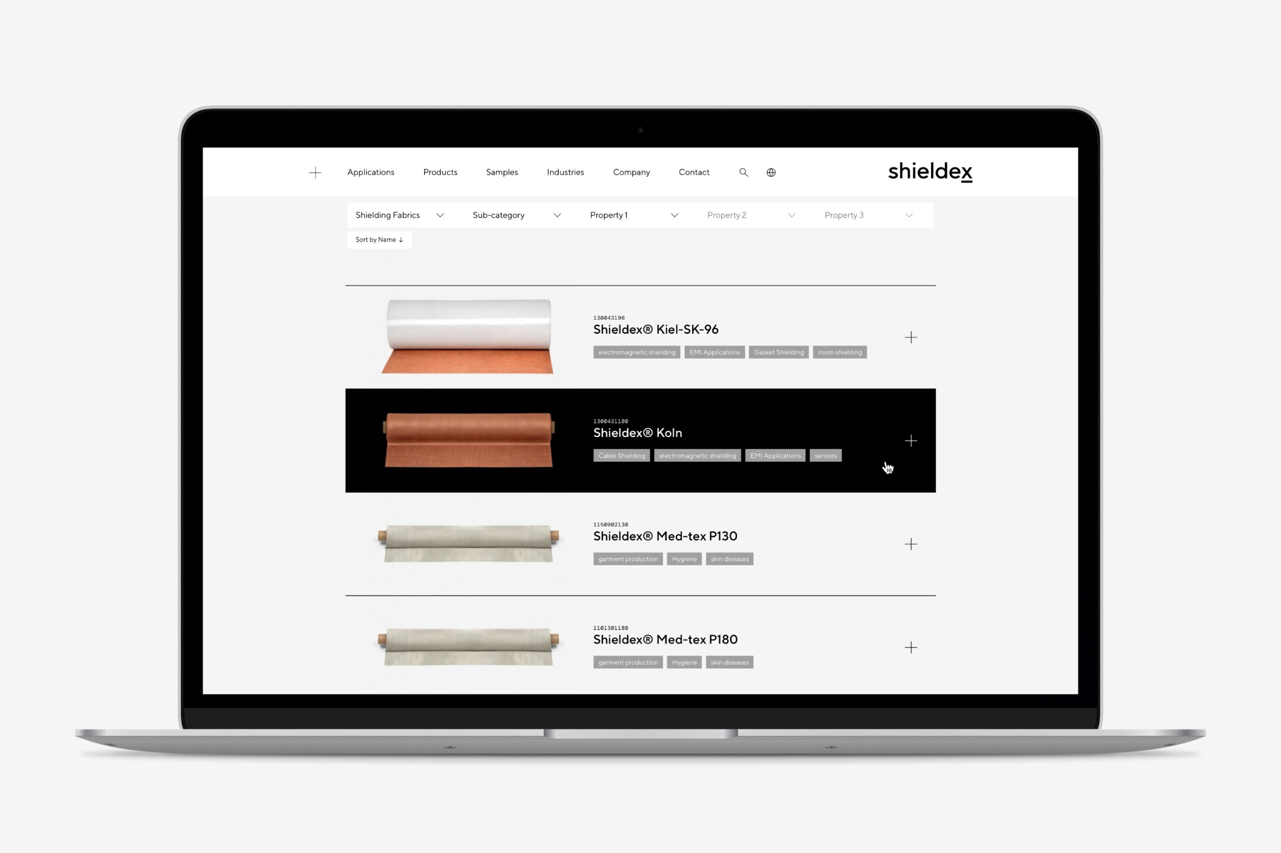
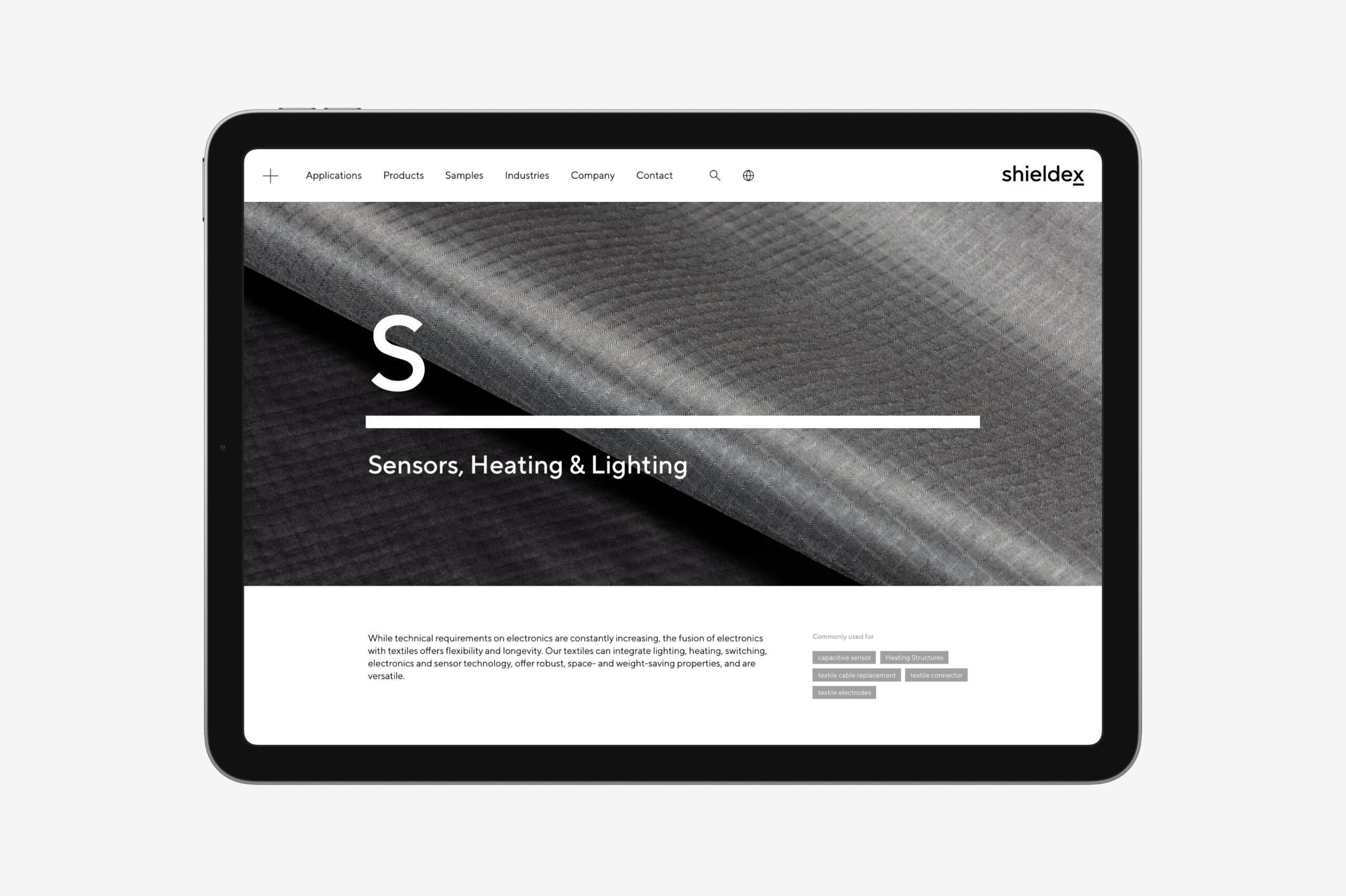
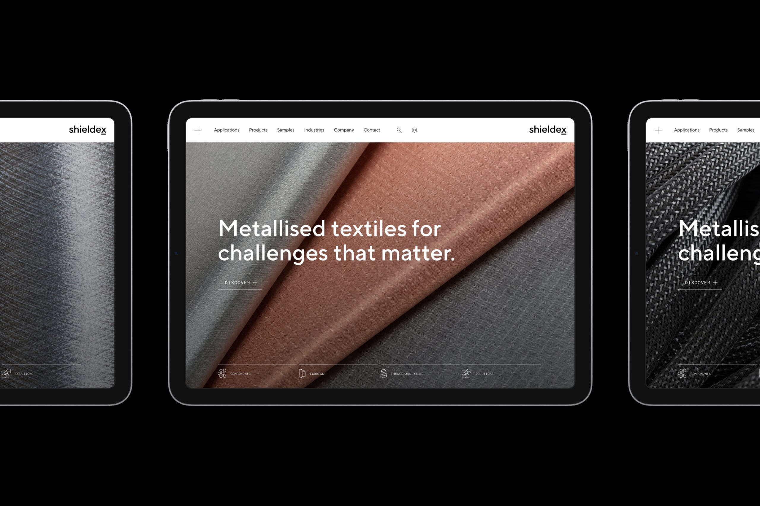
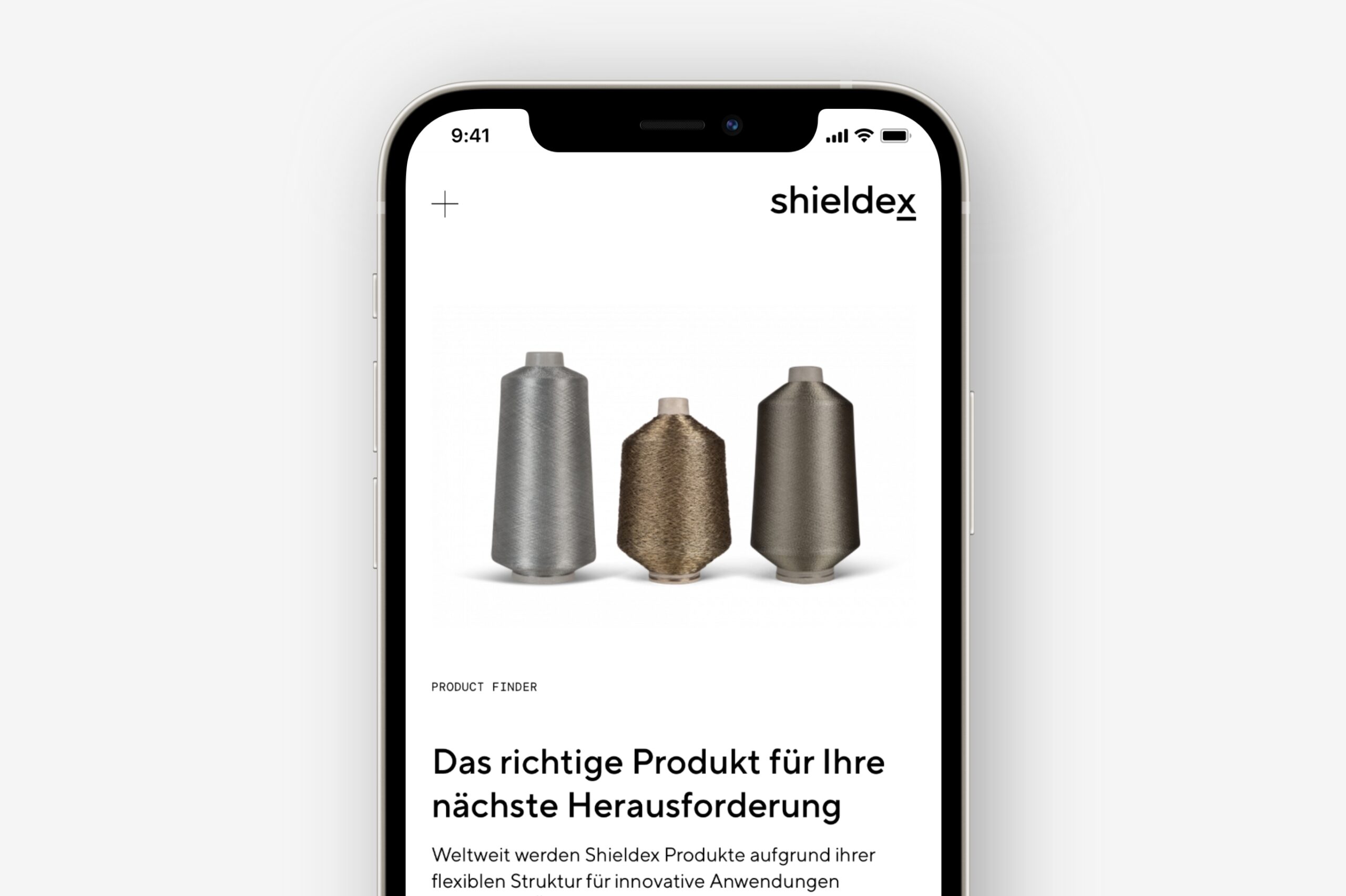
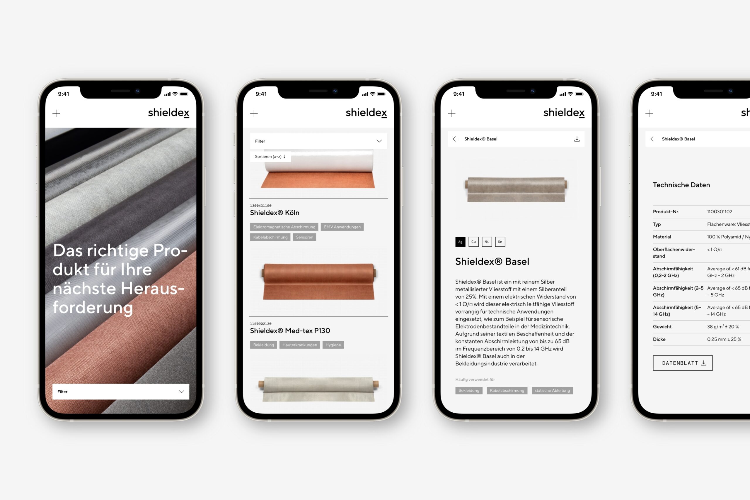
A new website with a convincing narrative
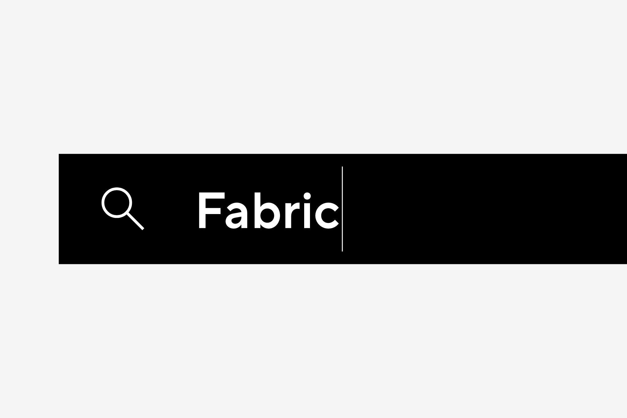
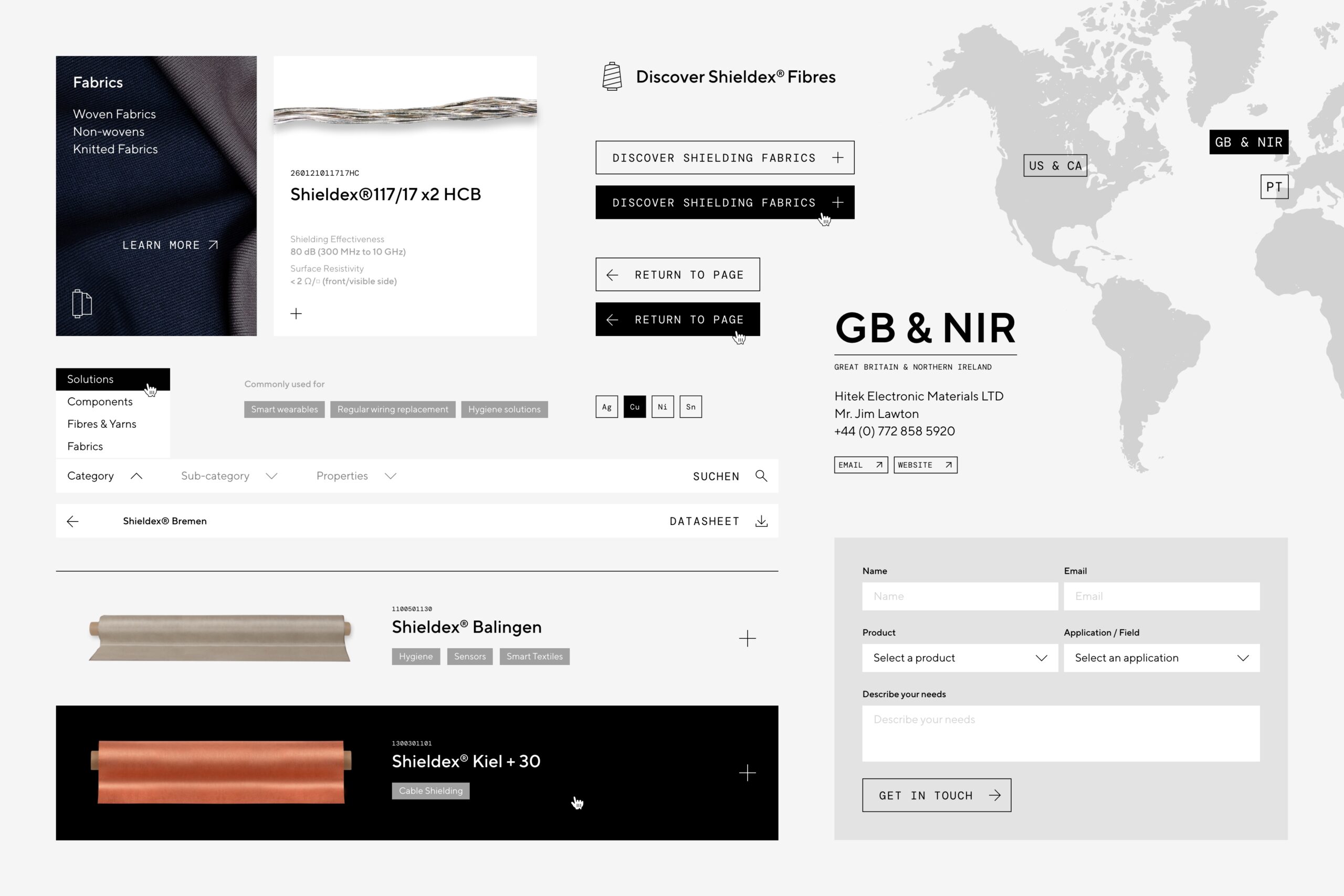
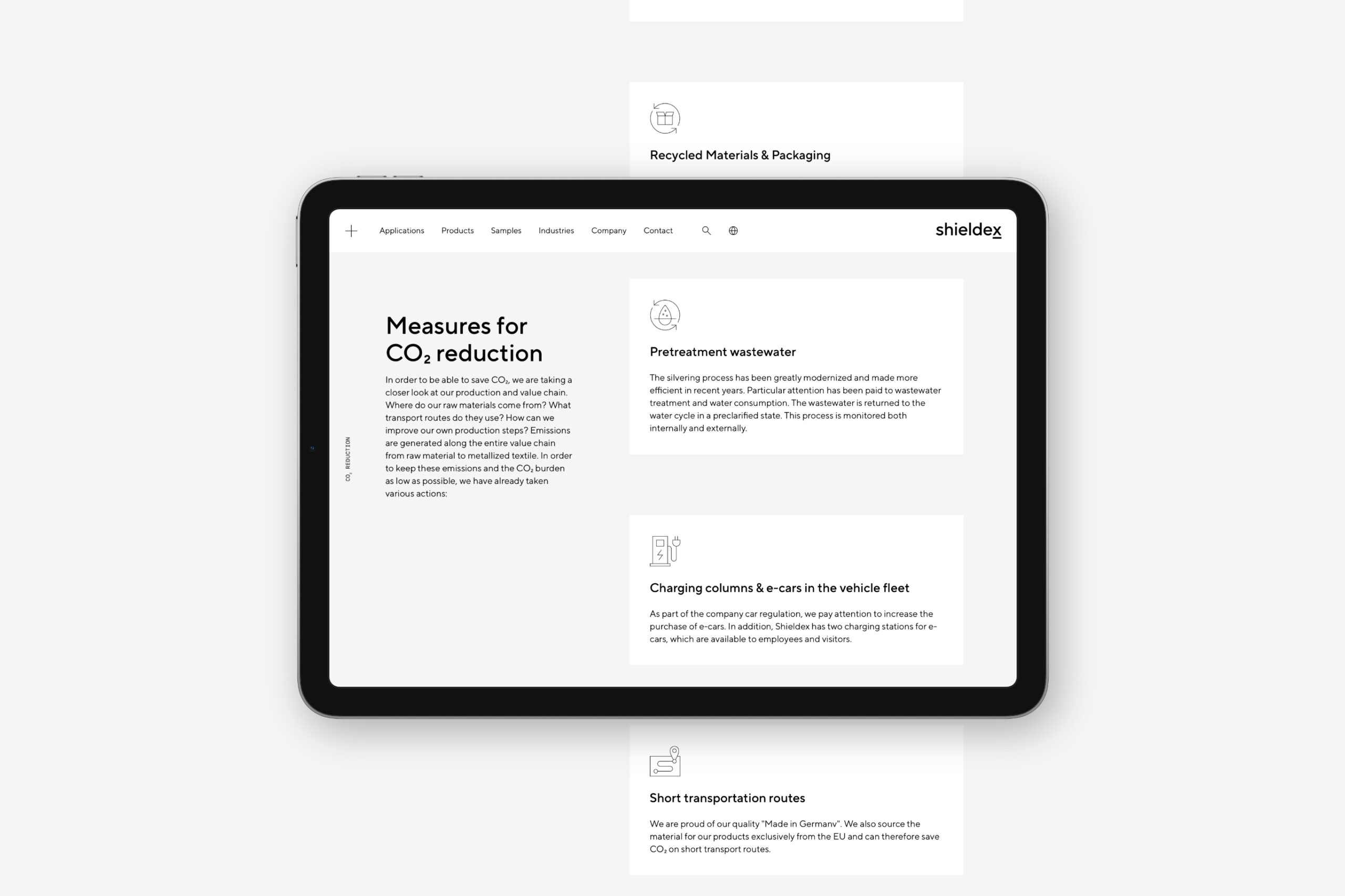
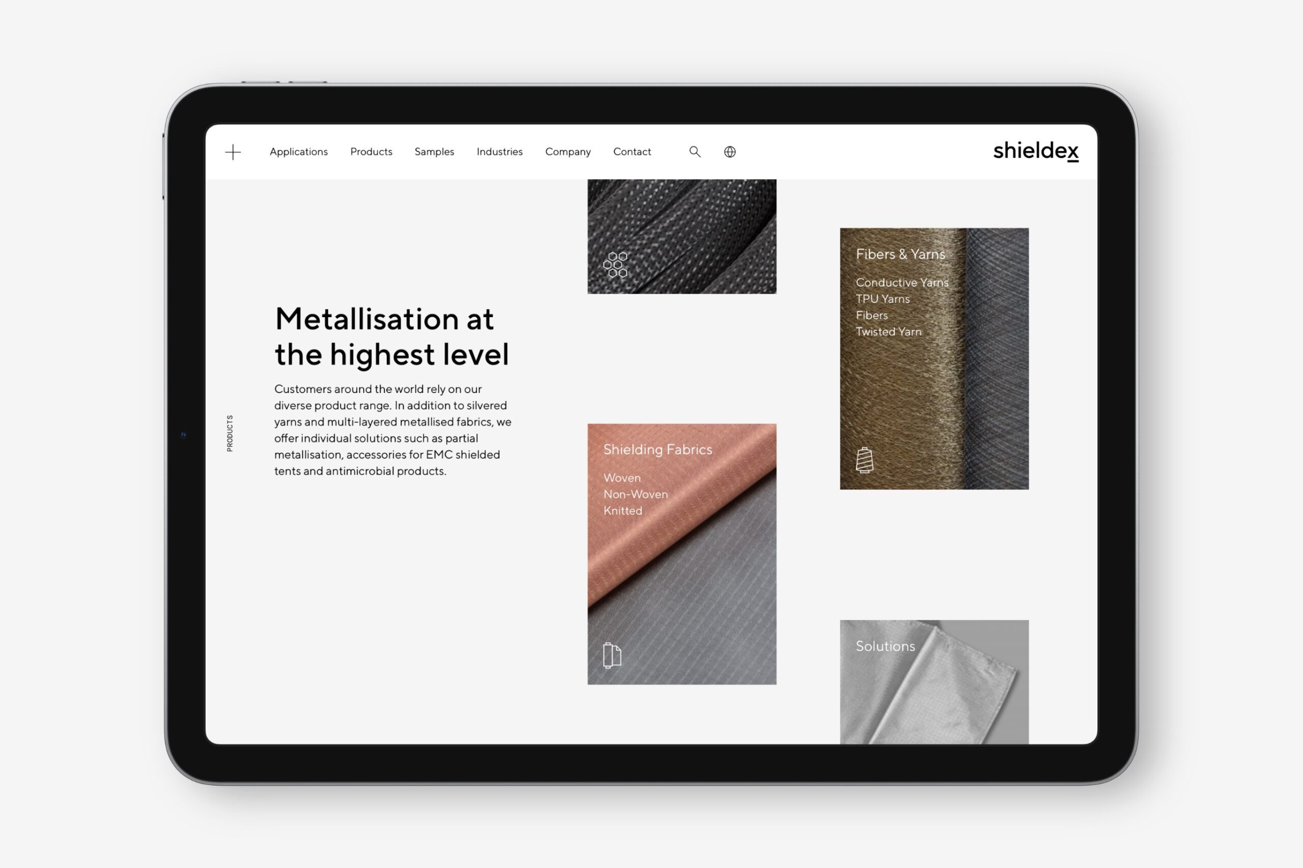
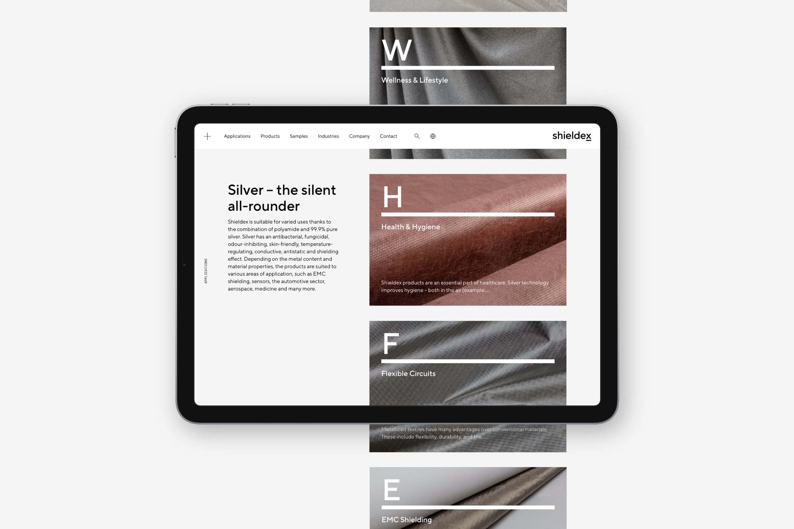
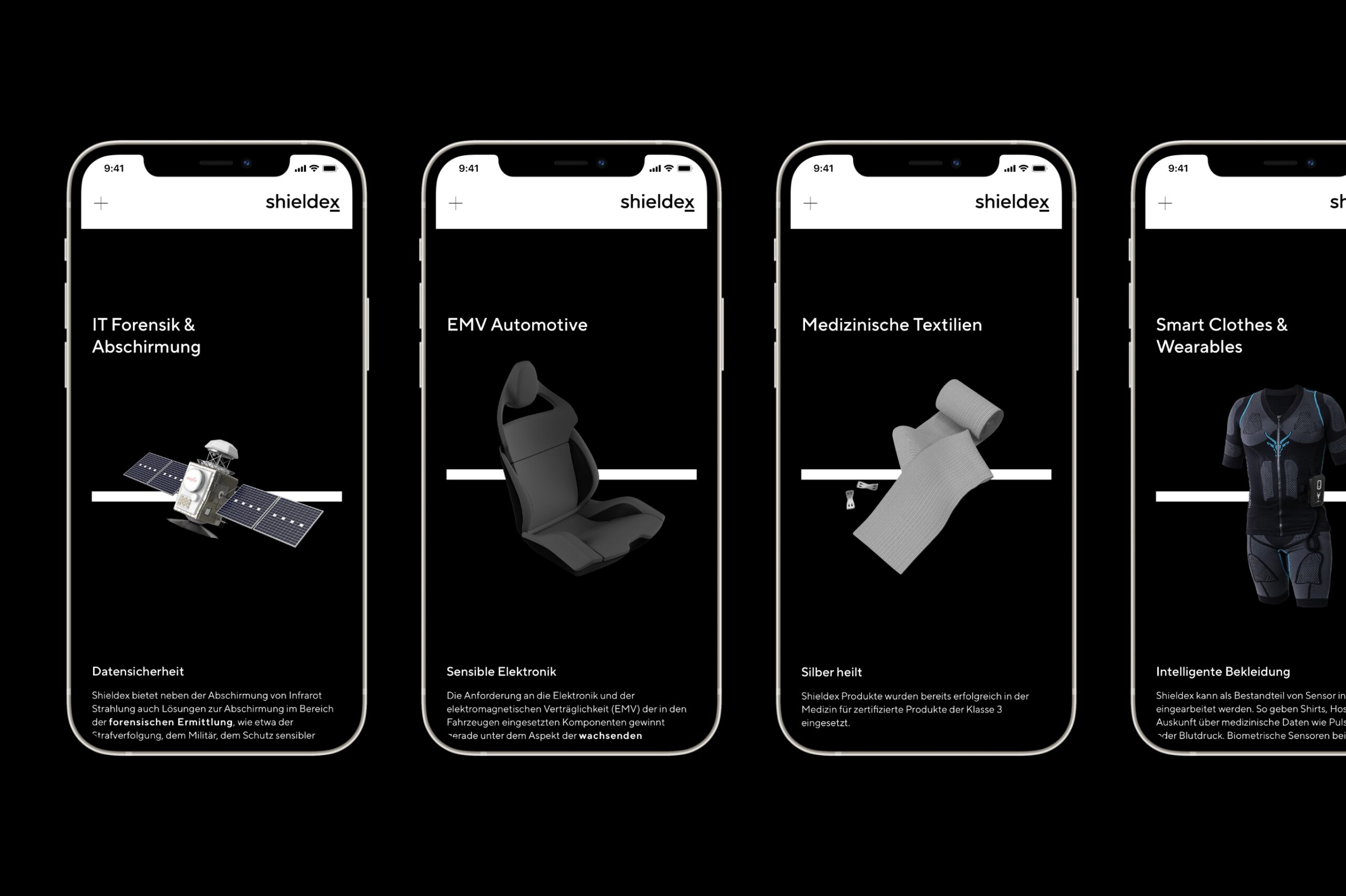
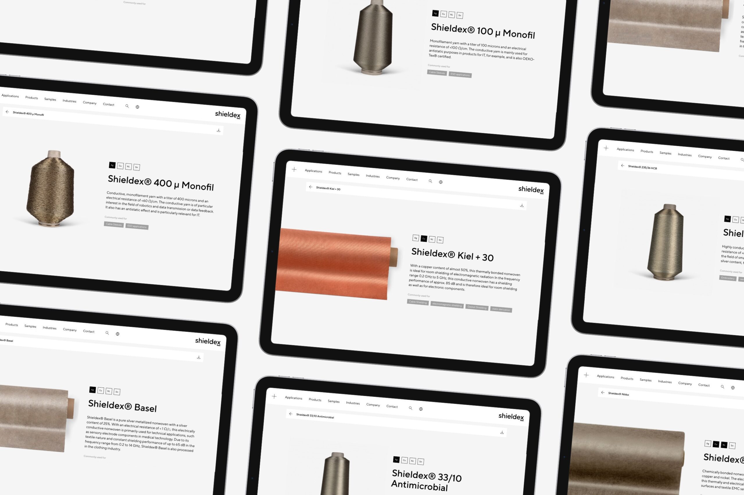
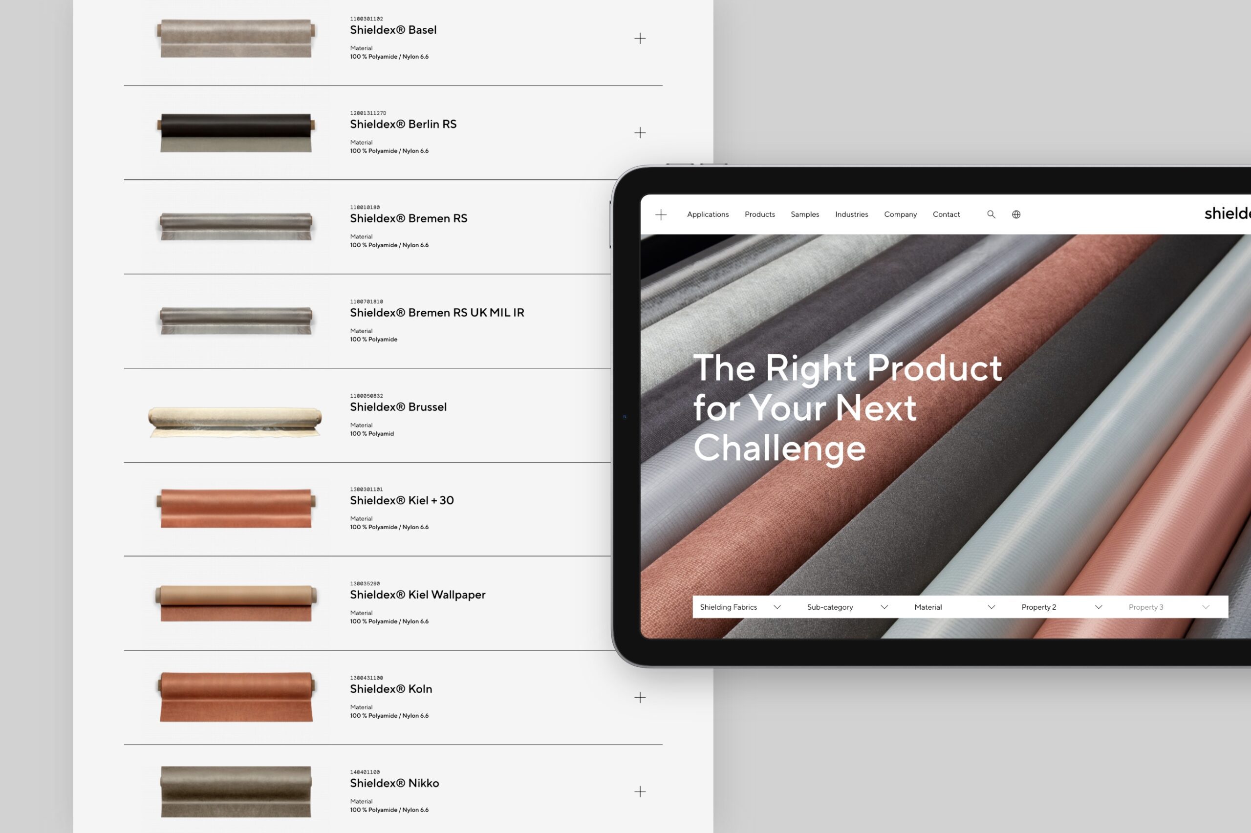
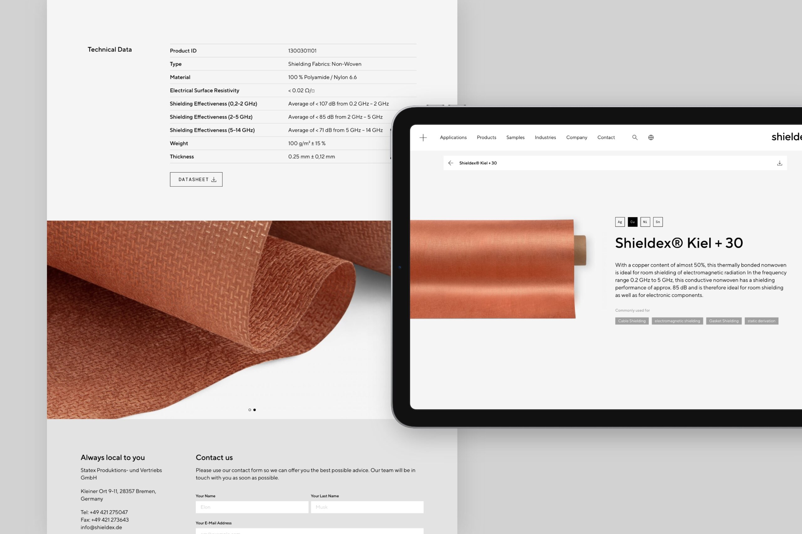
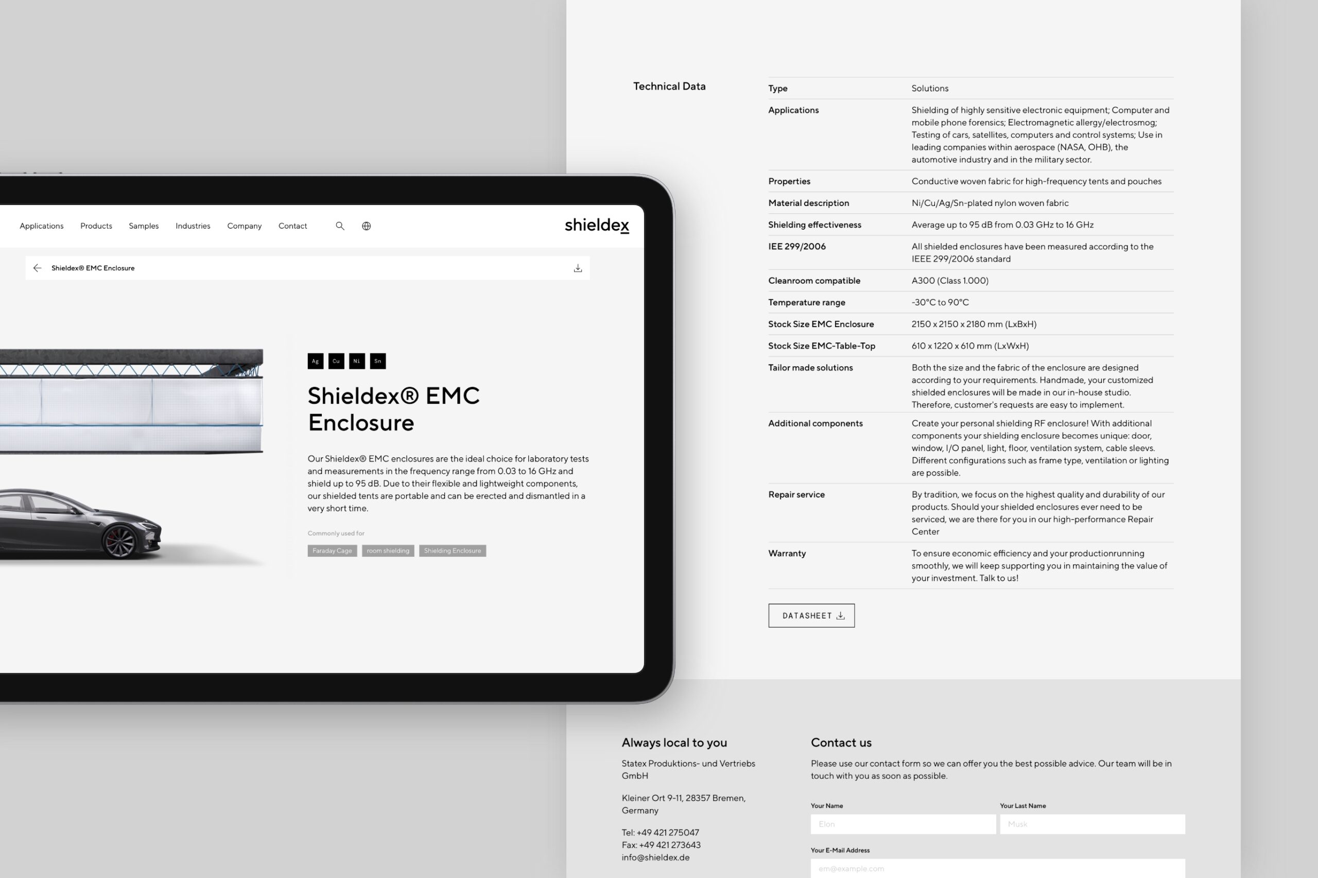
The new website showcases the family-owned company and confidently communicates its offering as an innovative and dedicated tech partner with leadership aspirations. A customised product finder provides quick access to Shieldex’s extensive portfolio of fabrics, yarns, components and solutions, all the while highlighting the high standard of quality in everything they do.
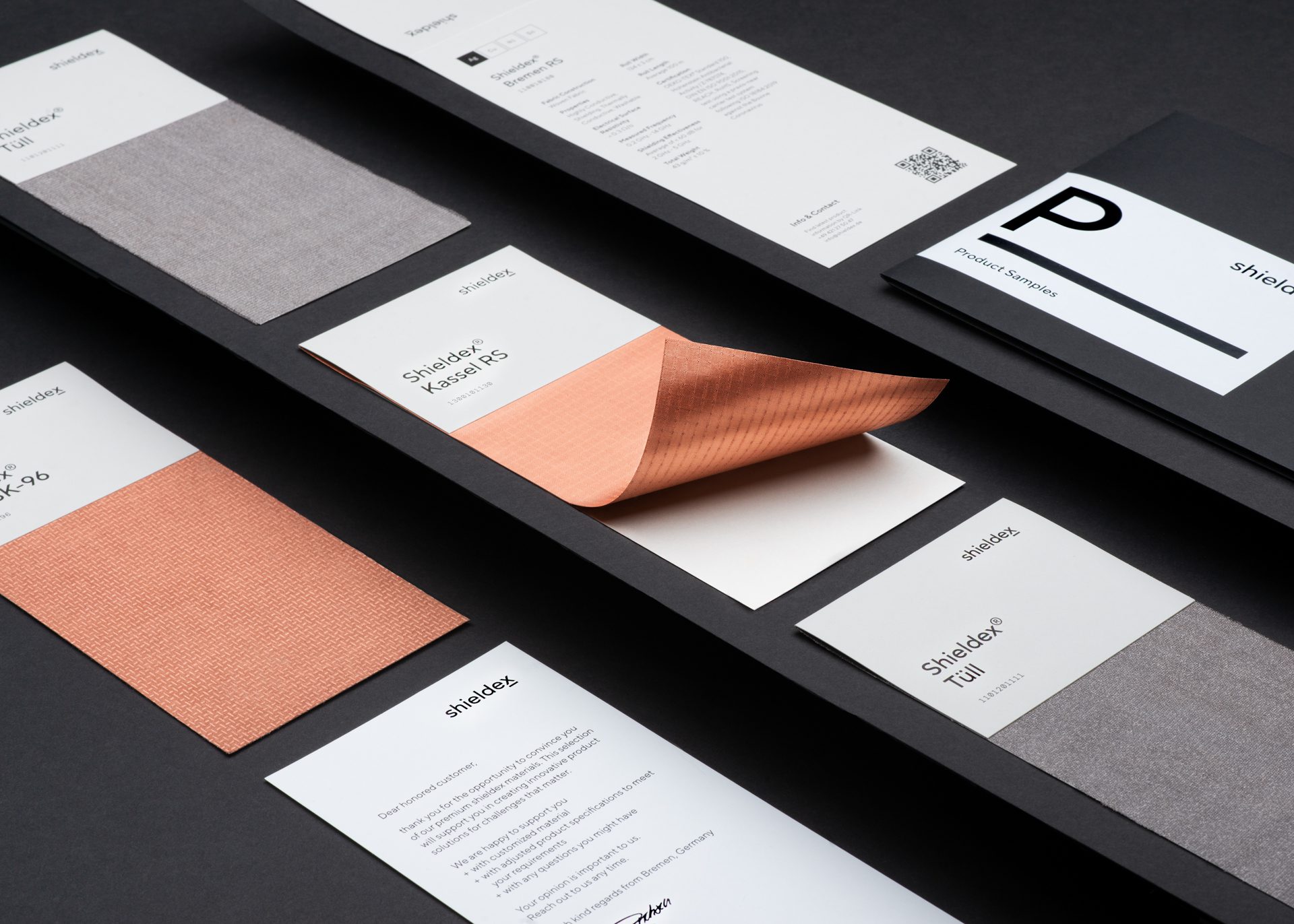
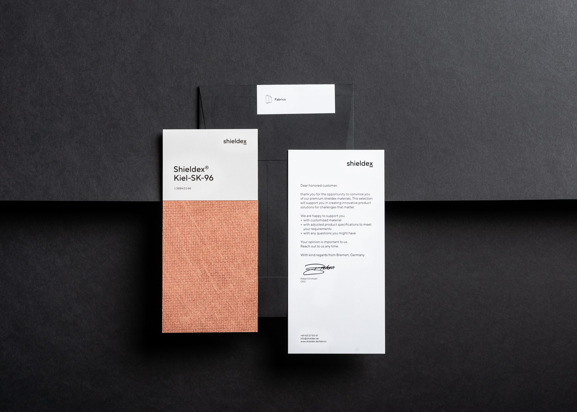
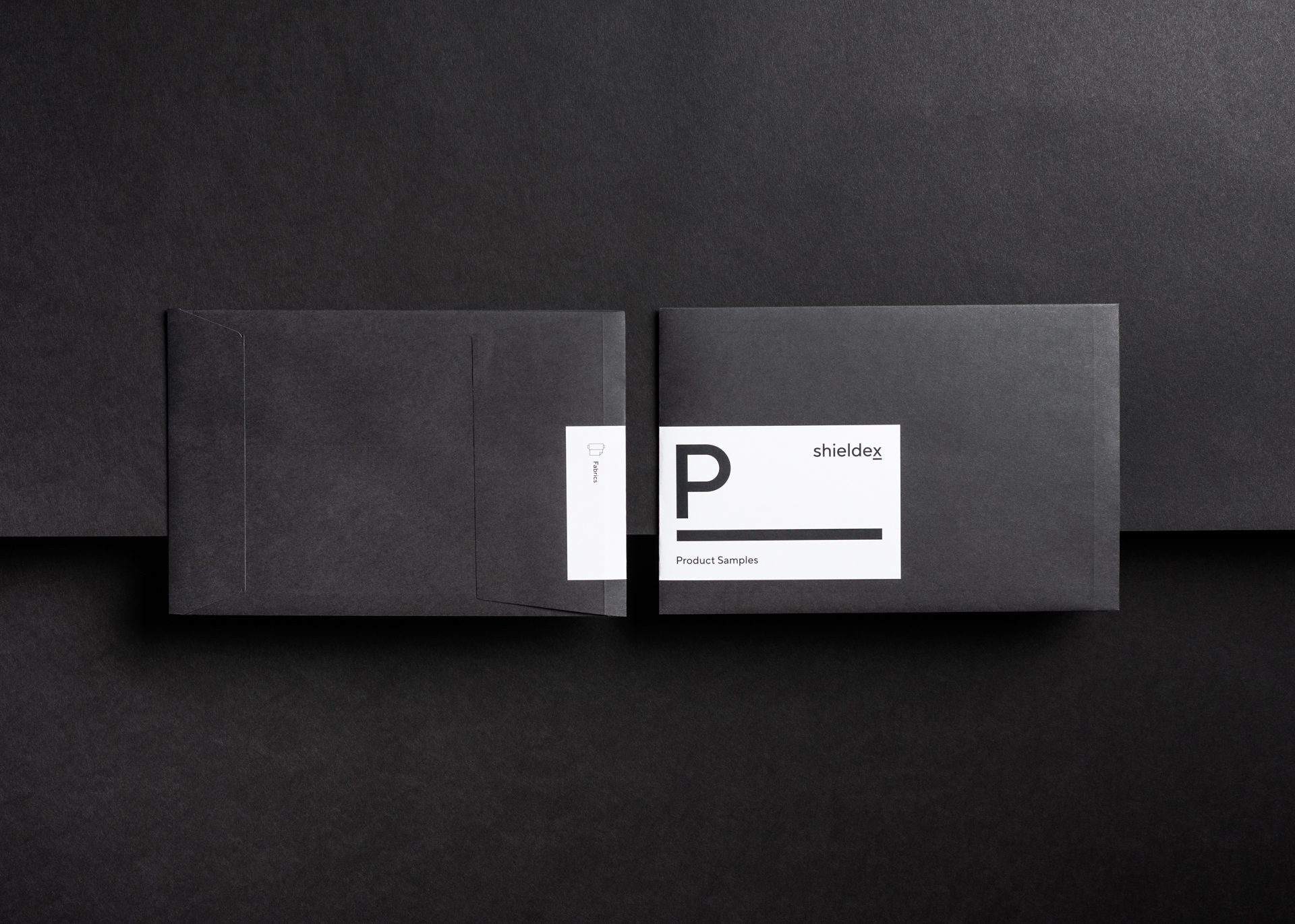
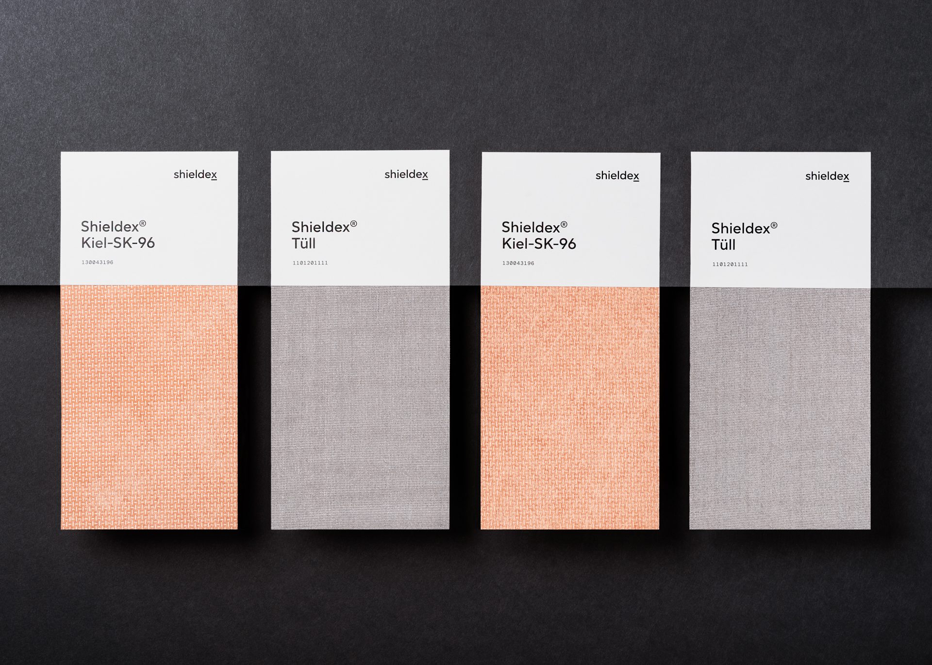
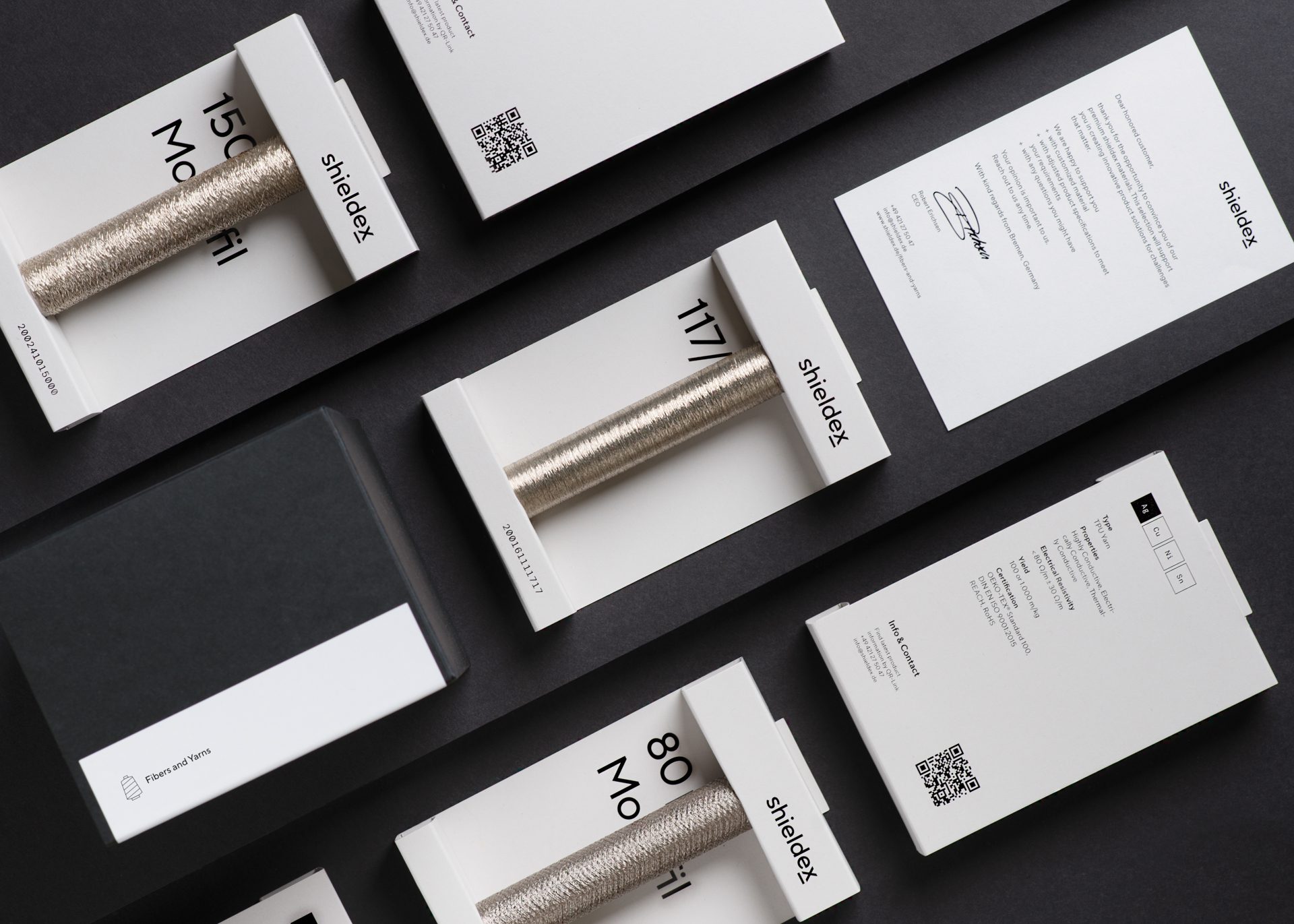
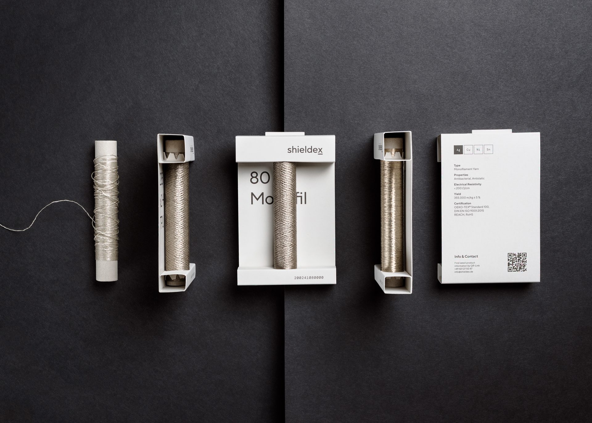
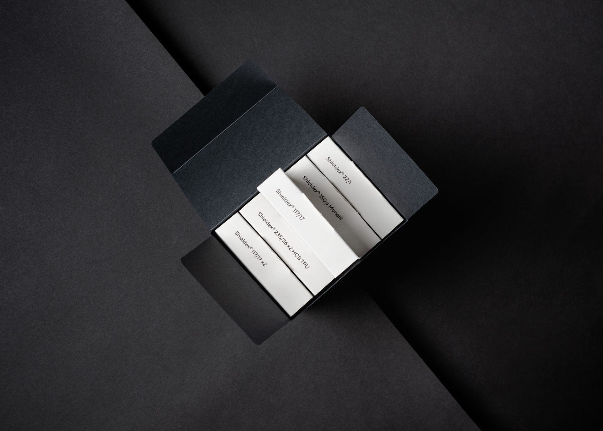
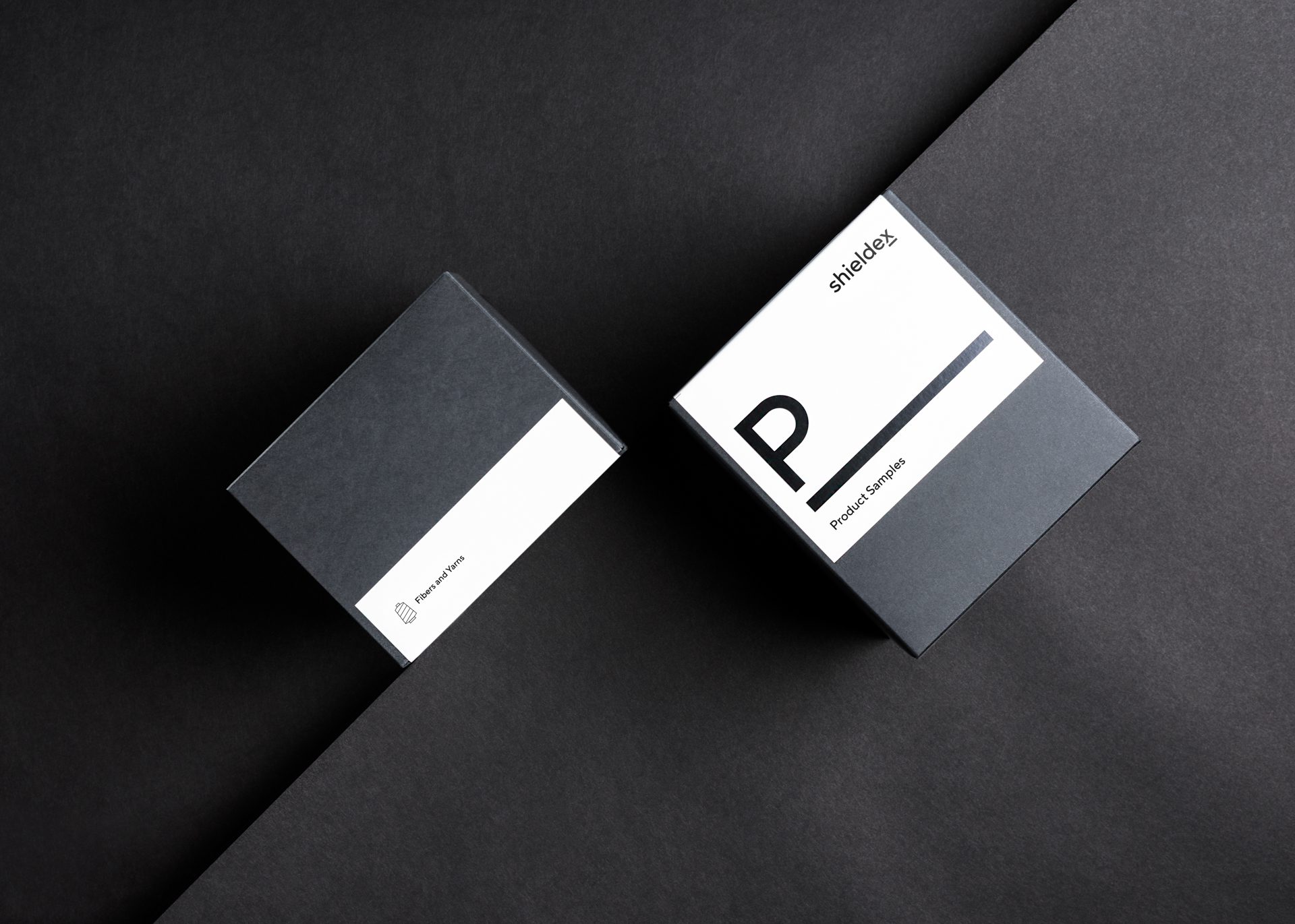
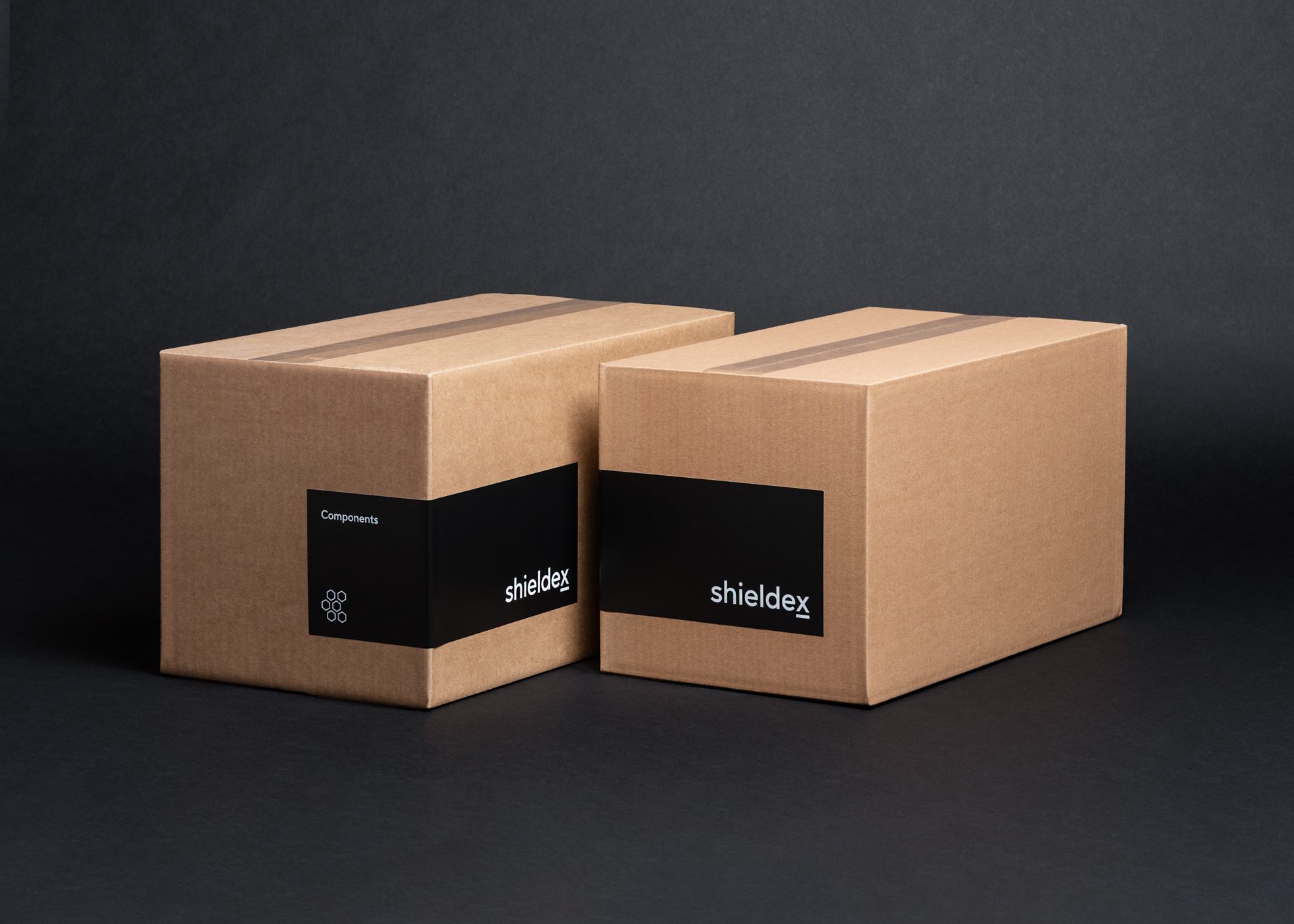
Packaging design to enhance the offline experience
A new sample kit is designed with a focus on tactile experience and sustainability, they combine material samples with key technical specifications whiling minimizing shipping materials. This puts their products within reach for interested parties and wins the eyes and heart of new customers.
Monospace understood who we are and where we want to go. We finally have a representative design for our brand that will accompany us for years to come. The collaboration during the transformation was very competent and cooperative – and the design quality speaks for itself. We are happy to have Monospace as a partner as they help us shape the path of our company.
Robert Erichsen
CEO