Biotec
Branding and website empower biopolymer innovator to lead sustainable change
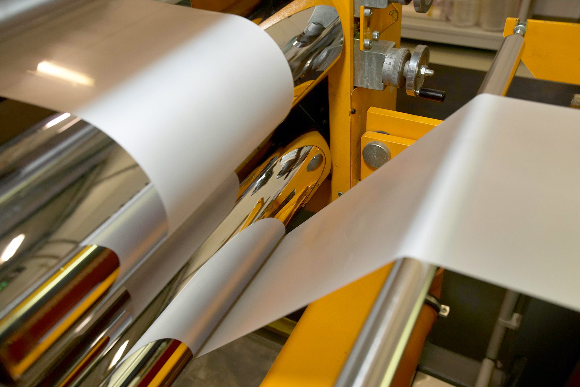
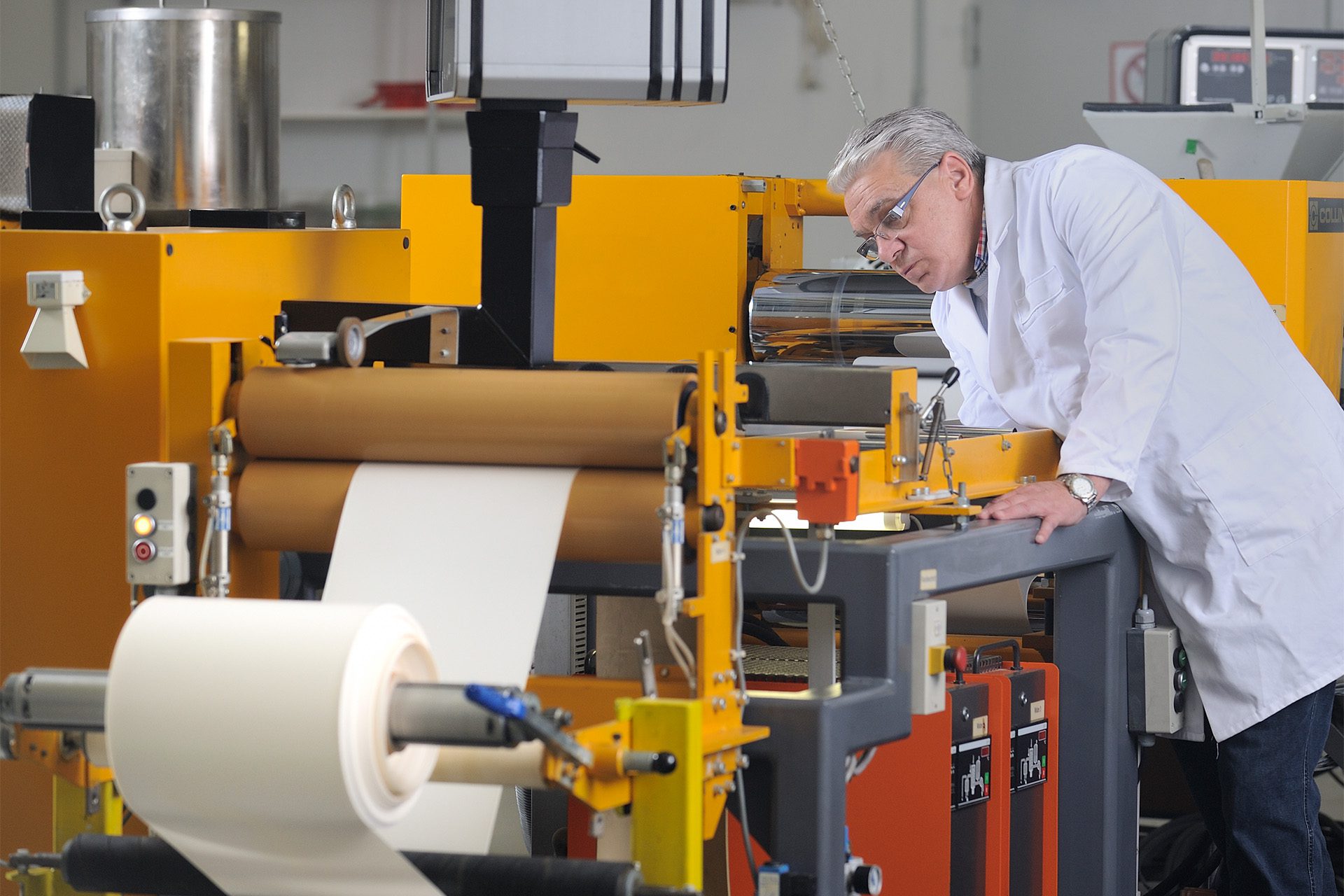
Biotec is one of Europe’s leading manufacturers of technical biopolymer compounds. Together with converters and processors, the Biotec team is able to develop and produce individualised biopolymer solutions to satisfy specific parameters and market or legislative requirements. Biotec’s products promises to be GMO-free, plasticiser free, food-safe, and biodegradable either at home or in industrial facilities.
After years of growth and in-house development, the brand is facing a number of challenges.
Inconsistencies in treatment and communication resulted in an outdated visual identity and a fragmented brand that did not clearly reflect Biotec’s market position. Poor UX, a patched navigational structure and outdated tech stack lead to difficulties in presenting the growing product range to customers. In addition, a growing gap between the website’s content and Biotec’s sales strategy generated an increasing number of unqualified leads, wasting valuable time and resources.
A visual scan of the existing brand highlighted the lack of a coherent design system. This and a nondescript graphic language that blends into the competitive landscape means inconsistencies exist between media and communication channels, diluting the core brand experience.
Brand strategy
Our analysis of the brand’s existing communication highlighted a lack of differentiation against competitors. Newly developed brand personalities also revealed discrepancies between the status quo and Biotec’s future vision. We helped the team to refine their brand position and developed communication strategies, better aligning the stakeholders before creating a new visual identity and brand experience.
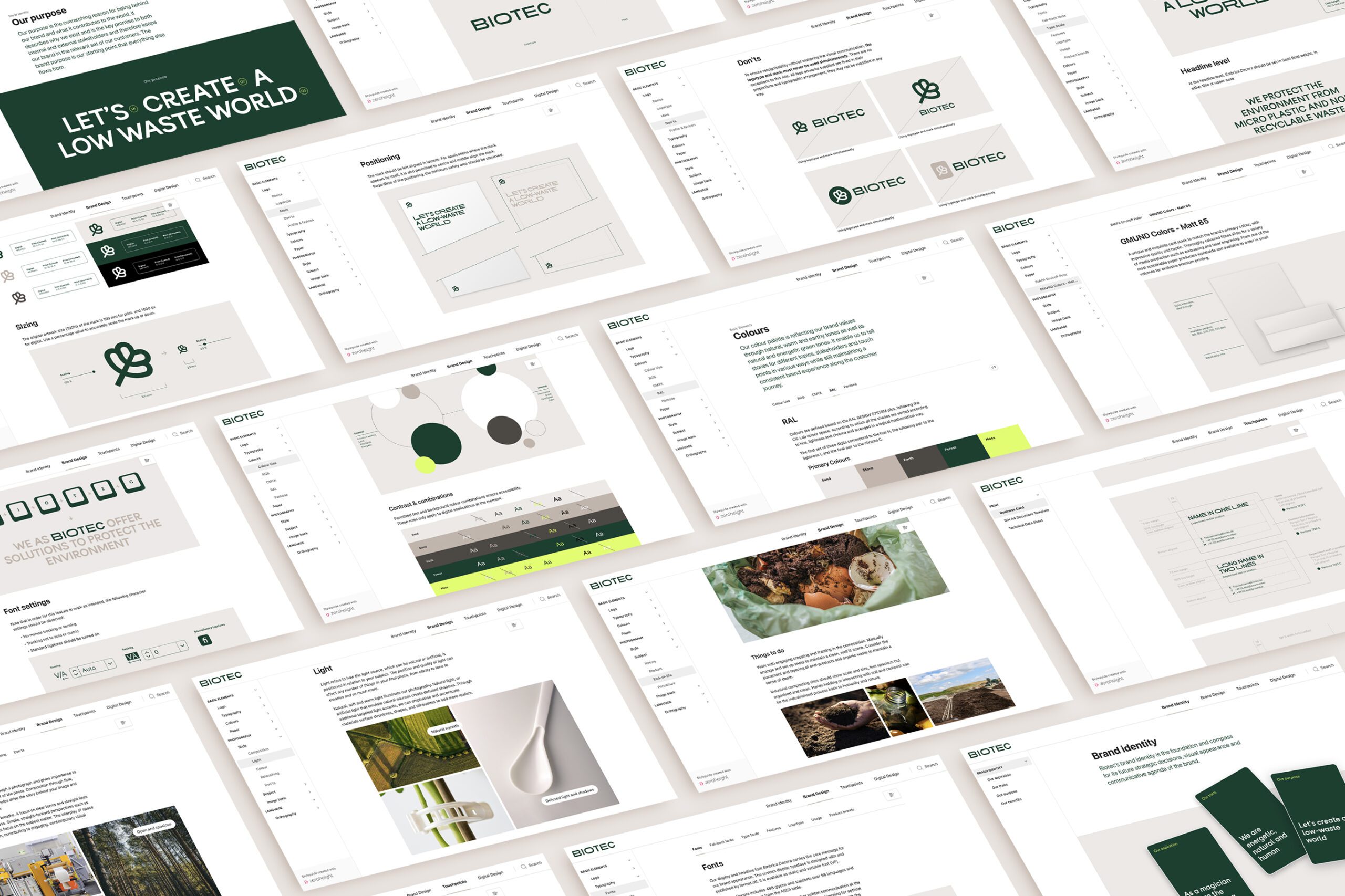
Visual identity
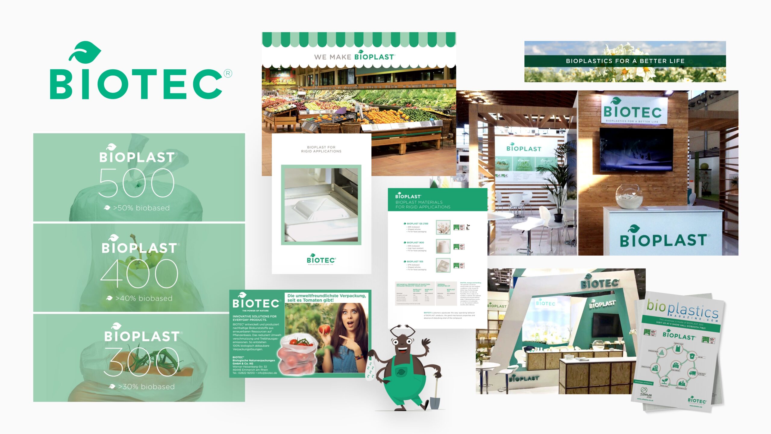
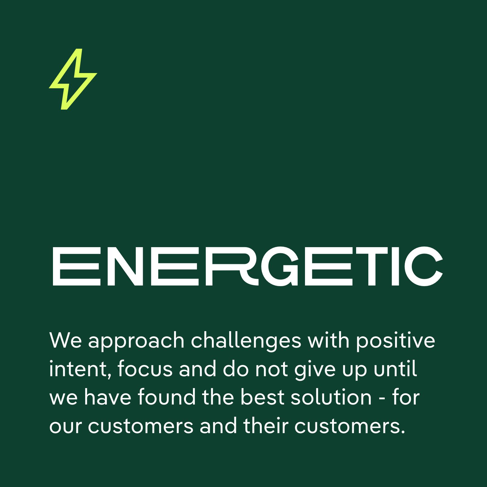
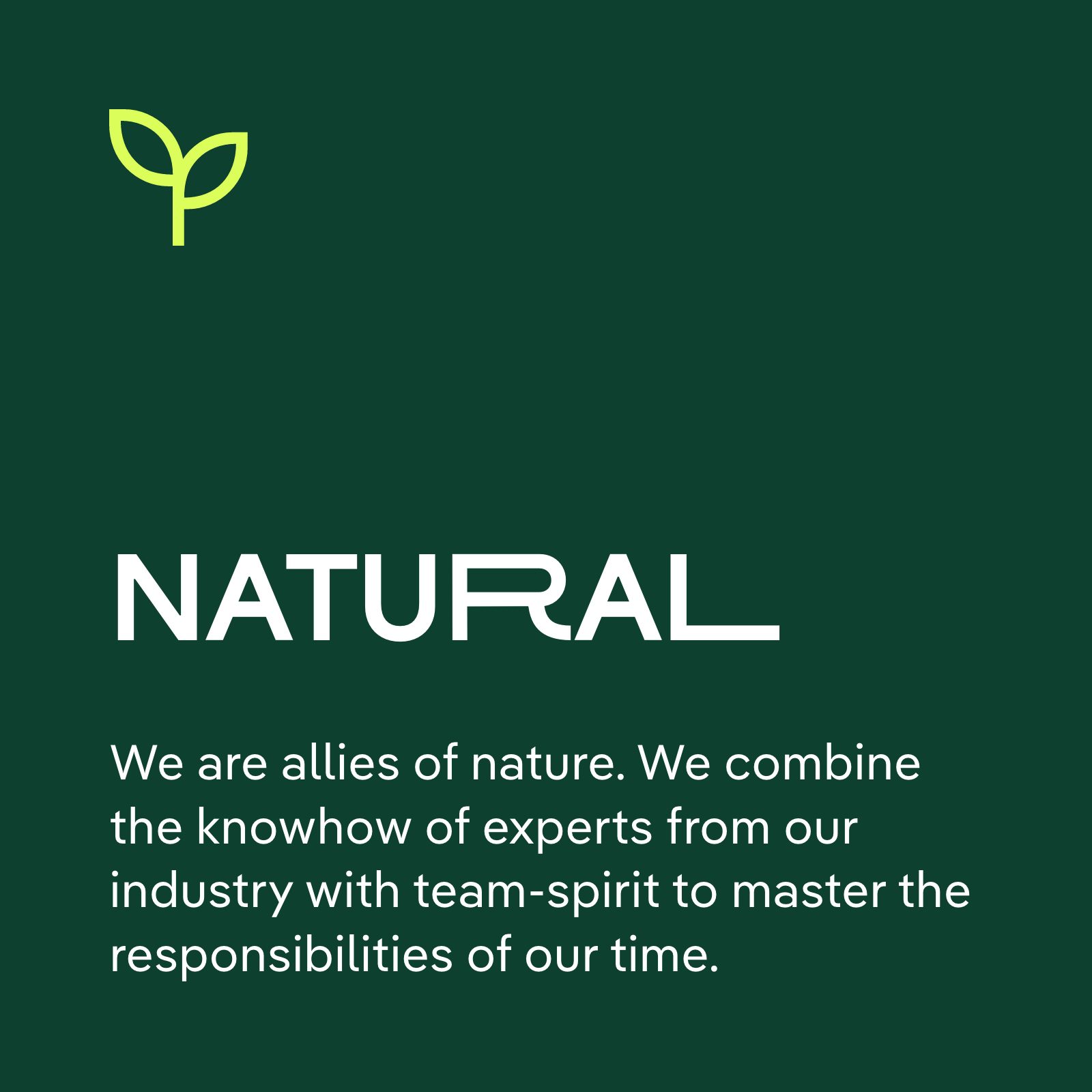
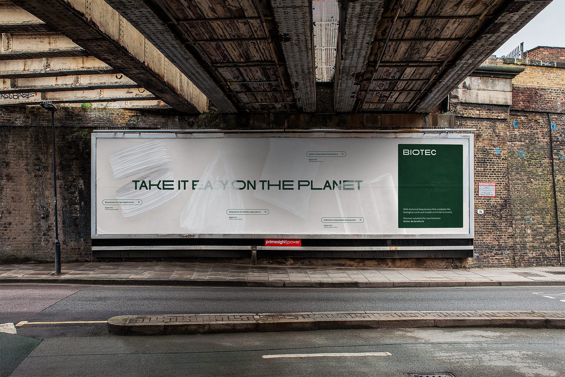
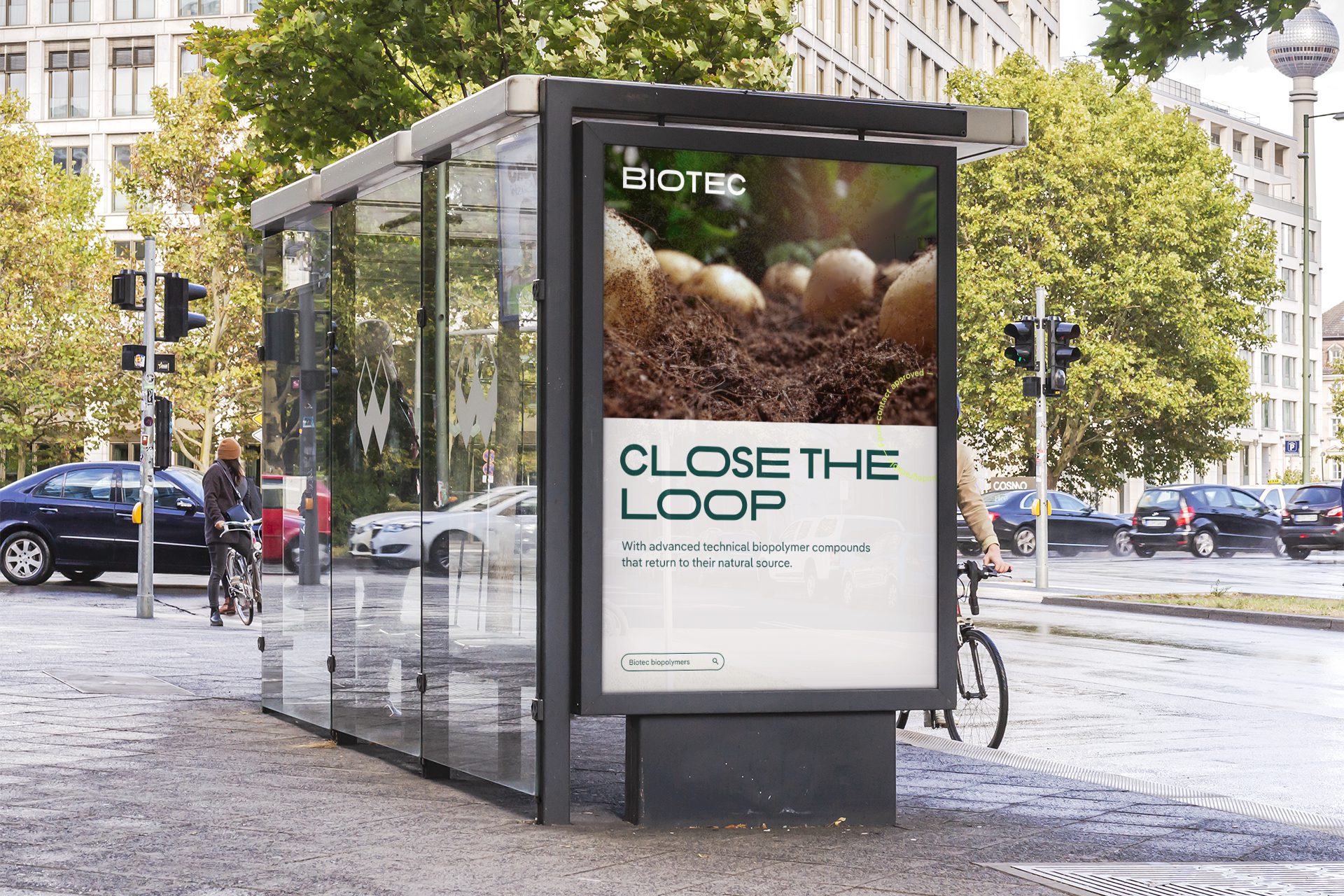
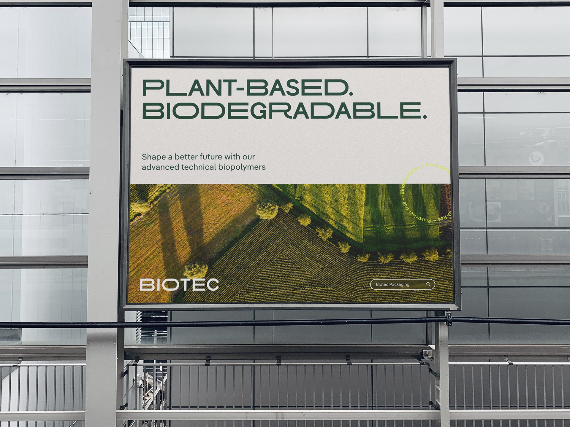
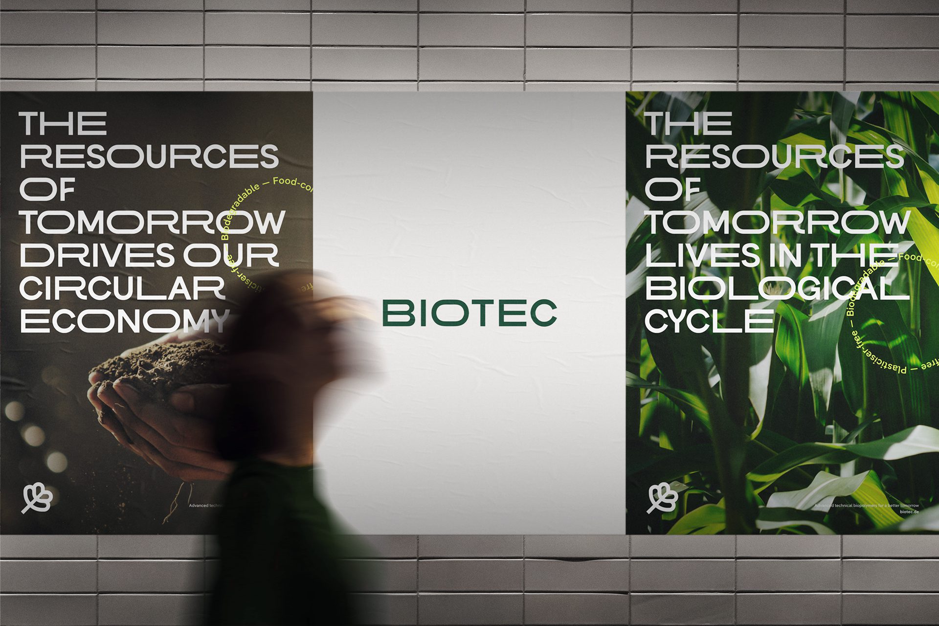
To reflect the new brand position and values, we created a clean, dynamic and transformative visual identity, clearly setting the Biotec apart from competitors. From logotype to colours, from font to photography, we created an extensive and robust toolkit of identity elements that balances the soft and human with the energetic and technical.
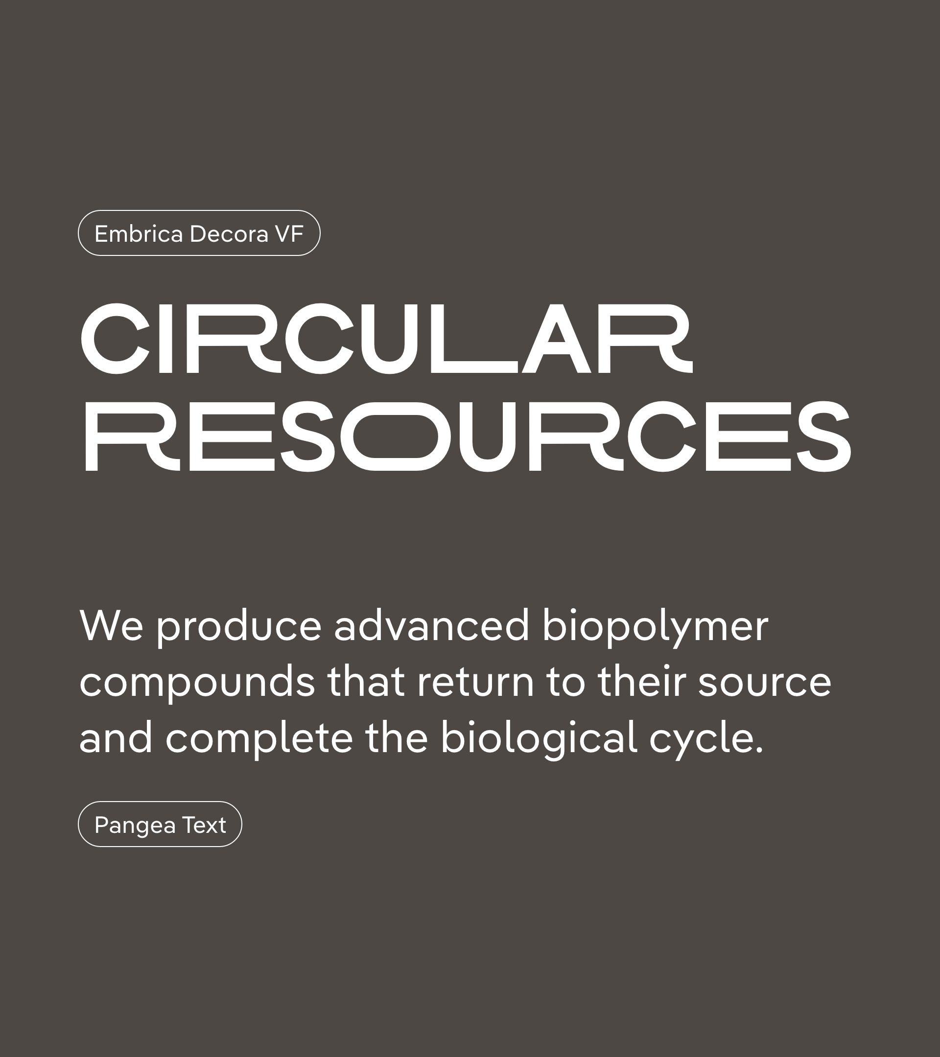
We collaborated with Format.OTF to create the custom variable display typeface Embrica Decora, from which the new wordmark is developed. The geometric construction and exaggerated proportions of the stretched glyphs form a bold, expressive, technical, and instantly recognisable visual language.
Pangea Text, a beautifully crafted text typeface from Fontwerk is selected for use in longer copy. The font offers optimal legibility in running texts, and counters the display typeface with a more neutral stance, softer appearance, diagonal terminals and slight inktraps.
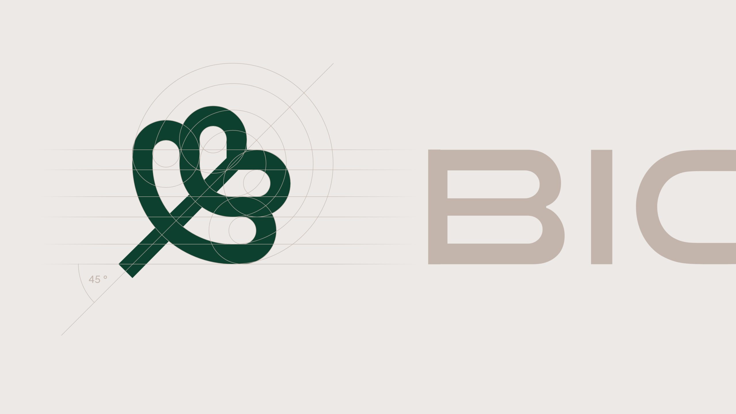
Using the capital B glyph as reference, a new emblem is created by reflecting its curved form over a diagonal axis. It complements the display typeface and is used independently from the wordmark. The emblem replaces the wordmark when placed in close proximity to the display type.
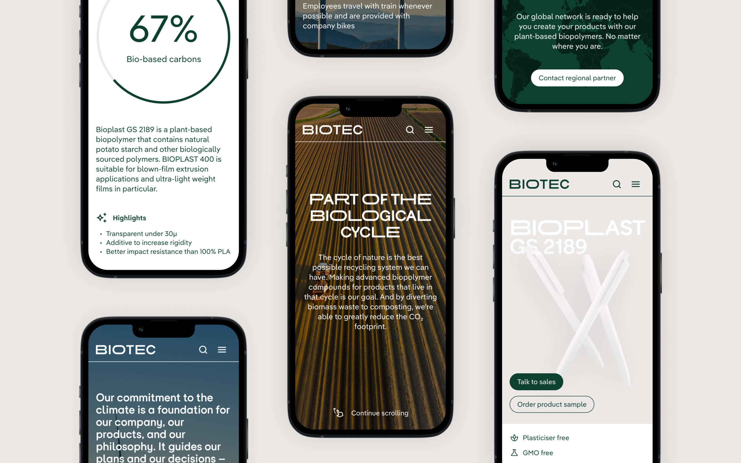
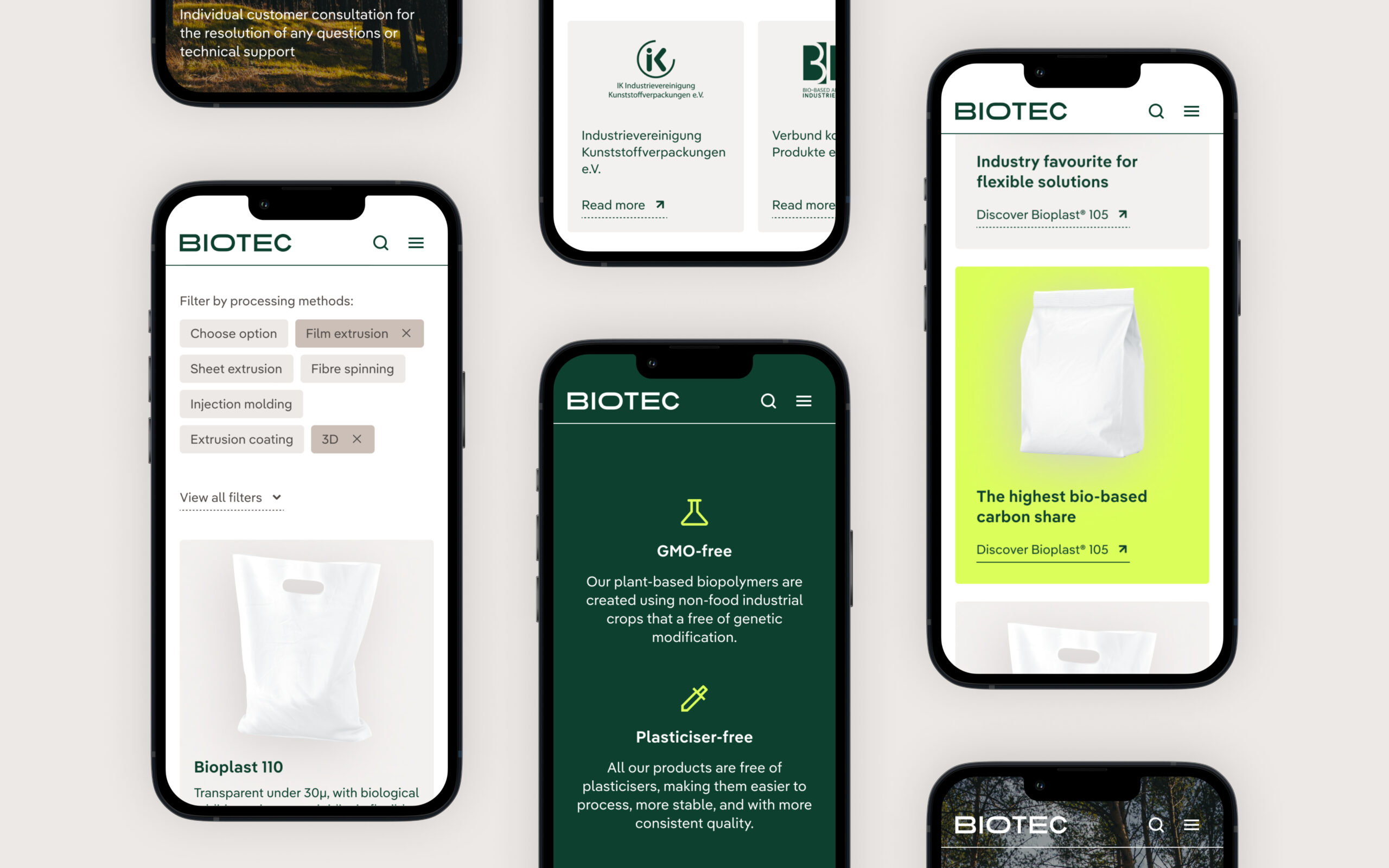
The new colour system uses varying amounts of white, light and dark earth-tones, and a rich forest green to echo nature. A bright moss accent highlights point of focus and signifies activation and action. Colour ratios can be adjusted based on application and target audience to strike the right tone of voice.


Photography (and moving images) transmit a sense of transparency, positive intent, and an optimistic vision for a better, more sustainable future for all stakeholders. A consistent image style is defined based on composition, lighting and colours, and takes into account the various subject matter in the brand’s communication.
Visual identity elements and their correct usage is collected and documented in a digital brand management portal to create a single source of truth for stakeholders.
Brand experience
Bringing the brand to life in the www
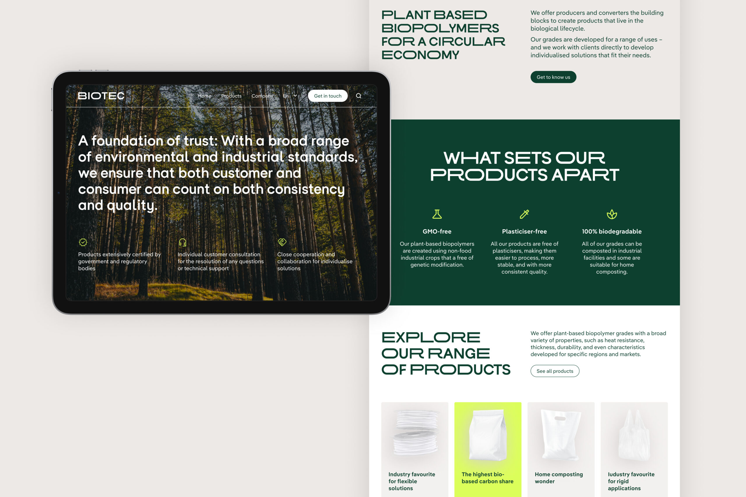
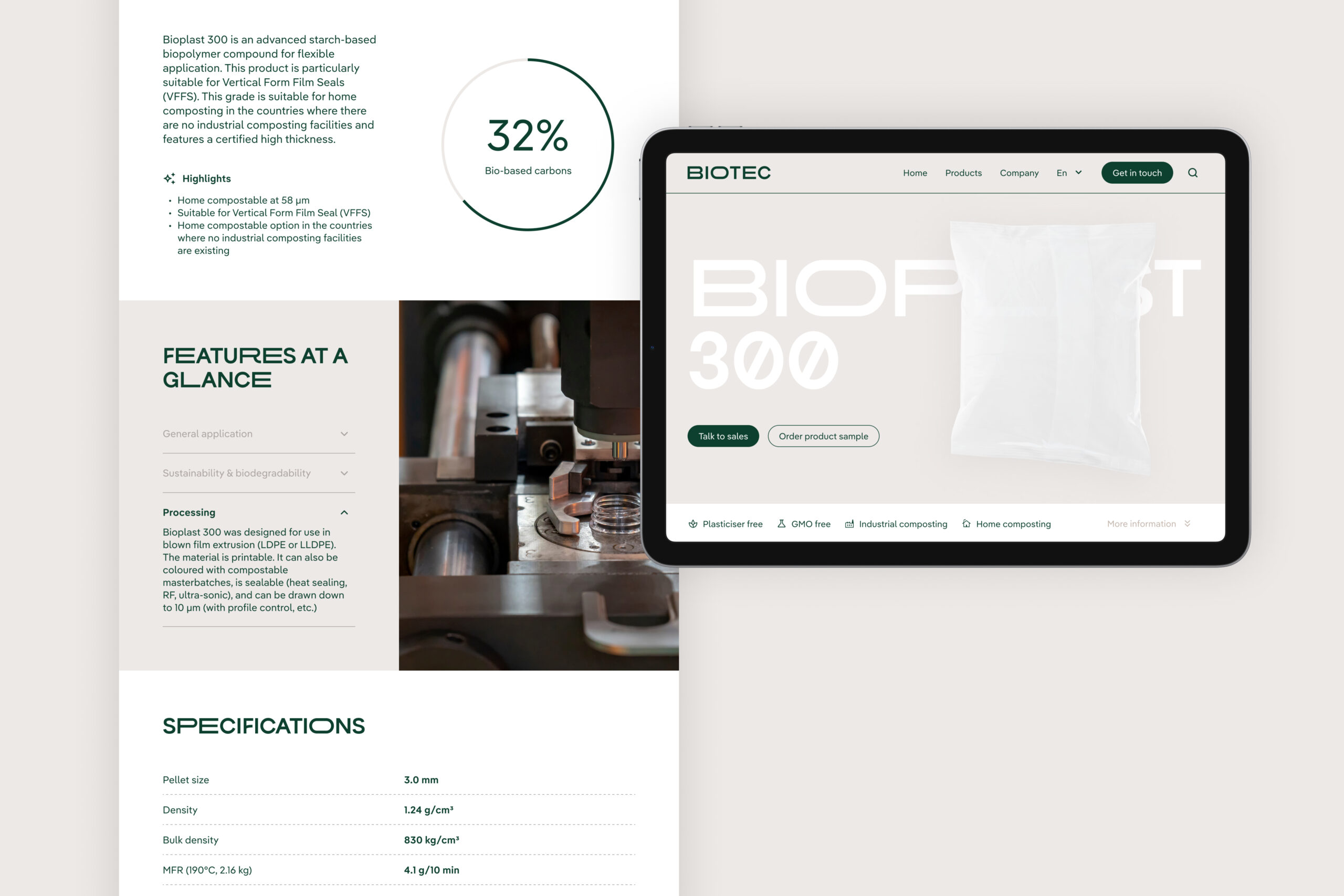
The new brand design language and its visual building blocks are brought together for the first time in a new website. Based on a refined site structure and clear user-flows, pages are assembled from a functional, modular, responsive and scalable digital design system.
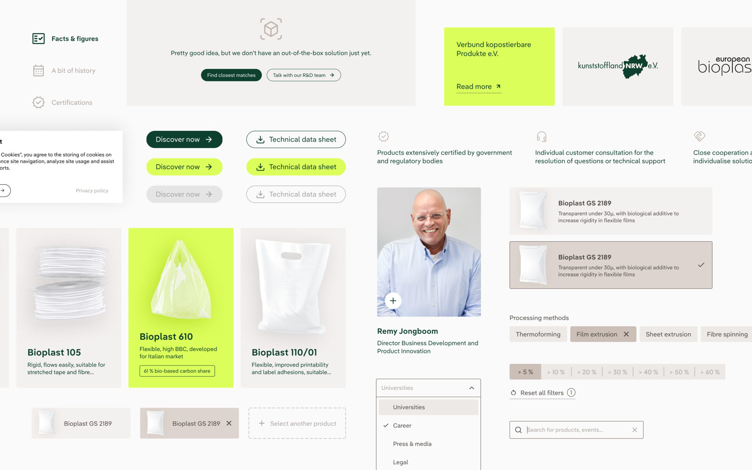
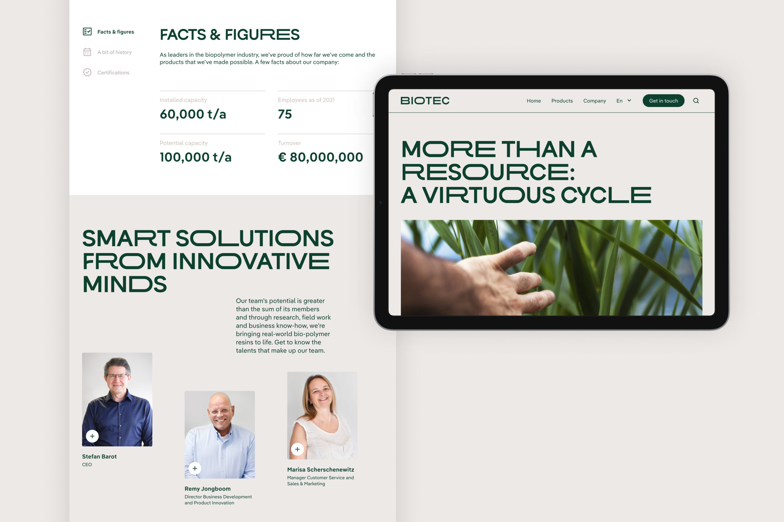
The design focused on presenting the most relevant content to the audience in a clear hierarchical order. Easy navigation, improved contact funnelling, instant search and filtering all contribute to an elevated browsing experience.
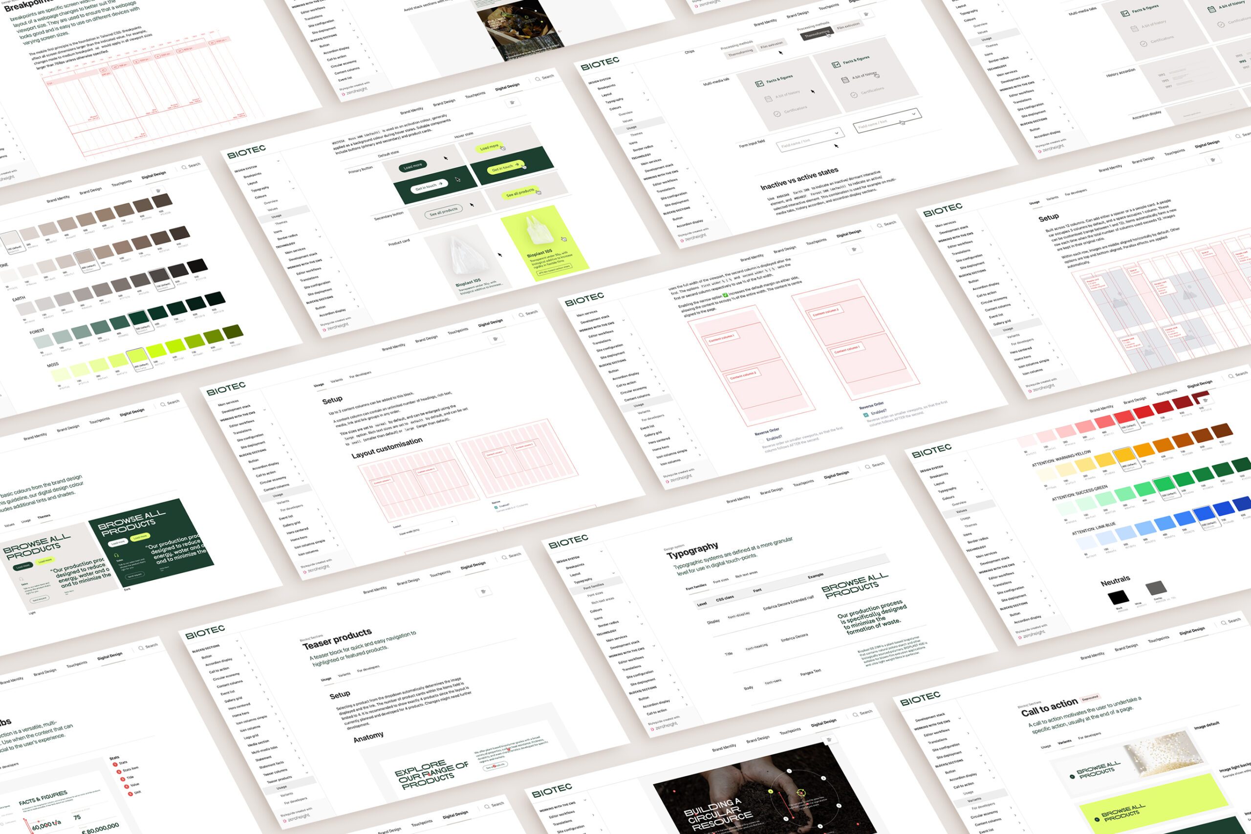
To ensure that editors, developers and future partners can continue to maintain and evolve the website in line with our vision and intentions, the design system is painstakingly documented in the online brand management portal.
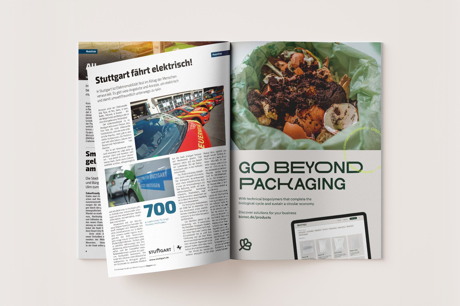
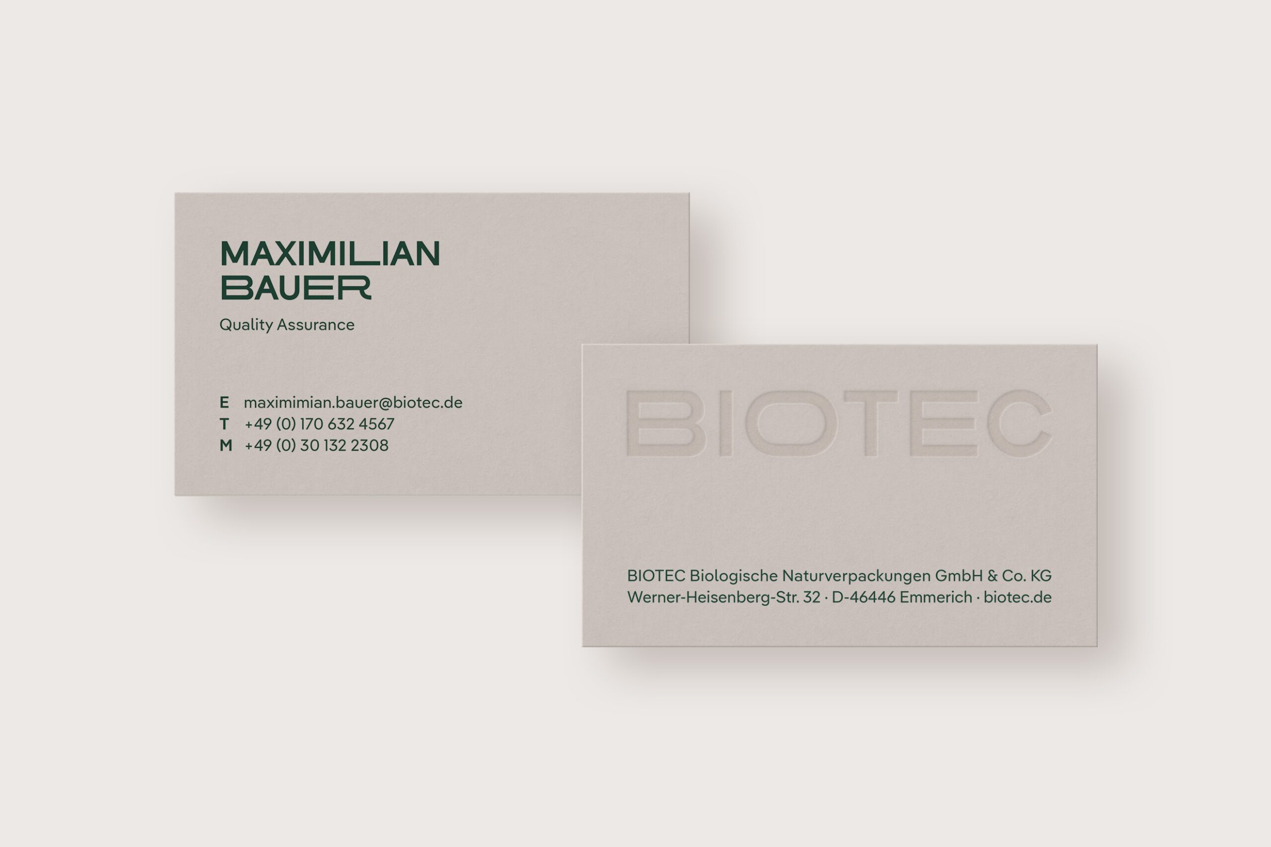
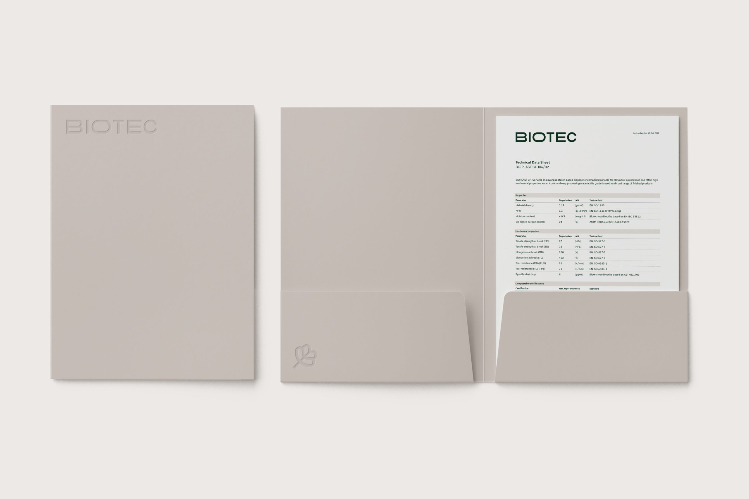
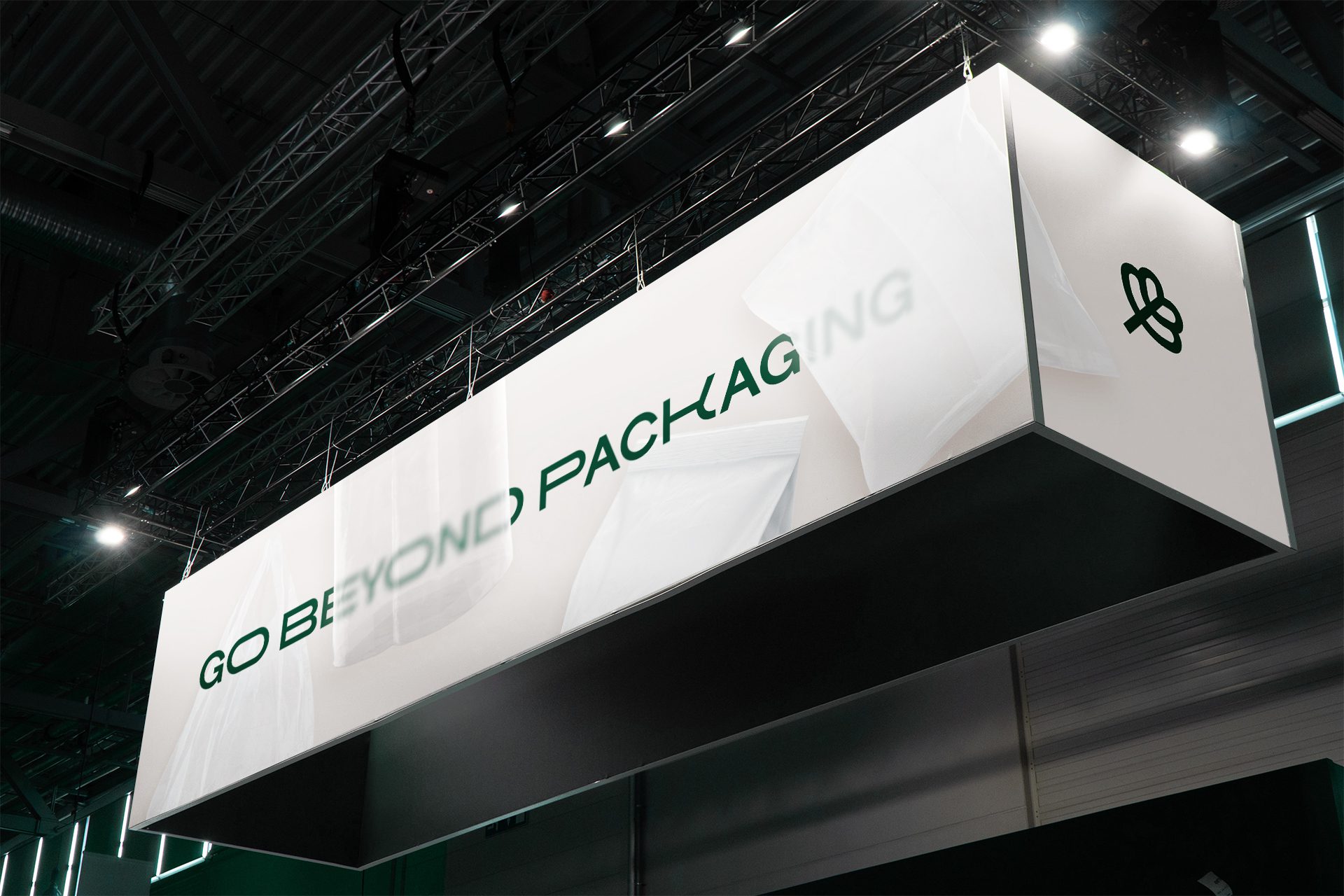
Peripherals to extend the brand experience
We developed additional touchpoints in the offline realm to echo and enhance the digital experience, ensuring a unified, consistent, impactful brand expression regardless of context and communication.
Outcome & impact
We developed a structured brand architecture to strengthen the umbrella brand and provide better orientation within the product range. The brand identity and personality were sharpened. An unambiguous position as the driving force of the industry helped clarify the brand’s relevance to its target audience and differentiated itself from the competition.
Built using a flexible design system, the new visual identity strengthened the brand position. Our digital style guide is cost-effective and enables stakeholders to manage the brand with ease and confidence.
The new website and digital design system form a robust foundation for growth. Improvements to the UX and better contact funnels increased inquiry volume and lead quality, and a robust tech stack ensures the website is fit for scaling and internationalisation.
The launch of the new brand and website is yielding positive feedback from customers and partners.