Creating a product brand with personality
24. August 2023
Daniel Albert
Recently, we had the opportunity to assist in developing and establishing a new product brand. The product: Wild bird food made from sunflower seeds – something different for a change. And even though the focus was primarily on the packaging design, we developed an awareness campaign for brand activation. Because sometimes, creativity takes over, and that’s something you shouldn’t suppress.
Discovering the sweet spot
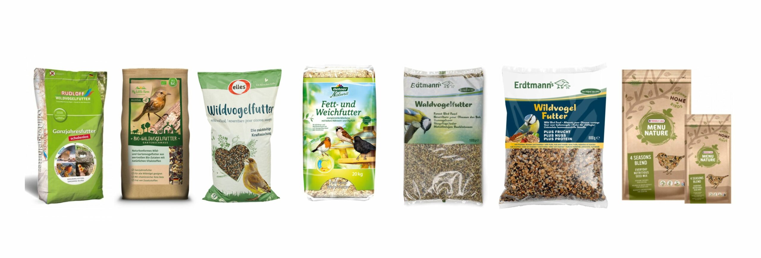
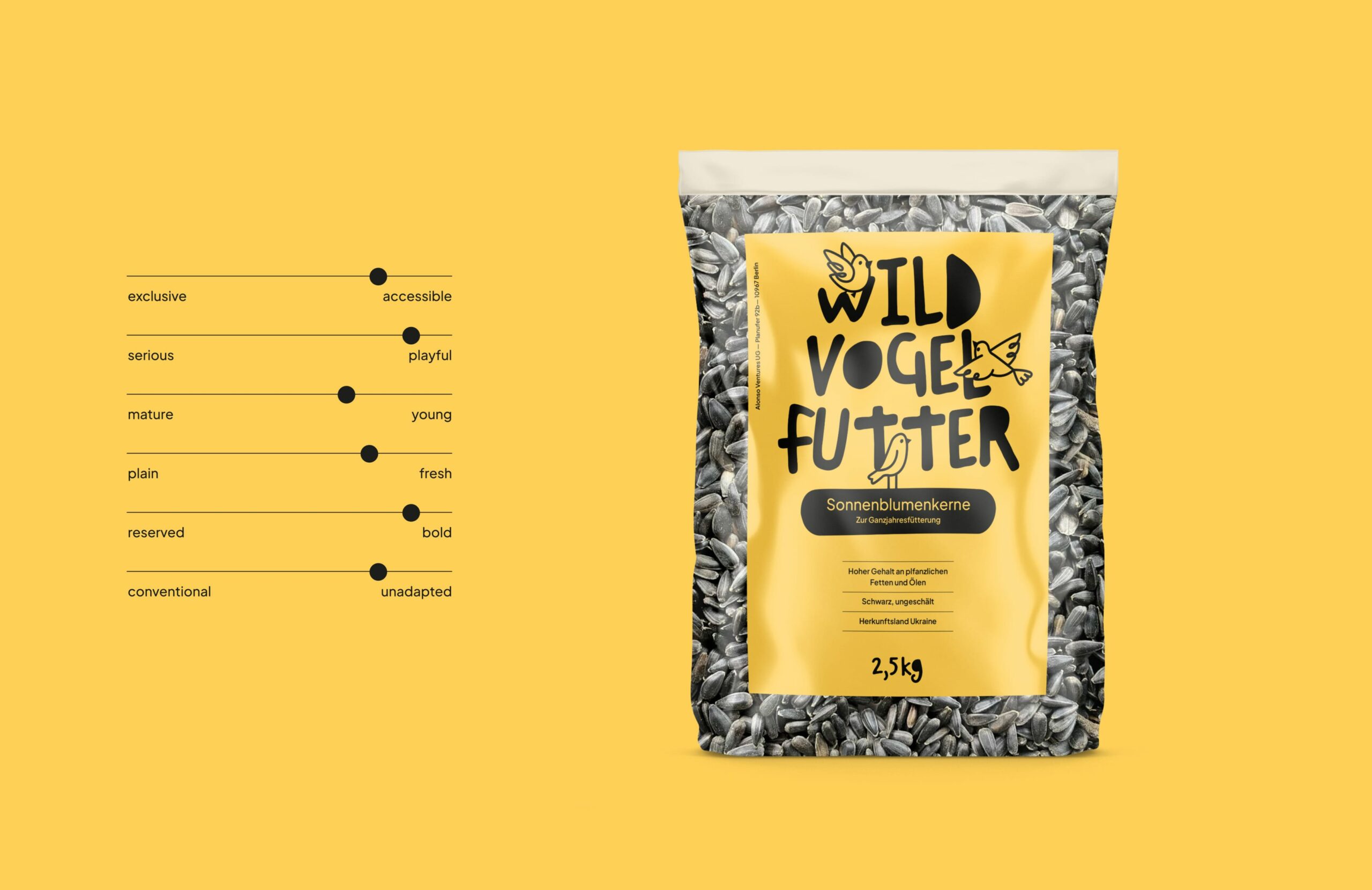
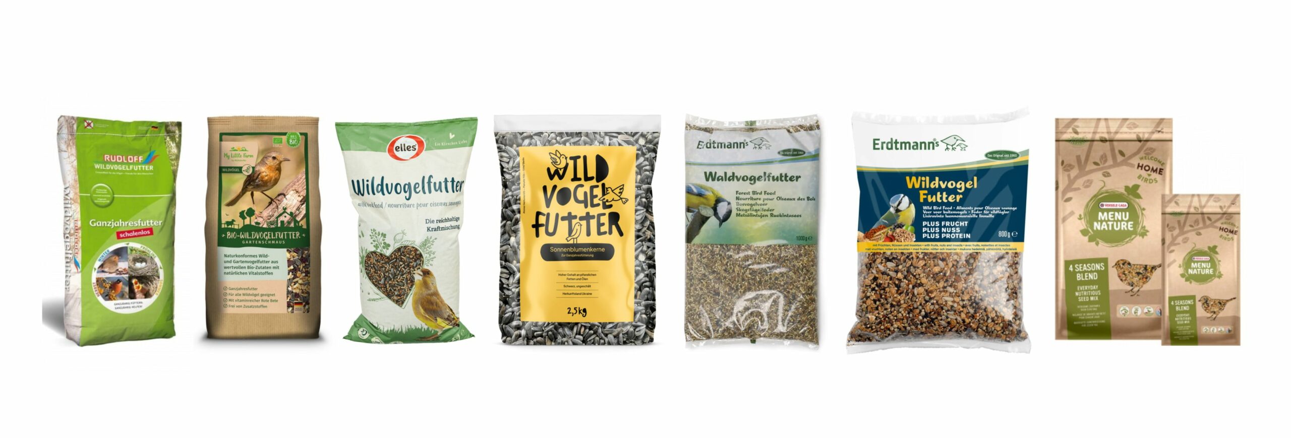
Initially, we scanned the market environment to derive requirements for positioning and the visual language – not just from a bird’s-eye view. The analysis revealed that the market for wild bird food is not very differentiated, with a majority of products sporting the expected industry-typical look. The layouts appear cluttered, and the packaging designs are confusingly similar. It became clear that there was significant potential in breaking visual habits, generating an impact through clear layouts and the use of color that would catch customers’ eyes – both online and offline at the point of sale. The goal was to generate attention through bold positioning while still being relatable to the masses.
Creating the identity
After the design direction was outlined through the discovery phase, the brand personality was further described, and the brand’s characteristics were defined. The subsequent exploration presented various concepts that visually translated the personality in different ways.
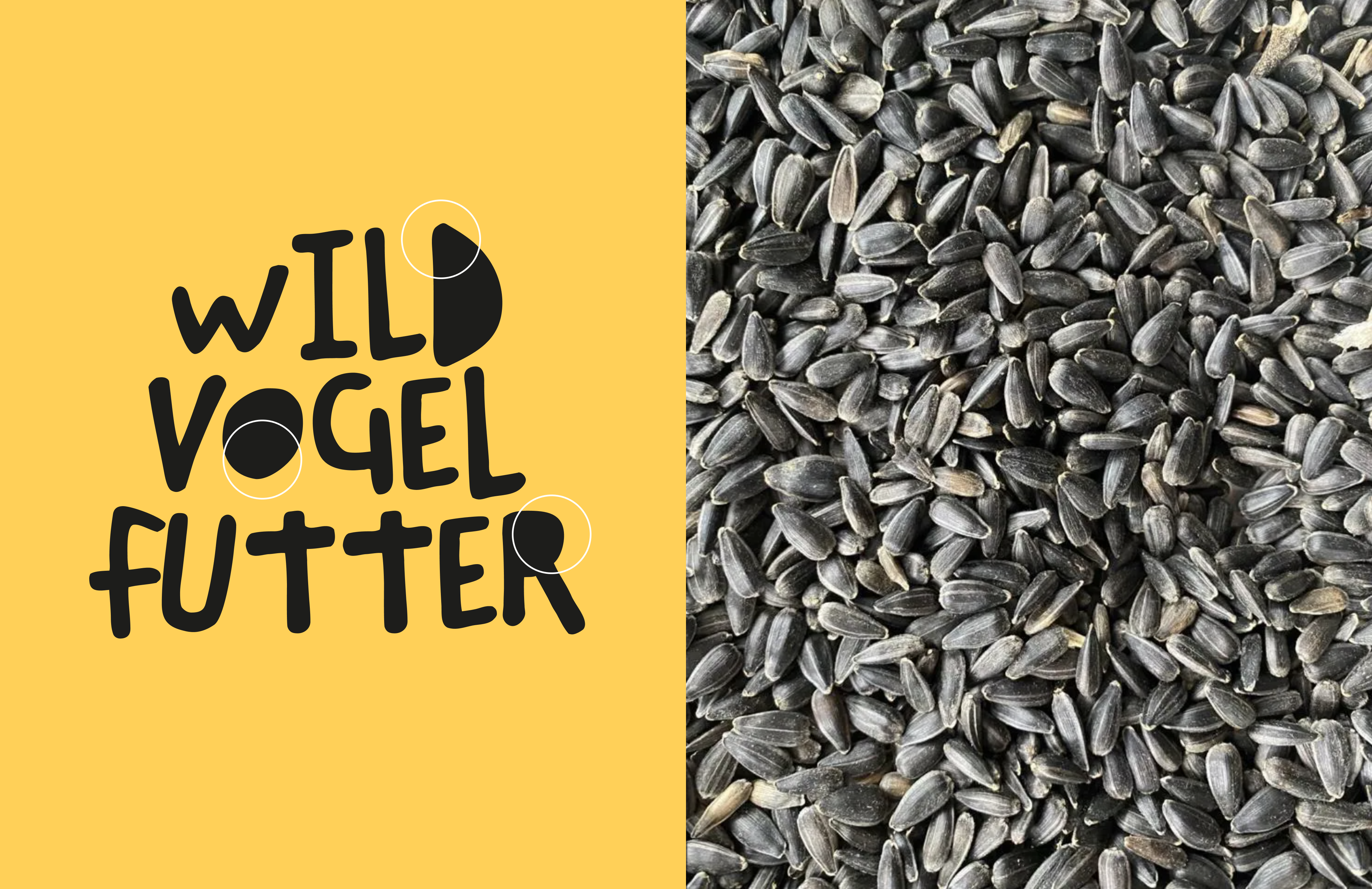
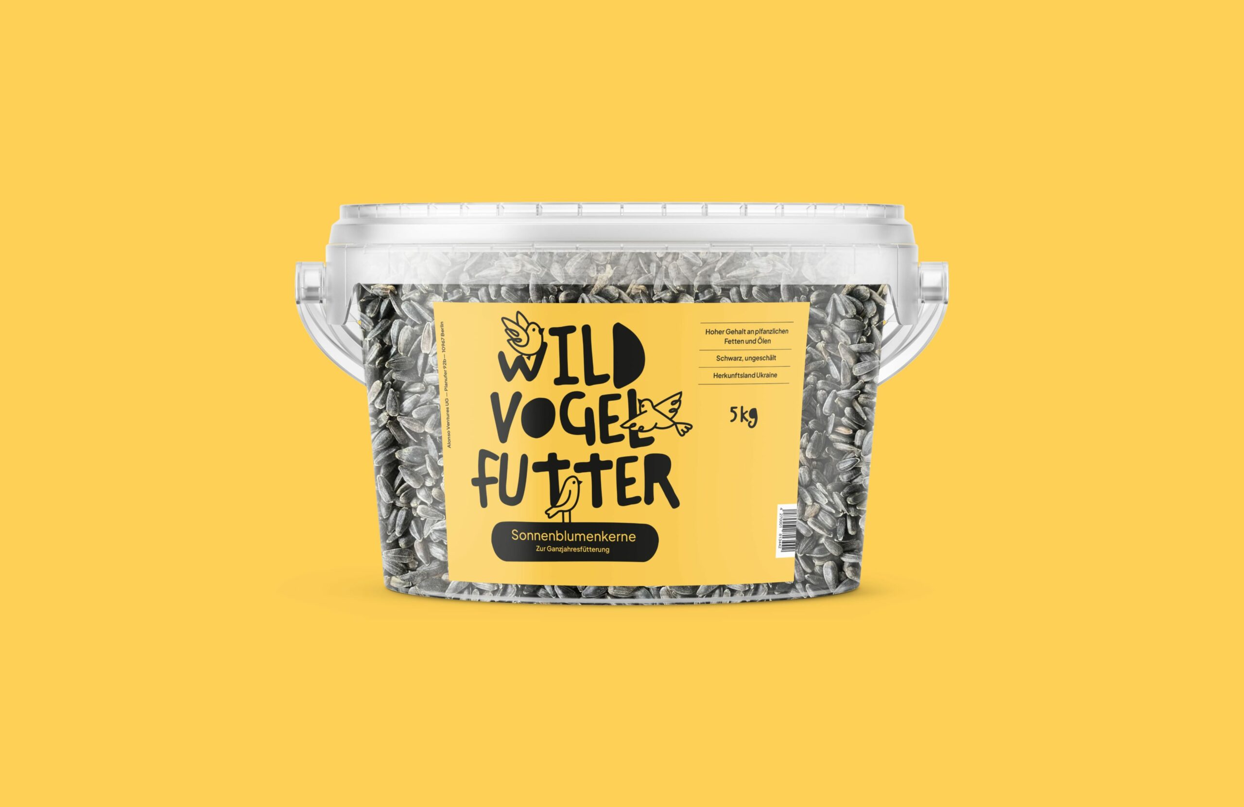
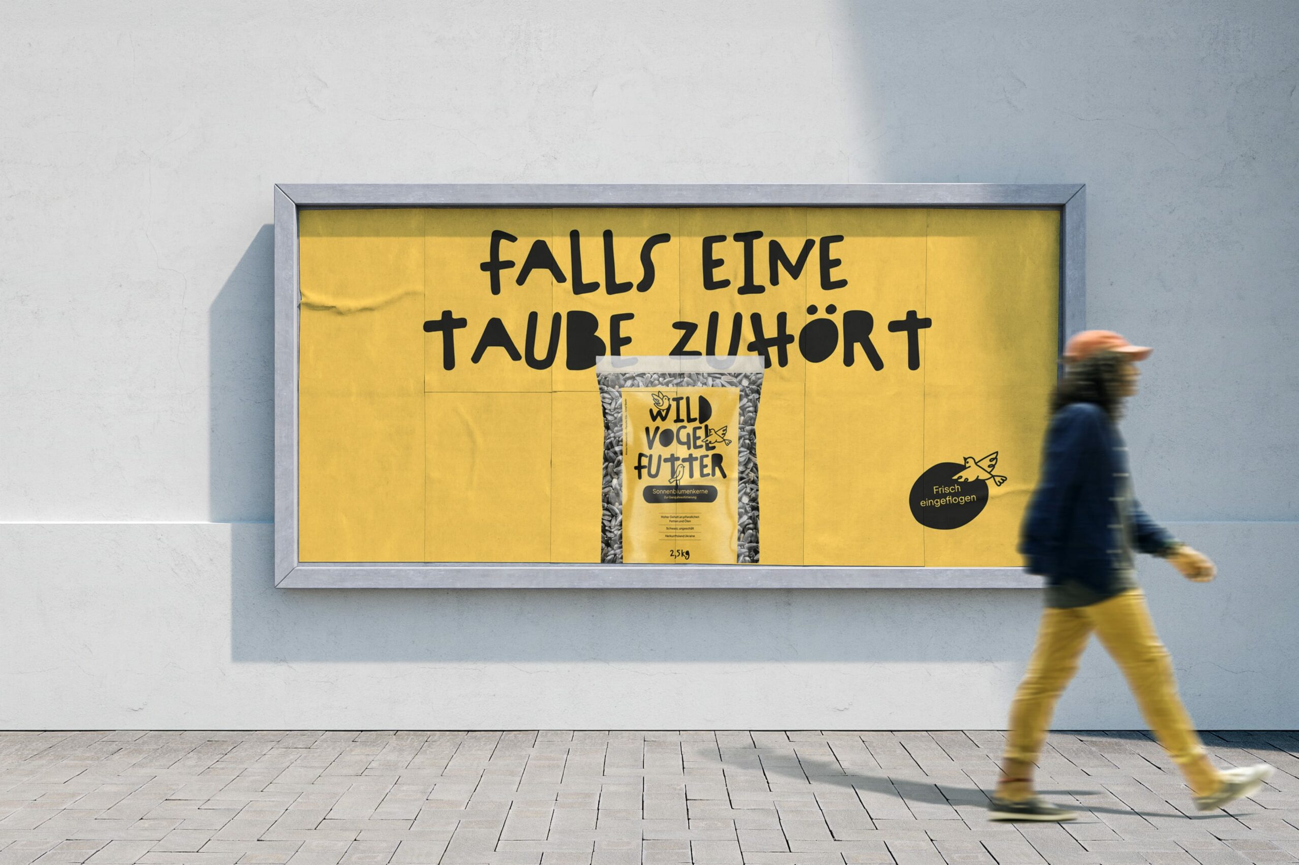
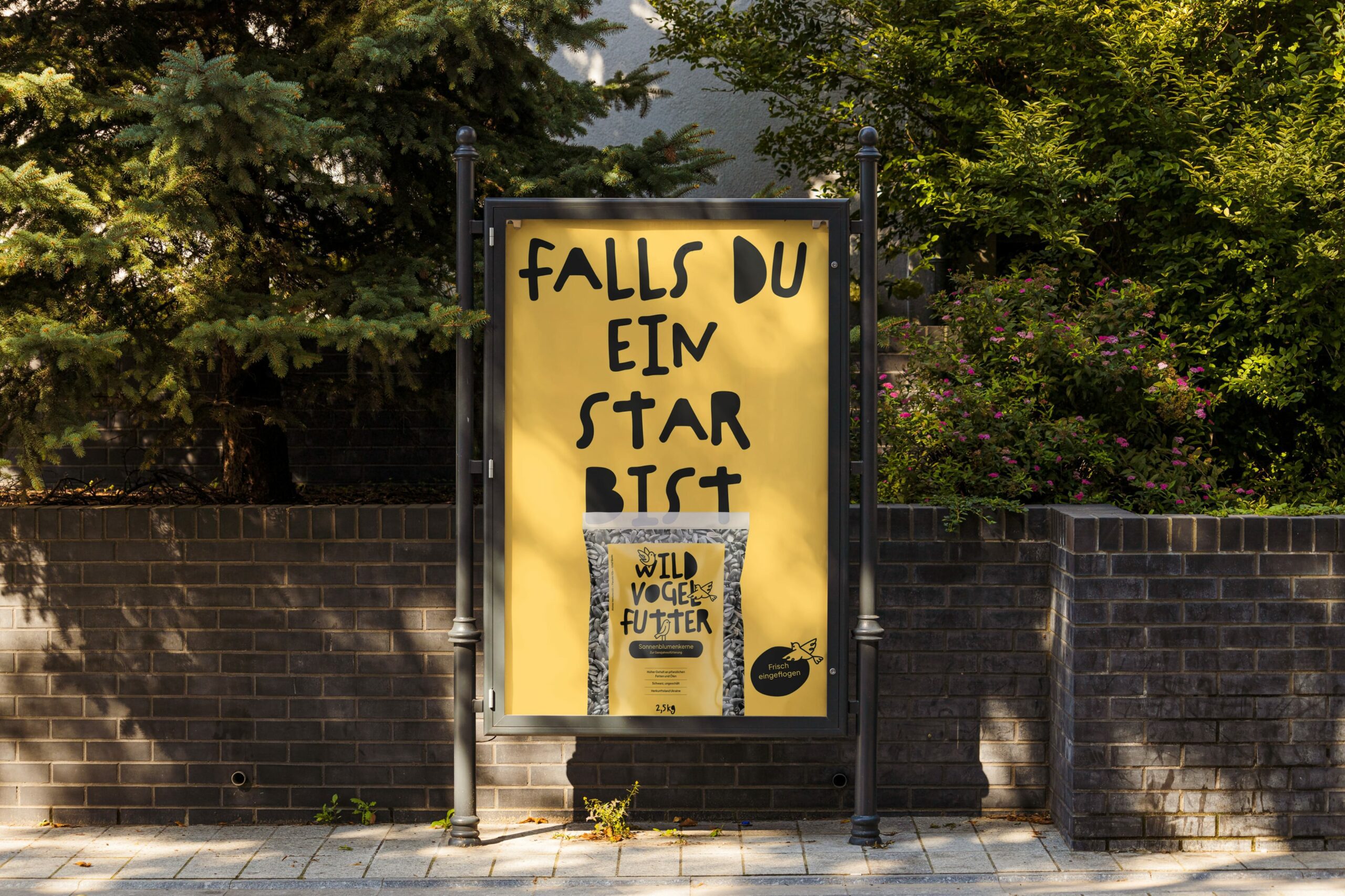
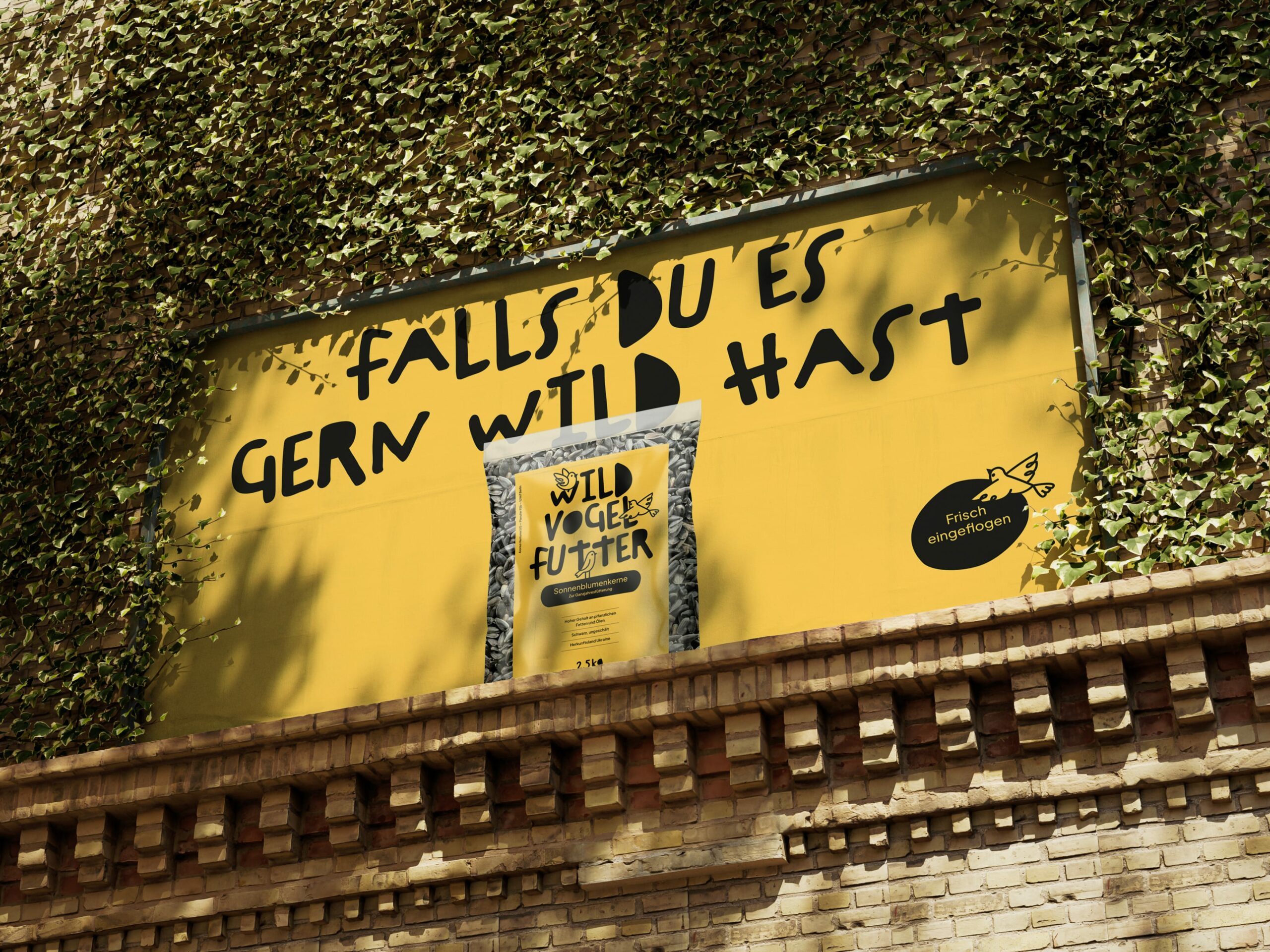
The visual identity is characterized by expressive typography that formally captures the form language of sunflower seeds. It imparts a wild, hand-made character to the otherwise clean, structured layouts, rendering the product authentic and approachable. In contrast, product information and body text are presented with a clear sans-serif typeface. Hand-drawn line illustrations of wild birds establish a connection to the product, injecting excitement and playfulness into the layouts.
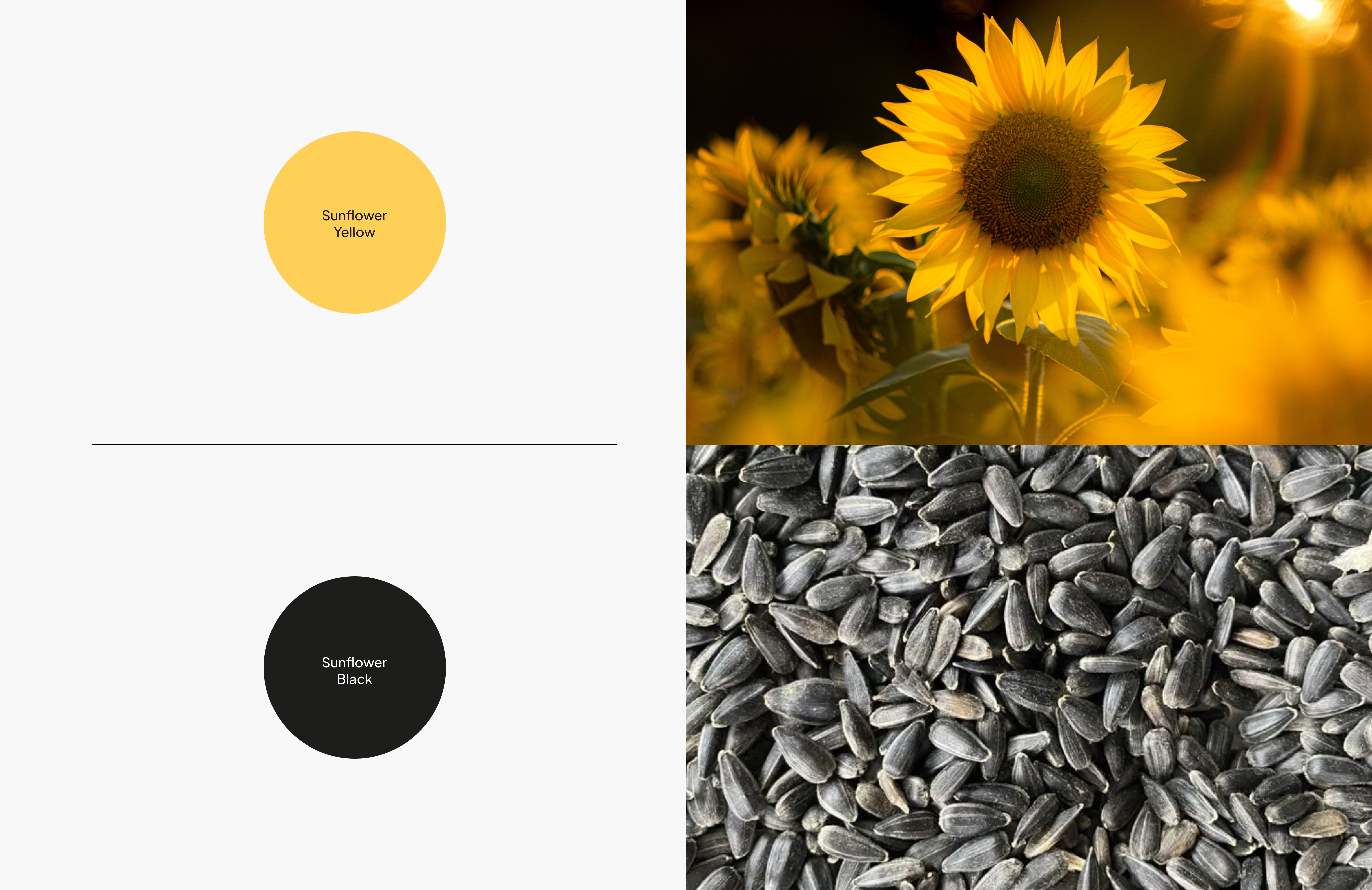
The color concept stands out due to its maximal simplicity and consequent directness. While the yellow is derived from sunflowers and generates warmth and attention through extensive use, the black references the color of sunflower seeds. This two-tone approach creates high recognizability, offering customers guidance and strengthening the brand connection. Overall, the brand personality has been translated into a lively, playful, and attention-grabbing visual identity that breaks conventions and stands out at the point of sale as packaging design, intriguing and captivating the curious.
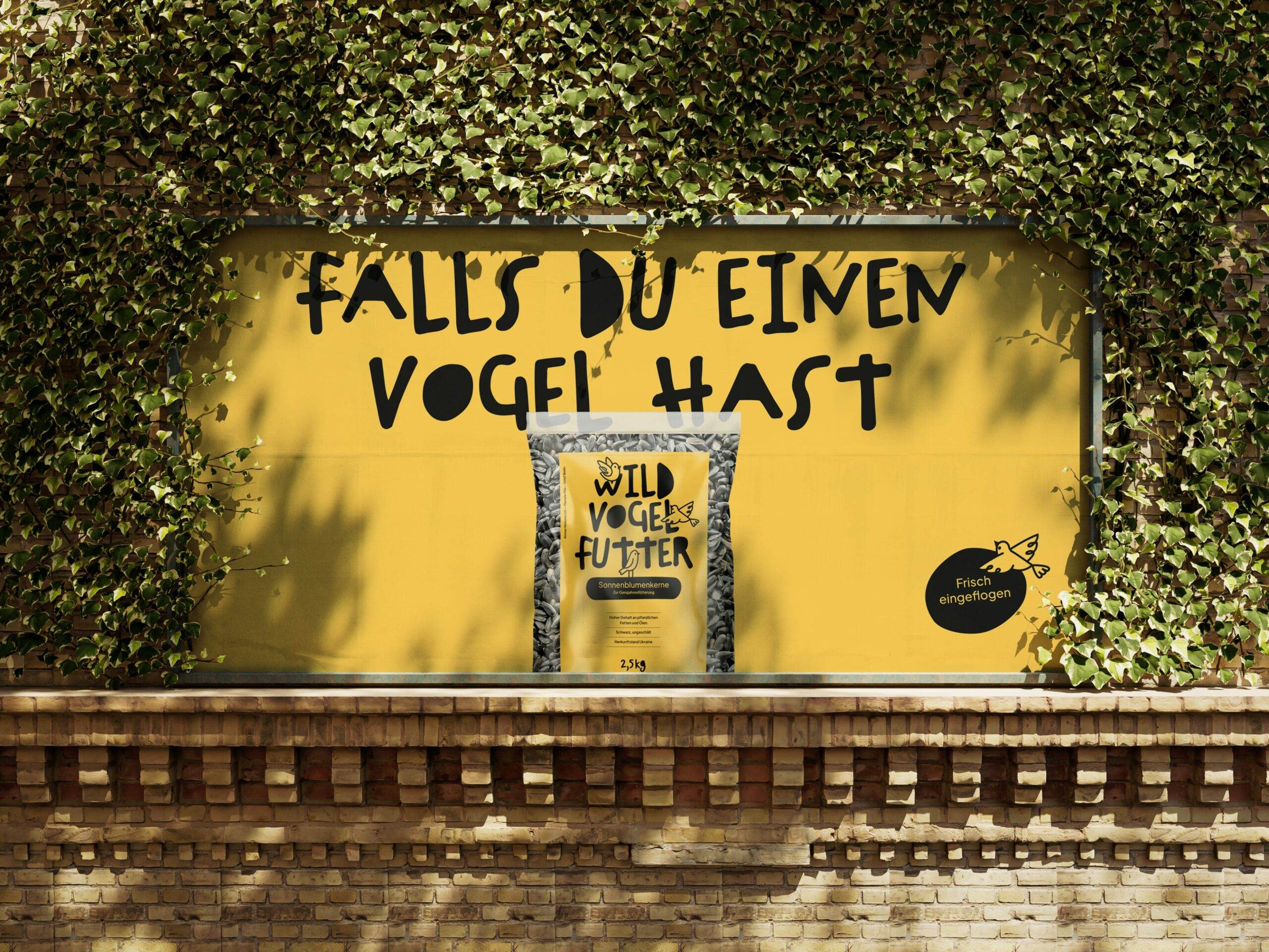
Activating the brand and the audience
Naturally, the impact was meant to be conveyed not only visually but also verbally through the brand’s voice. And since sometimes ideas don’t need a lot of brooding and you simply can’t keep your beak shut, humorous and provocative campaign claims were quickly generated, bringing a smile to the viewer’s face and ensuring memorability.
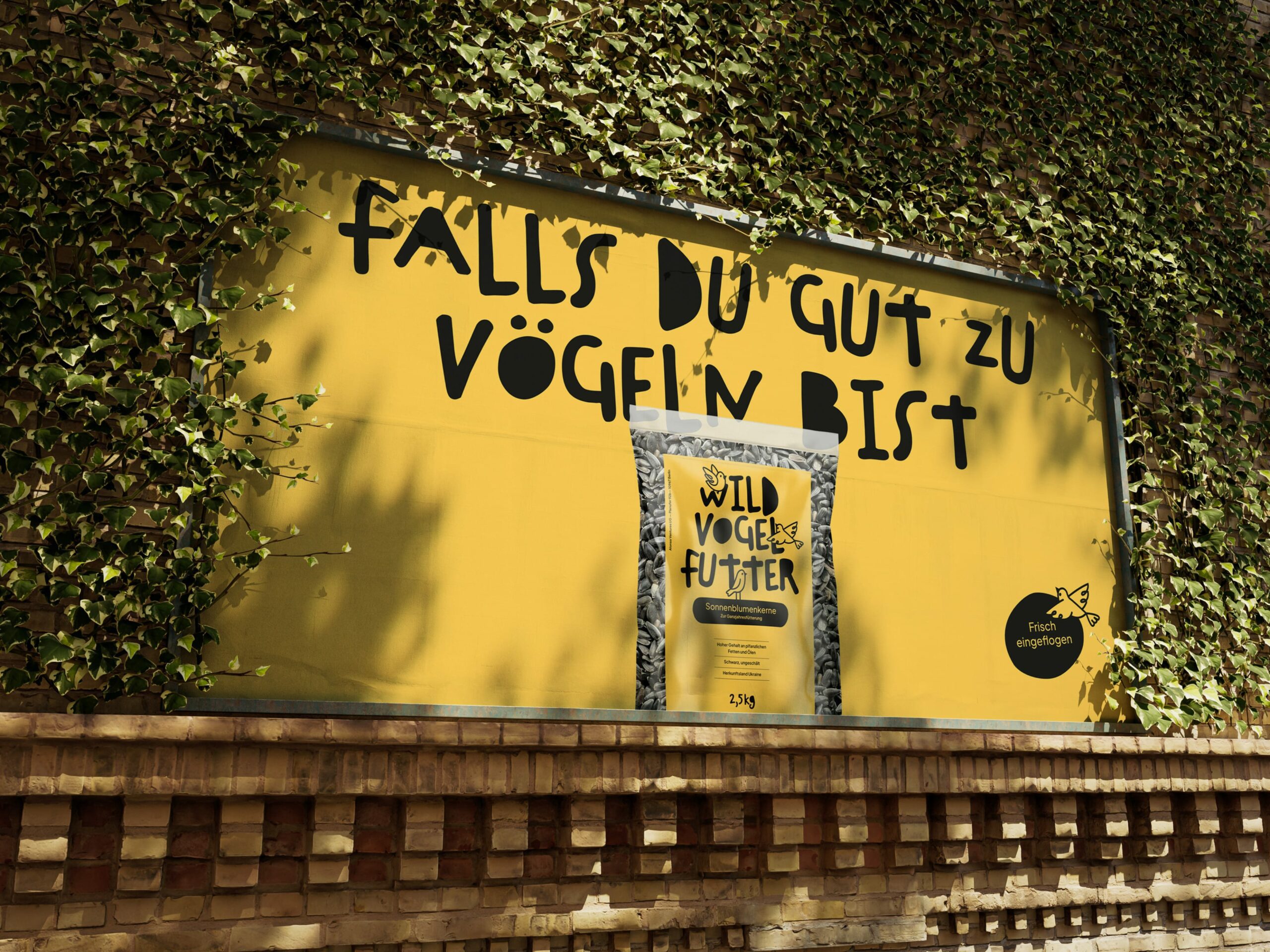
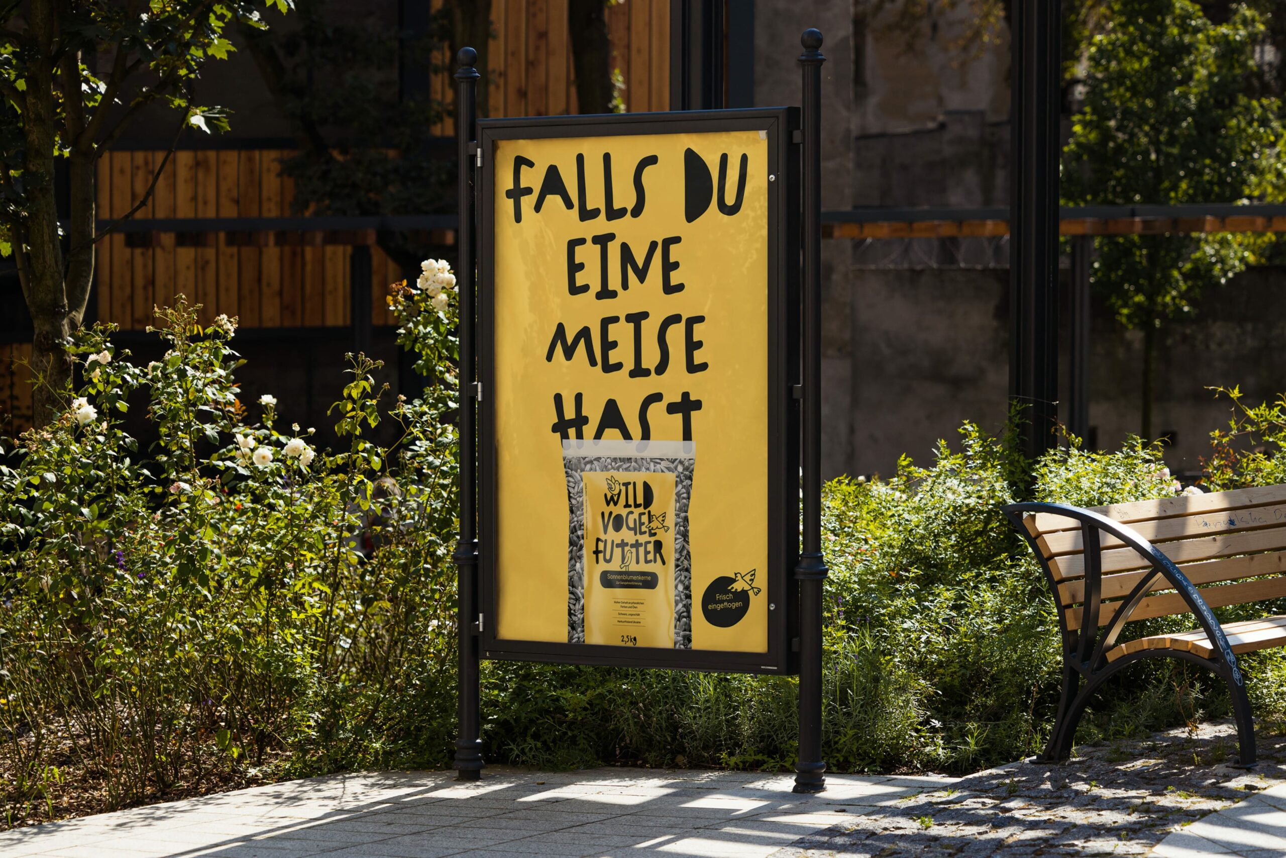
However, the fictional brand awareness campaign doesn’t just make the rooster crow on Out-of-Home but also gives the brand wings through animation in the online campaign. The result is a campaign that will conquer the hearts of customers and the beaks of the bird world in flight.

Sparked your interest? Feel free to get in touch.
Daniel Albert
Managing partner, creative director